Add space between histogram bars in Matplotlib
Last Updated :
24 Jan, 2021
Matplotlib is a plotting library in Python programming language and it’s by default numerical mathematics extension of NumPy library in python language. While programming in python language we use the matplotlib library package for graph and histogram visualizations. But while plotting histogram using matplotlib in python, it lacks division or space between adjacent bars. This makes histograms very tedious to work with and it becomes very difficult to interpret. In this article, we will study how to add space between histogram bars in matplotlib.
Let’s understand with this example:
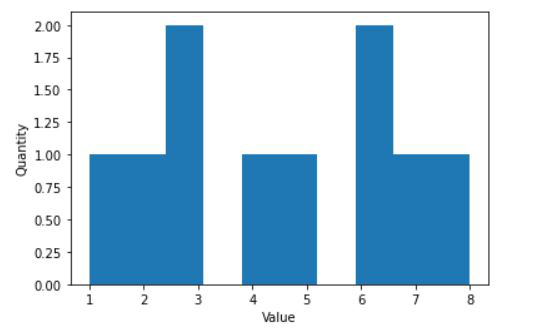
Example 1: Creating a simple plot.
Python3
import matplotlib.pyplot as plt
values = [1, 2, 3, 3, 4, 5, 6, 6, 7, 8]
plt.hist(values)
plt.ylabel("Quantity")
plt.xlabel("Value")
plt.show()
|
Output:
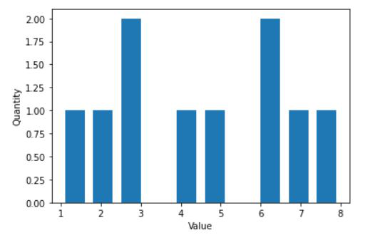
Now we will add space between the histogram bars:
The space between bars can be added by using rwidth parameter inside the “plt.hist()” function. This value specifies the width of the bar with respect to its default width and the value of rwidth cannot be greater than 1.
Python3
import matplotlib.pyplot as plt
values = [1, 2, 3, 3, 4, 5, 6, 6, 7, 8]
plt.hist(values, rwidth=0.7)
plt.ylabel("Quantity")
plt.xlabel("Value")
plt.show()
|
Output:
Example 2: Creating a simple plot.
Python3
import matplotlib
import numpy as np
import matplotlib.pyplot as plt
np.random.seed(10**7)
n_bins = 20
x = np.random.randn(10000, 3)
colors = ['green', 'blue', 'lime']
plt.hist(x, n_bins, density = True,
histtype ='bar',
color = colors,
label = colors)
plt.legend(prop ={'size': 10})
plt.show()
|
Output:
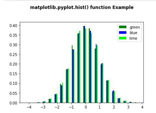
With adding space:
Python3
import matplotlib
import numpy as np
import matplotlib.pyplot as plt
np.random.seed(10**7)
n_bins = 20
x = np.random.randn(10000, 3)
colors = ['green', 'blue', 'lime']
plt.hist(x, n_bins, density = True,
histtype ='bar',
color = colors,
label = colors,
rwidth = 0.5)
plt.legend(prop ={'size': 10})
plt.title('matplotlib.pyplot.hist() function Example\n\n',
fontweight ="bold")
plt.show()
|
Output:
Like Article
Suggest improvement
Share your thoughts in the comments
Please Login to comment...