Advanced Excel – Chart Design
Last Updated :
04 Jan, 2023
The charts are the visual representation of data in both rows and columns. They are used to analyze the trends and patterns in the datasets. For example, If we want to analyze the sales of different courses for a specific period of time we can easily do this with the help of charts and get the result of queries such as months having a maximum number of sales etc. The following are the uses of charts:
- Allows visualizing the data graphically.
- Easy to compare and interpret the data in datasets.
- Provide easier and more convenient analysis for trends and patterns in data over a period.
Advance Chart
Advanced charts are used to visualize and analyze consolidated information in a single chart for more than one dataset. For example, if we have more than one dataset, we can use one dataset to create a chart and after that, we can add another dataset also on the same chart while formatting the chart.
Examples of Top Advance Charts
Following are the examples of top advance charts,
Conditional Doughnut Progress Chart
Conditional doughnut progress chart display percentage(%) change with conditional colors for different levels of completion of the task.
Column Chart with Percentage Change
Column chart with percentage change displays the percentage(%) change between a time period for an event or task.
Interactive Waterfall Chart
Waterfall chart displays the change in a number(quantity, amount, etc.) over a time span.
Actual Vs. Multiple Targets Chart
Actual vs. multiple chart display multiple goals compared to the actual goals.
Example:
In this example, we will work on some random dataset for the number of articles published on geeksforgeeks in 6 different months and the number of monthly visitors who visited the site. We will try to find the relationship between them.
Step By Step Implementation
Step 1: Create a Dataset.
In this step, we will create a random dataset for our example. We will need 3 different columns Month, No. Of Articles Published, No. Of Visitors.
Step 2: Create A Column Chart.
In this step, we will create a basic column chart using our random dataset. For this Select Dataset > Insert > Charts > Insert Column / Bar Chart. Excel will automatically insert a chart depending on chart basics.
Step 3: Formatting Chart.
In this step, we will format the chart in order to make it a little more advanced. As we can see in the above chart we are able to visualize the number of visitors who visited the website and the articles published but in order to make it more enhanced we will also show the relationship between the two curves we will format the chart. For this Select Any Visitor Curve > Chart Design > Change Chart Type.
Step 4: Adding Secondary Curve.
Once we click on the Change Chart Type, it will open a window where we will add change the Visitors curve as a secondary curve this will enable us to easily visualize the relationship between the articles published and the number of visitors on the website. For this Select Combo > Click On Clustered Column Drop-Down > Select Line Cure.
Once we select the Line curve for our visitor’s axis, we need to click on the OK button.
Once we click on the OK button we will get the following chart as an outcome.
Step 5: Adding Secondary Axis.
In this step, we will add a secondary axis to our chart. For this, we need to repeat the same thing. For this Select Chart > Chart Design > Change Chart Type.
It will open a popup window where we need to Secondary Axis checkbox for the Visitors curve, this will add the secondary axis to the chart.
Once we click on the OK button, we will get the output.
Step 6: Adding Data Table.
In this step, we will try to add a data table to our chart. For this Click Chart Element > Data Table.
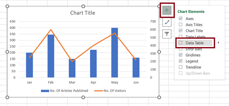
Fig10 – Adding Data Table
Step 7: Output.
Once we click on the Data Table Checkbox Excel will automatically add a data table to our chart.
Like Article
Suggest improvement
Share your thoughts in the comments
Please Login to comment...