Animated shared layout using framer-motion and React.js
Last Updated :
17 Nov, 2023
Animated shared layout using framer-motion and React.js involves items that toggle open and close show some animation/transitions and switch the states when clicked.
Prerequisites:
Approach:
To design an Animated shared layout using framer-motion and React.js we will be using the AnimatedSharedLayout along with motion and AnimatePresence components for showing transitions and useState hook to store and render the components after state changes.
Steps to Create React Application And Installing Module :
Step 1: Create a React application using the following command:
npx create-react-application demo
Step 2: After creating your project folder i.e. demo, move to it using the following command
cd animated-layout
Step 3: Add the npm packages you will need during the project :
npm i framer-motion
Project Structure:
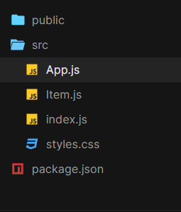
Folder structure
The updated dependencies in packages.json file.
"dependencies": {
        "@testing-library/jest-dom": "^5.17.0",
        "@testing-library/react": "^13.4.0",
        "@testing-library/user-event": "^13.5.0",
        "framer-motion": "^10.16.4",
        "react": "^18.2.0",
        "react-dom": "^18.2.0",
        "react-scripts": "5.0.1",
        "web-vitals": "^2.1.4"
}
Example: This example uses AnimatedSharedLayout and AnimatePresence components to implement the Animated shared layout.
Javascript
import React from "react";
import { AnimateSharedLayout } from "framer-motion";
import Item from "./Item";
import "./styles.css";
const itemsList = [
{
index: 0,
content: `Motion components are DOM primitives
optimised for 60fps animation and gestures.`,
},
{
index: 1,
content: `Motion can animate:
Numbers: 0, 10 etc.
Strings containing numbers: "0vh", "10px" etc.`,
},
{
index: 2,
content: `Transform properties are accelerated by the GPU,
and therefore animate smoothly. `,
},
];
const App = () => {
return (
<AnimateSharedLayout>
{}
{itemsList.map((item) => (
<Item
key={item.index}
content={item.content}
/>
))}
</AnimateSharedLayout>
);
};
export default App;
|
Javascript
import React, { useState } from "react";
import { motion, AnimatePresence } from "framer-motion";
const Content = ({ content }) => {
"20200817185016/gfg_complete_logo_2x-min.png"
return (
<motion.div
layout
initial={{ opacity: 0 }}
animate={{ opacity: 1 }}
exit={{ opacity: 0 }}
>
<img
src={url}
alt="geeksforgeeks"
/>
<div className="row">{content}</div>
</motion.div>
);
};
const Item = ({ content }) => {
const [isOpen, setIsOpen] = useState(false);
const toggleOpen = () => setIsOpen(!isOpen);
"27UlohMeBLxyUdhs9hUbc-Agw=s900-c-k-c0x00ffffff-no-rj"
return (
<motion.li
layout
title="Click to reveal"
onClick={toggleOpen}
initial={{ borderRadius: [25] }}
>
<motion.div className="avatar" layout>
{" "}
<img
src={url}
alt="gfg"
/>{" "}
</motion.div>
<br />
<AnimatePresence>{isOpen && <Content content={content} />}
</AnimatePresence>
</motion.li>
);
};
export default Item;
|
CSS
body {
min-height: 100vh;
margin: 0;
display: flex;
justify-content: center;
align-items: center;
}
* {
box-sizing: border-box;
}
ul,
li {
list-style: none;
margin: 0;
padding: 0;
}
ul {
width: 300px;
display: flex;
flex-direction: column;
background: #fcfcfc;
padding: 20px;
border-radius: 25px;
}
li {
background-color: rgba(214, 214, 214, 0.5);
border-radius: 10px;
padding: 20px;
margin-bottom: 20px;
overflow: hidden;
cursor: pointer;
width: 300px;
}
li:last-child {
margin-bottom: 0px;
}
.avatar {
width: 40px;
height: 40px;
border-radius: 20px;
}
.avatar img {
width: 40px;
border-radius: 100%;
}
.row {
margin-top: 12px;
}
img {
width: 250px;
height: 40px;
}
|
Step to Run Application: Run the application using the following command from the root directory of the project:
npm start
Output: Now open your browser and go to http://localhost:3000/, you will see the following output:

Like Article
Suggest improvement
Share your thoughts in the comments
Please Login to comment...