Built-in Continuous Color Scales in Python Plotly
Last Updated :
28 Feb, 2022
Plotly has built-in discrete and continuous color scales. This article is about discrete color scales. A color continuous scale input is accepted by several Plotly Express functions, and many trace types have a color scale property in their schema. Plotly has a wide variety of built-in continuous color scales that can be referenced in Python code when specifying the arguments, either by name or by reference.
Code to print out the names of the color scales:
Python3
import plotly.express as px
plotly_colorscales = px.colors.named_colorscales()
print(plotly_colorscales)
|
Output:
[‘aggrnyl’, ‘agsunset’, ‘blackbody’, ‘bluered’, ‘blues’, ‘blugrn’, ‘bluyl’, ‘brwnyl’, ‘bugn’, ‘bupu’,’burg’, ‘burgyl’, ‘cividis’, ‘darkmint’, ‘electric’, ’emrld’, ‘gnbu’, ‘greens’, ‘greys’, ‘hot’, ‘inferno’,’jet’, ‘magenta’, ‘magma’, ‘mint’, ‘orrd’, ‘oranges’, ‘oryel’, ‘peach’, ‘pinkyl’, ‘plasma’, ‘plotly3′,’pubu’, ‘pubugn’, ‘purd’, ‘purp’, ‘purples’, ‘purpor’, ‘rainbow’, ‘rdbu’, ‘rdpu’, ‘redor’, ‘reds’,’sunset’, ‘sunsetdark’, ‘teal’, ‘tealgrn’, ‘turbo’, ‘viridis’, ‘ylgn’, ‘ylgnbu’, ‘ylorbr’, ‘ylorrd’,’algae’, ‘amp’, ‘deep’, ‘dense’, ‘gray’, ‘haline’, ‘ice’, ‘matter’, ‘solar’, ‘speed’, ‘tempo’, ‘thermal’,’turbid’, ‘armyrose’, ‘brbg’, ‘earth’, ‘fall’, ‘geyser’, ‘prgn’, ‘piyg’, ‘picnic’, ‘portland’, ‘puor’,’rdgy’, ‘rdylbu’, ‘rdylgn’, ‘spectral’, ‘tealrose’, ‘temps’, ‘tropic’, ‘balance’, ‘curl’, ‘delta’, ‘oxy’, ‘edge’, ‘hsv’, ‘icefire’, ‘phase’, ‘twilight’, ‘mrybm’, ‘mygbm’]
Code to view the built-in sequential color scales in plotly.colors.sequential module. Swatches_sequential() method is used to view the color scales. The method returns a plot of all sequential color scales:
Python3
import plotly.express as px
fig = px.colors.sequential.swatches_continuous()
fig.show()
|
Output:

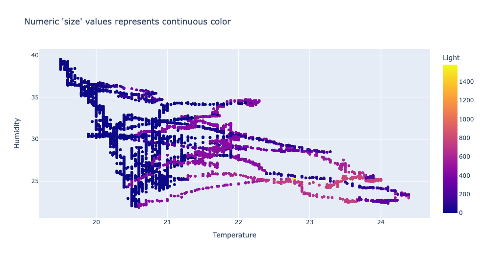
Example 1:
A scatter plot is plotted where the color of the scatterplot depends on the column ‘Light’. ‘size’ values represent continuous color.
To view and download the CSV files used in the examples click here.
Python3
import pandas as pd
from matplotlib import pyplot as plt
import numpy as np
import plotly.express as px
df = pd.read_csv('weather.csv', encoding='UTF-8')
fig = px.scatter(df, x="Temperature", y='Humidity', color='Light',
title="Numeric 'size' values represents continuous color")
fig.show()
|
Output:
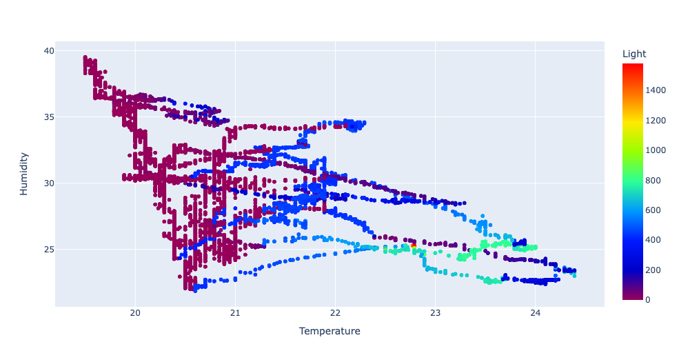
Example 2:
The same example is repeated again but in the px. scatter() method we include an extra parameter ‘color_continous_scale’, name of the colour scale is given as input. px.colors.sequential contain color scales. In the given example Rainbow is the name of the color scale.
Python3
import pandas as pd
from matplotlib import pyplot as plt
import numpy as np
import plotly.express as px
df = pd.read_csv('weather.csv', encoding='UTF-8')
fig = px.scatter(df, x="Temperature", y='Humidity', color='Light',
color_continuous_scale=px.colors.sequential.Rainbow)
fig.show()
|
Output:
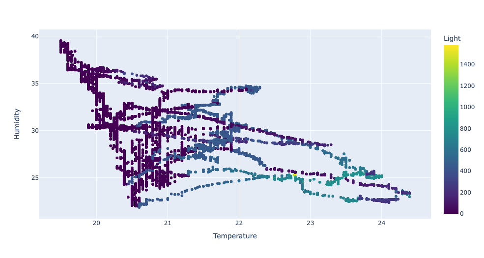
Example 3:
We can also specify the name of the color scale by using the name of the continuous color scale as a string. ‘Viridis’ is the name of the color scale.
Python3
import pandas as pd
from matplotlib import pyplot as plt
import numpy as np
import plotly.express as px
df = pd.read_csv('weather.csv', encoding='UTF-8')
fig = px.scatter(df, x="Temperature", y='Humidity', color='Light',
color_continuous_scale='Viridis')
fig.show()
|
Output:
Like Article
Suggest improvement
Share your thoughts in the comments
Please Login to comment...