Choropleth Maps using Plotly in Python
Last Updated :
05 Nov, 2021
Plotly is a Python library that is very popular among data scientists to create interactive data visualizations. One of the visualizations available in Plotly is Choropleth Maps. Choropleth maps are used to plot maps with shaded or patterned areas which are proportional to a statistical variable. They are composed of colored polygons. They are used for representing spatial variations of a quantity.
To create them, we require two main types of inputs –
- Geometric information –
- this can be a GeoJSON file (here each feature has an id or some identifying value in properties, or
- this can be built-in geometries of plotly – US states and world countries
- A list of values with feature identifier as index
Syntax – plotly.express.choropleth((data_frame=None, lat=None, lon=None, locations=None, locationmode=None, geojson=None, color=None, scope=None, center=None, title=None, width=None, height=None)
Parameters:
- lat = this value is used to position marks according to latitude on a map
- long = this value is used to position marks according to longitude on a map
- locations = this value is interpreted according to locationmode and mapped to longitude/latitude.
- locationmode = one of ‘ISO-3’, ‘USA-states’, or ‘country names’. this determines the set of locations used to match entries in locations to regions on the map.
- geojson = contains a Polygon feature collection, with IDs, which are references from locations
- color = used to assign color to marks
- scope = possible values – ‘world’, ‘usa’, ‘europe’, ‘asia’, ‘africa’, ‘north america’, or ‘south america’`Default is `’world’ unless projection is set to ‘albers usa’, which forces ‘usa’
- center = sets the center point of the map
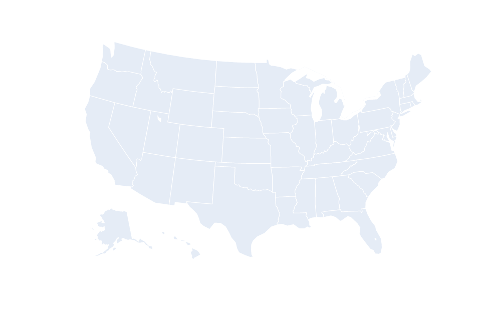
Example:
Python3
import plotly
import plotly.express as px
fig = px.choropleth(locationmode="USA-states", color=[1], scope="usa")
fig.show()
|
Output:
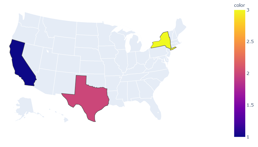
A choropleth map can be used to highlight or depict specific areas. The implementation of achieving such functionality is given below.
Example:
Python3
fig = px.choropleth(locations=["CA","TX","NY"], locationmode="USA-states", color=[1,2,3], scope="usa")
fig.show()
|
Output:
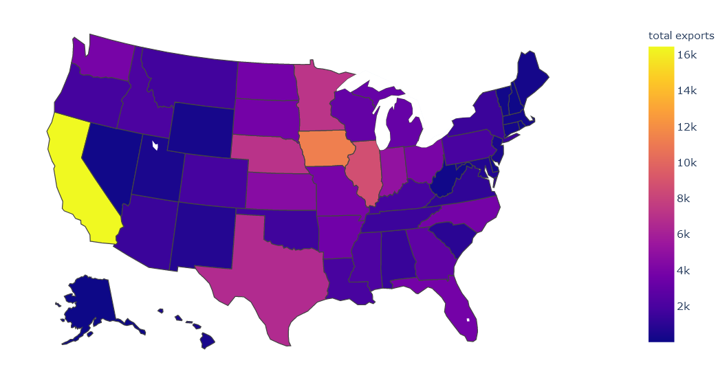
In this example, we will take a dataset of US-states and create a choropleth map for US Agriculture Exports by USA in 2011.
Dataset Link – Click here
Example:
Python3
import pandas as pd
import plotly.express as px
data = pd.read_csv('2011_us_ag_exports.csv')
fig = px.choropleth(data, locations='code',
locationmode="USA-states", color='total exports', scope="usa")
fig.show()
|
Output:
Like Article
Suggest improvement
Share your thoughts in the comments
Please Login to comment...