It feels surreal to imagine how the virus began to spread from one person that is patient zero to four million today. It was possible because of the transport system. Earlier back in the days, we didn’t have a fraction of the transportation system we have today.
Well, what good practices you can follow for now is to sanitize your grocery products and keep them idle for a day or two. Until we find a vaccine that could be years away from us, keeping social distance in public places is the only way to reduce the number of cases. Make sure you take vitamin C in the form of additional tablets or the form of food. Well, it’s not going to prevent you from getting corona, but at least if you get infected, your immunity is going to be stronger than the person who didn’t take it to fight the virus. The last practice is to replace your handshakes with Namaste or Wakanda Salute.
Getting Started
We will be going through some basic plots available in matplotlib and make it more aesthetically pleasing.
Here are the Visualizations we’ll be designing using matplotlib
- Simple Plot?—?Date handling
- Pie Chart
- Bar Plot
Link to the datasets (CSV): Click here
Initializing Dataset
Importing Dataset on Covid-19 India case time series
data = pd.read_csv('case_time_series.csv')
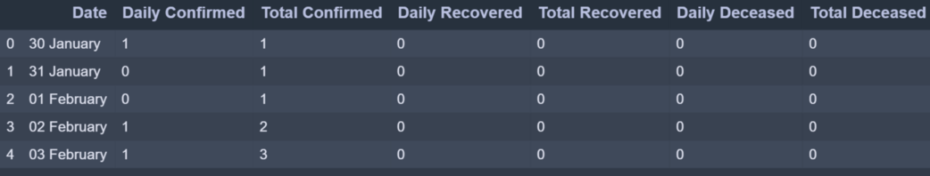
case_time_series.csv dataset has 7 column. We will be collecting Daily Confirmed Daily Recovered and Daily Deceased in variables as array.
Y = data.iloc[61:,1].values #Stores Daily Confirmed
R = data.iloc[61:,3].values #Stores Daily Recovered
D = data.iloc[61:,5].values #Stores Daily Deceased
X = data.iloc[61:,0] #Stores Date
‘Y’ variable stores the ‘Daily Confirmed’ corona virus cases
‘R’ variable stores the ‘Daily Recovered’ corona virus cases
‘D’ variable stores the ‘Daily Deceased’ corona virus cases
And ‘X’ variable stores the ‘Date’ column
Plotting Simple Plot
We’ll be following the object-oriented method for plotting. The plot function takes two arguments that are X-axis values and Y-axis values plot. In this case, we will pass the ‘X’ variable which has ‘Dates’ and ‘Y’ variable which has ‘Daily Confirmed’ to plot.
Example:
Python3
import numpy as np
import pandas as pd
import matplotlib.pyplot as plt
data = pd.read_csv('case_time_series.csv')
Y = data.iloc[61:,1].values
R = data.iloc[61:,3].values
D = data.iloc[61:,5].values
X = data.iloc[61:,0]
plt.plot(X,Y)
|
Output:
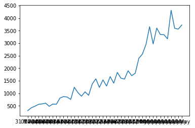
We get a Simple Plot on the execution of above code which looks like this where X-axis has Dates and Y-axis has Number of Confirmed cases. But this is not the best representation for large dataset values along the axes as you can see the ‘Dates’ are overlapping on X-axis. To overcome this challenge we will introduce some new functions to take more control over the aesthetics of the graph.
Aesthetics
To have control over the aesthetics of the graph such as labels, titles, color and size we shall apply more functions as shown below.
plt.figure(figsize=(25,8))
This creates a canvas for the graph where the first value ‘25’ is the width argument position and ‘8’ is the height argument position of the graph.
ax = plt.axes()
Let’s create an object of the axes of the graph as ‘ax’ so it becomes easier to implement functions.
ax.grid(linewidth=0.4, color='#8f8f8f')
‘.grid’ function lets you create grid lines across the graph. The width of the grid lines can be adjusted by simply passing an argument ‘linewidth’ and changing its color by passing ‘color’ argument.
ax.set_facecolor("black")

ax.set_xlabel('\nDate',size=25,
              color='#4bb4f2')

ax.set_ylabel('Number of Confirmed Cases\n',
               size=25,color='#4bb4f2')
‘.set_facecolor’ lets you set the background color of the graph which over here is black. ‘.set_xlabel’ and ‘.set_ylabel’ lets you set the label along both axes whose size and color can be altered .
ax.plot(X,Y,
        color='#1F77B4',
        marker='o',
        linewidth=4,
        markersize=15,
        markeredgecolor='#035E9B')
Now we plot the graph again with ‘X’ as Dates and ‘Y’ as Daily Confirmed by calling plot function. The plotting line , marker and color can be altered by passing color, linewidth?—?to change color and adjust the width of plotting line and marker, markersize, markeredgecolor?—?to create marker which is the circle in this case, adjust the size of the marker and define marker’s edge color.
Complete Code:
Python3
import numpy as np
import pandas as pd
import matplotlib.pyplot as plt
data = pd.read_csv('case_time_series.csv')
Y = data.iloc[61:,1].values
R = data.iloc[61:,3].values
D = data.iloc[61:,5].values
X = data.iloc[61:,0]
plt.figure(figsize=(25,8))
ax = plt.axes()
ax.grid(linewidth=0.4, color='#8f8f8f')
ax.set_facecolor("black")
ax.set_xlabel('\nDate',size=25,color='#4bb4f2')
ax.set_ylabel('Number of Confirmed Cases\n',
size=25,color='#4bb4f2')
ax.plot(X,Y,
color='#1F77B4',
marker='o',
linewidth=4,
markersize=15,
markeredgecolor='#035E9B')
|
Output:
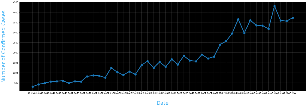
Still as we can see the dates are overlapping and the labels along axes are not clear enough. So now we are going to change the ticks of the axes and also annotate the plots.
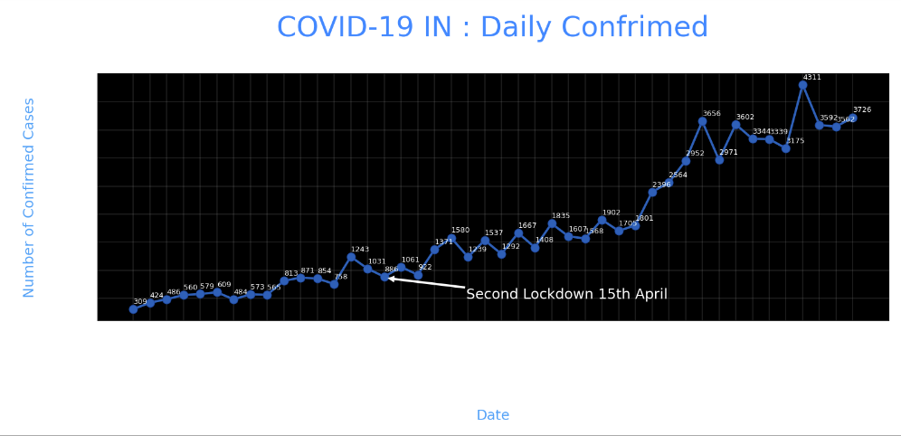
plt.xticks(rotation='vertical',size='20',color='white')
plt.yticks(size=20,color='white')
plt.tick_params(size=20,color='white')
‘.xticks’ and ‘.yticks’ lets you alter the Dates and Daily Confirmed font. For the Dates to not overlap with each other we are going to represent them vertically by passing ‘rotation = vertical’. To make the ticks easily readable we change the font color to white and size to 20.
‘.tick_params’ lets you alter the size and color of the dashes which look act like a bridge between the ticks and graph.
for i,j in zip(X,Y):
    ax.annotate(str(j),xy=(i,j+100),
                color='white',size='13')
‘.annotate’ lets you annotate on the graph. Over here we have written a code to annotate the plotted points by running a for loop which plots at the plotted points. The str(j) holds the ‘Y’ variable which is Daily Confirmed. Any string passed will be plotted. The XY is the coordinates where the string should be plotted. And finally the color and size can be defined. Note we have added +100 to j in XY coordinates so that the string doesn’t overlap with the marker and it is at the distance of 100 units on Y?—?axis.
ax.annotate('Second Lockdown 15th April',
            xy=(15.2, 860),
            xytext=(19.9,500),
            color='white',
            size='25',
            arrowprops=dict(color='white',
                            linewidth=0.025))
To annotate an arrow pointing at a position in graph and its tail holding the string we can define ‘arrowprops’ argument along with its tail coordinates defined by ‘xytext’. Note that ‘arrowprops’ alteration can be done using a dictionary.
plt.title("COVID-19 IN : Daily Confirmed\n",
          size=50,color='#28a9ff')
Finally we define a title by ‘.title’ and passing string ,its size and color.
Complete Code:
Python3
import numpy as np
import pandas as pd
import matplotlib.pyplot as plt
data = pd.read_csv('case_time_series.csv')
Y = data.iloc[61:,1].values
R = data.iloc[61:,3].values
D = data.iloc[61:,5].values
X = data.iloc[61:,0]
plt.figure(figsize=(25,8))
ax = plt.axes()
ax.grid(linewidth=0.4, color='#8f8f8f')
ax.set_facecolor("black")
ax.set_xlabel('\nDate',size=25,color='#4bb4f2')
ax.set_ylabel('Number of Confirmed Cases\n',
size=25,color='#4bb4f2')
plt.xticks(rotation='vertical',size='20',color='white')
plt.yticks(size=20,color='white')
plt.tick_params(size=20,color='white')
for i,j in zip(X,Y):
ax.annotate(str(j),xy=(i,j+100),color='white',size='13')
ax.annotate('Second Lockdown 15th April',
xy=(15.2, 860),
xytext=(19.9,500),
color='white',
size='25',
arrowprops=dict(color='white',
linewidth=0.025))
plt.title("COVID-19 IN : Daily Confirmed\n",
size=50,color='#28a9ff')
ax.plot(X,Y,
color='#1F77B4',
marker='o',
linewidth=4,
markersize=15,
markeredgecolor='#035E9B')
|
Output:
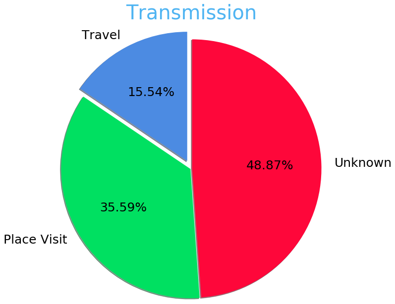
Pie Chart
We’ll be plotting the Transmission Pie Chart to understand the how the virus is spreading based on Travel, Place Visit and Unknown reason.
Initializing Dataset
slices = [62, 142, 195]
activities = ['Travel', 'Place Visit', 'Unknown']
So we have created list slices based on which our Pie Chart will be divided and the corresponding activities are it’s valued.
Plotting Pie Chart
cols=['#4C8BE2','#00e061','#fe073a']
exp = [0.2,0.02,0.02]
plt.pie(slices,
labels=activities,
textprops=dict(size=25,color='black'),
radius=3,
colors=cols,
autopct='%2.2f%%',
explode=exp,
shadow=True,
startangle=90)
plt.title('Transmission\n\n\n\n',color='#4fb4f2',size=40)
To plot a Pie Chart we call ‘.pie’ function which takes x values which is ‘slices’ over here based on it the pie is divided followed by labels which have the corresponding string the values it represents. These string values can be altered by ‘textprops’. To change the radius or size of Pie we call ‘radius’. For the aesthetics we call ‘shadow’ as True and ‘startangle ’= 90. We can define colors to assign by passing a list of corresponding colors. To space out each piece of Pie we can pass on the list of corresponding values to ‘explode’. The ‘autopct’ defines the number of positions that are allowed to be shown. In this case, autopct allows 2 positions before and after the decimal place.
Complete Code:
Python3
slices = [62, 142, 195]
activities = ['Travel', 'Place Visit', 'Unknown']
cols=['#4C8BE2','#00e061','#fe073a']
exp = [0.2,0.02,0.02]
plt.pie(slices,labels=activities,
textprops=dict(size=25,color='black'),
radius=3,
colors=cols,
autopct='%2.2f%%',
explode=exp,
shadow=True,
startangle=90)
plt.title('Transmission\n\n\n\n',color='#4fb4f2',size=40)
|
Output:
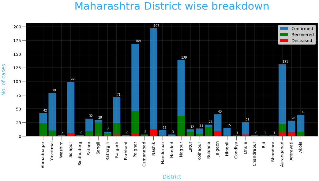
Bar Plot
Now we are going to plot the most common type of graph which is a bar plot. Over here we will be plotting the district wise coronavirus cases for a state.
Initializing Dataset
data = pd.read_csv('district.csv')
data.head()
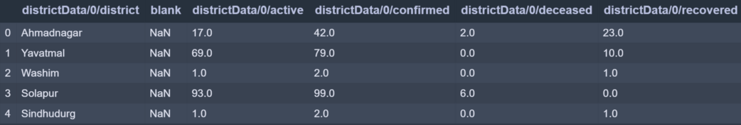
re=data.iloc[:30,5].values
de=data.iloc[:30,4].values
co=data.iloc[:30,3].values
x=list(data.iloc[:30,0])
‘re’ stores Recovered corona patients count for all districts.
‘de’ stores Deceased corona patients count for all districts.
‘co’ stores Confirmed corona patients count for all districts.
‘x’ stored District names.
Plotting Bar Chart
plt.figure(figsize=(25,10))
ax=plt.axes()

ax.set_facecolor('black')
ax.grid(linewidth=0.4, color='#8f8f8f')


plt.xticks(rotation='vertical',
           size='20',
           color='white')#ticks of X

plt.yticks(size='20',color='white')


ax.set_xlabel('\nDistrict',size=25,
              color='#4bb4f2')
ax.set_ylabel('No. of cases\n',size=25,
              color='#4bb4f2')


plt.tick_params(size=20,color='white')


ax.set_title('Maharashtra District wise breakdown\n',
             size=50,color='#28a9ff')
The code for aesthetics will be the same as we saw in earlier plot. The Only thing that will change is calling for the bar function.
plt.bar(x,co,label='re')
plt.bar(x,re,label='re',color='green')
plt.bar(x,de,label='re',color='red')

for i,j in zip(x,co):
    ax.annotate(str(int(j)),
                xy=(i,j+3),
                color='white',
                size='15')

plt.legend(['Confirmed','Recovered','Deceased'],
           fontsize=20)
To plot a bar graph we call ‘.bar’ and pass it x-axis and y-axis values. Over here we called the plot function three times for all three cases (i.e Recovered , Confirmed, Deceased) and all three values are plotted with respect to y-axis and x-axis being common for all three which is district names. As you can see we annotate only for Confirmed numbers by iterating over Confirmed cases value. Also, we have mentioned ‘.legend’ to indicate legends of the graph.
Complete Code:
Python3
data = pd.read_csv('district.csv')
data.head()
re=data.iloc[:30,5].values
de=data.iloc[:30,4].values
co=data.iloc[:30,3].values
x=list(data.iloc[:30,0])
plt.figure(figsize=(25,10))
ax=plt.axes()
ax.set_facecolor('black')
ax.grid(linewidth=0.4, color='#8f8f8f')
plt.xticks(rotation='vertical',
size='20',
color='white')
plt.yticks(size='20',color='white')
ax.set_xlabel('\nDistrict',size=25,
color='#4bb4f2')
ax.set_ylabel('No. of cases\n',size=25,
color='#4bb4f2')
plt.tick_params(size=20,color='white')
ax.set_title('Maharashtra District wise breakdown\n',
size=50,color='#28a9ff')
plt.bar(x,co,label='re')
plt.bar(x,re,label='re',color='green')
plt.bar(x,de,label='re',color='red')
for i,j in zip(x,co):
ax.annotate(str(int(j)),
xy=(i,j+3),
color='white',
size='15')
plt.legend(['Confirmed','Recovered','Deceased'],
fontsize=20)
|
Output:
Like Article
Suggest improvement
Share your thoughts in the comments
Please Login to comment...