Data Visualization using Turicreate in Python
Last Updated :
20 Aug, 2020
In Machine Learning, Data Visualization is a very important phase. In order to correctly understand the behavior and features of your data one needs to visualize it perfectly. So here I am with my post on how to efficiently and at the same time easily visualize your data to extract most out of it.
Before going in detail about how to visualize data first understand some terminologies.
- Turicreate – Turi Create is an open-source toolset for creating Core ML models, for tasks such as image classification, object detection, style transfers, recommendations, and more. Learn how you can use Turi Create to build models for your apps.
- SFrame – SFrame means scalable data frame. A tabular, column-mutable dataframe object that can scale to big data. The data in SFrame is stored column-wise.
- Sarray – Each column in an SFrame is termed as Sarray.
Why Turicreate? : By this time you all should be guessing that why am I choosing turicreate for data visualization when there is Pandas which is very much ease to use. So I will highlight some points in which turicreate is better than pandas :
- Pandas is an in-memory data structure. This means you can usually not store data frames bigger than the main memory (eg. RAM) on your machine whereas SFrame is an out-of-core data structure. This means you can virtually store any size dataframe as long as you do not run out of both disk space(eg. Hard Drives) and memory(eg. RAM).
- In turicreate you can make use of the built-in visualization feature to visualize your data but in case of pandas you need to use other tools for data visualization(such as matplotlib, seaborn, etc).
So let’s get started with the actual content :
Before visualizing the data we first need to install the required libraries :
pip install turicreate
So, we now have our complete setup. So let’s get started by importing the dataset.
Link to the dataset used in this tutorial : https://www.kaggle.com/c/house-prices-advanced-regression-techniques
import turicreate
training_data = turicreate.SFrame.read_csv("Url of the dataset").
training_data.head()
|
Output :
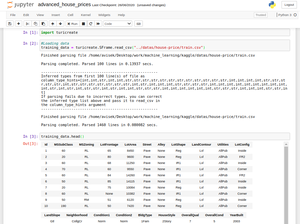
Output
Now comes the data visualization part :
Bar Plot :
training_data['OverallCond'].plot(title = "Overall Condition of the house",
xlabel = "Rating",
ylabel = "No. of Houses")
|
Output :
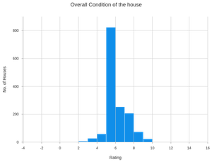
Output for Bar Plot
Scatter Plot :
turicreate.visualization.scatter(training_data["OverallCond"],
training_data["SalePrice"],
xlabel = "Overall Condition",
ylabel = "Sale Price")
|
Output :
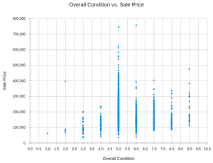
Output for Scatter Plot
Heatmap :
turicreate.visualization.heatmap(training_data["OverallCond"],
training_data["SalePrice"],
xlabel = "Overall Condition",
ylabel = "Sale Price")
|
Output :
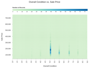
Output for Heatmap
Categorical Heatmap :
turicreate.visualization.categorical_heatmap(training_data["Street"],
training_data["LotShape"],
xlabel = "Street",
ylabel = "Lot Shape")
|
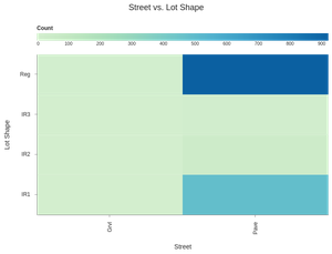
Output for Categorical Heatmap
Box Plot :
turicreate.visualization.box_plot(training_data["Street"],
training_data["SalePrice"],
xlabel = "Street",
ylabel = "Sale Price")
|
Output :
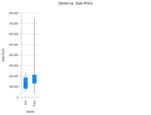
Output for Box Plot
Histogram :
turicreate.visualization.histogram(training_data["SalePrice"],
xlabel ="Sale Price")
|
Output :
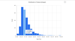
Output for Histogram
Like Article
Suggest improvement
Share your thoughts in the comments
Please Login to comment...