How to create linear gradient background using CSS ?
Last Updated :
15 May, 2023
In CSS, we can use the background-color property to set the background color of an element to a specific color. Sometimes we want to add more styling to the element when setting the background color by using the linear-gradient property. CSS linear-gradient property lets you display smooth transitions between two or more colors.
Syntax:
background-image: linear-gradient(direction, color1, color2, ...);
Parameters:
- direction: Specify the direction of the transition. The default value is 180deg (if not specified).
- color1: Specify the first color.
- color2: Specify the second color.
Note: You can specify as many colors as you want.
Example 1: In this example, we are using the above method.
HTML
<!DOCTYPE html>
<html>
<head>
<style>
/* Remove the default padding and
margin of all HTML tags */
* {
margin: 0;
padding: 0;
}
/* Implementation of linear-gradient property */
#lin_grad {
/* Set the height of the div to
the entire screen */
height: 100vh;
/* linear-gradient syntax */
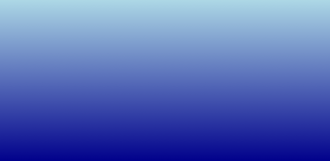
background-image: linear-gradient(lightblue, darkblue);
}
</style>
</head>
<body>
<div id="lin_grad"></div>
</body>
</html>
|
Output:
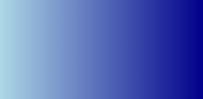
Example 2: This demonstrates the setting of direction. In the above HTML code, just change the “background-image” property value in the CSS part of the head section as given below.
Syntax:
background-image: linear-gradient(to right, lightblue, darkblue)
Example: Here we are following above explained approach.
HTML
<!DOCTYPE html>
<html>
<head>
<style>
/* Remove the default padding and
margin of all HTML tags */
* {
margin: 0;
padding: 0;
}
/* Implementation of linear-gradient property */
#lin_grad {
/* Set the height of the div to
the entire screen */
height: 100vh;
/* linear-gradient syntax */
background-image: linear-gradient(to right, lightblue, darkblue)
}
</style>
</head>
<body>
<div id="lin_grad"></div>
</body>
</html>
|
Output:
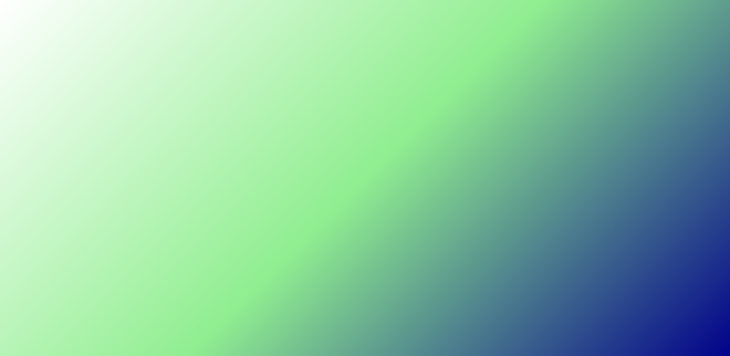
Example 3: This demonstrates the setting of direction in degree. In the above HTML first code, just change the “background-image” property value in the CSS part of the head section as given below.
Syntax:
background-image: linear-gradient(135deg, white, lightgreen, darkblue);
Example: Here we are using the above syntax.
HTML
<!DOCTYPE html>
<html>
<head>
<style>
/* Remove the default padding and
margin of all HTML tags */
* {
margin: 0;
padding: 0;
}
/* Implementation of linear-gradient property */
#lin_grad {
/* Set the height of the div to
the entire screen */
height: 100vh;
/* linear-gradient syntax */
background-image: linear-gradient(135deg, white, lightgreen, darkblue);
}
</style>
</head>
<body>
<div id="lin_grad"></div>
</body>
</html>
|
Output:
Example 4: This demonstrates the setting of the position for each color. If you don’t specify the location of a color, it is placed halfway between its preceding color and the color that follows it. The two gradients given below are equivalent. In the above HTML first code, just change the “background-image” in the CSS part of the head section as given below.
Syntax:
background-image: linear-gradient(90deg, white, lightgreen, darkblue)
background-image: linear-gradient(90deg, white 0%,
        lightgreen 50%, darkblue 100%)
HTML
<!DOCTYPE html>
<html>
<head>
<style>
/* Remove the default padding and
margin of all HTML tags */
* {
margin: 0;
padding: 0;
}
/* Implementation of linear-gradient property */
#lin_grad {
/* Set the height of the div to
the entire screen */
height: 100vh;
/* linear-gradient syntax */
background-image:
linear-gradient(90deg, white, lightgreen, darkblue)
background-image: linear-gradient(90deg, white 0%,
lightgreen 50%, darkblue 100%)
}
</style>
</head>
<body>
<div id="lin_grad"></div>
</body>
</html>
|
Output:
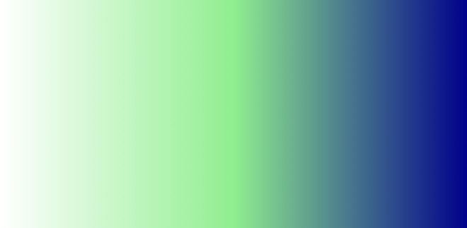
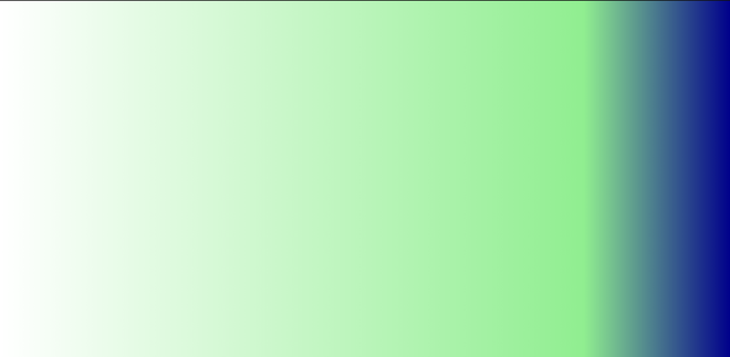
Let us change the % value of the light green color and see what happens.
Syntax:
background-image: linear-gradient(90deg, white 0%,
    lightgreen 80%, darkblue 100%)
Example:
HTML
<!DOCTYPE html>
<html>
<head>
<style>
/* Remove the default padding and
margin of all HTML tags */
* {
margin: 0;
padding: 0;
}
/* Implementation of linear-gradient property */
#lin_grad {
/* Set the height of the div to
the entire screen */
height: 100vh;
/* linear-gradient syntax */
background-image: background-image: linear-gradient(90deg, white 0%,
lightgreen 80%, darkblue 100%)
}
</style>
</head>
<body>
<div id="lin_grad"></div>
</body>
</html>
|
Output:
Like Article
Suggest improvement
Share your thoughts in the comments
Please Login to comment...