How to create scatterplot with both negative and positive axes?
Last Updated :
26 Mar, 2021
Prerequisites: Matplotlib
In Scatter Plot the values of two different numeric variables are represented by dots or circles. It is also known as Scatter Graph or Aka Scatter Chart. The individual data point in the scatter plot is represented by each dot on the horizontal and vertical axis.
Generally, the scatter plot is plotted on the positive values, but what happens when the dataset has both negative and positive values. So in this article, we are creating the scatter plot with both negative and positive axes.
Installation:
For installing the matplotlib library, write the following command in your command prompt.
pip install matplotlib
With the help of some functions, we can plot the scatter plot with both negative and positive axes are as follows:
 plt.scatter(x, y, c, cmap)
 plt.axvline(x, ymin, ymax, c, ls)
 plt.axhline(y, xmin, xmax, c, ls)
| Function |
Description |
| scatter() |
Creates the scatter plot on the given data. |
| axvline() |
Add a vertical line in data coordinates. |
| axhline() |
Add a horizontal line in data coordinates. |
Steps-by-Step Approach:
- Import necessary library.
- Create or import the dataset for creating the plot.
- Create the scatter plot using plt.scatter() in which pas x and y a parameter.
- Since the plot has negative and positive axes coordinates add a vertical and horizontal line in the plot using plt.axvline() and plt.axhline() function and pass the origin as 0 and color according to you and line style i.e, ls as you want.
- Plot is now separated into positive and negative axes.
- For make the plot more attractive and easy to understand give x label, y label, and title to the plot using plt.xlabel(), plt.ylabel() and plt.title() function in which pass the string as a parameter.
- Add the color scheme and grid style pass color and cmap i.e, colormap inside the scatter() function as discussed above, and for grid-style add plt.style.use() before creating a scatter plot in the program code and pass the style you want as a parameter.
- Add a color bar for visualizing the mapping of numeric values into color using plt.colormap() function.
- Now for visualizing the plot use plt.show() function.
Example 1: Creating Default Scatter plot with negative and positive axes using Matplotlib Library.
Python
import matplotlib.pyplot as plt
import numpy as np
x = np.arange(-20, 20, 1)
y = [-30, -20, -10, -3, 1, 11, 10, 5, -20, 20, 15,
30, 20, 2, 4, 3, -7, -8, -13, -16, 16, -15, 32,
-12, -19, 25, -25, 30, -6, -18, -11, -14, -21,
27, -21, -14, -4, -1, 0, 17]
plt.scatter(x, y)
plt.show()
|
Output:
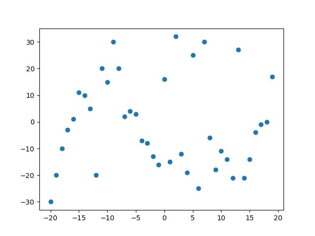
The above output shows the scatter plot with both negative and positive axes, but in this plot, it is difficult to analyze the points since some are on negative axes and some are on positive axes.
So let’s make this plot easier to understand.
Example 2: Creating Scatter Plot with both negative and positive axes.
Python
import matplotlib.pyplot as plt
import numpy as np
x = np.arange(-20, 20, 1)
y = [-30, -20, -10, -3, 1, 11, 10, 5, -20, 20, 15, 30, 20,
2, 4, 3, -7, -8, -13, -16, 16, -15, 32, -12, -19, 25,
-25, 30, -6, -18, -11, -14, -21, 27, -21, -14, -4, -1, 0, 17]
plt.scatter(x, y)
plt.axvline(0, c='black', ls='--')
plt.axhline(0, c='black', ls='--')
plt.show()
|
Output:
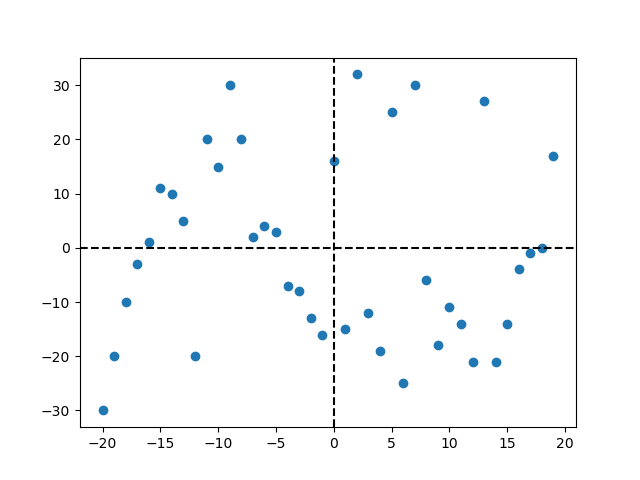
In the above output, we have drawn the vertical and horizontal line from the center of data co-ordinates with the help of plt.axvline() function and plt.axhline() function by passing the 0 as a parameter which specifies that the line will be drawn at 0 co-ordinates, color parameter which specifies the color of the line and ls i,e. Line style.
Example 3: Creating Scatter plot with both negative and positive axes by adding color scheme.
Python
import matplotlib.pyplot as plt
import numpy as np
x = np.arange(-20, 20, 1)
y = [-30, -20, -10, -3, 1, 11, 10, 5, -20, 20,
15, 30, 20, 2, 4, 3, -7, -8, -13, -16, 16,
-15, 32, -12, -19, 25, -25, 30, -6, -18,
-11, -14, -21, 27, -21, -14, -4, -1, 0, 17]
plt.scatter(x, y, c=y, cmap='plasma')
plt.axvline(0, c='black', ls='--')
plt.axhline(0, c='black', ls='--')
plt.xlabel("X axis")
plt.ylabel("Y axis")
plt.title("Scatter Plot with both negative and positive axes")
plt.colorbar()
plt.show()
|
Output:
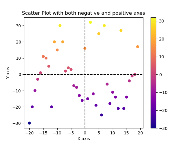
In the above output, we have added the color scheme to plasma and given the color with respect to y values and added the color bar to visualize the mapping from values to color and given the x label, y label, and title to the plot so that plot looks more interactive and easy to understand.
For adding color scheme we had passes the parameter c which refers to give the color and cmap stands for color map having a list of register colormap, added color map by using plt.colormap() function and added X label, Y label, and title using plt.xlabel() function plt.ylabel() function and plt.title() respectively.
Example 4: Creating Scatter Plot with negative and positive axes by adding theme.
Python
import matplotlib.pyplot as plt
import numpy as np
x = np.arange(-20, 20, 1)
y = [-30, -20, -10, -3, 1, 11, 10, 5, -20, 20,
15, 30, 20, 2, 4, 3, -7, -8, -13, -16, 16,
-15, 32, -12, -19, 25, -25, 30, -6, -18,
-11, -14, -21, 27, -21, -14, -4, -1, 0, 17]
plt.style.use('seaborn')
plt.scatter(x, y, c=y, cmap='plasma')
plt.axvline(0, c='black', ls='--')
plt.axhline(0, c='black', ls='--')
plt.xlabel("X axis")
plt.ylabel("Y axis")
plt.title("Scatter Plot with both negative and positive axes")
plt.colorbar()
plt.show()
|
Output:

In the above output, we have added the grid-like style theme in our scatter plot so that the plot looks more interactive and easy to understand. To add the style theme add the plt.style.use() function before creating a scatter plots in the program code.
Like Article
Suggest improvement
Share your thoughts in the comments
Please Login to comment...