How to Draw a Horizontal Barplot in R
Last Updated :
03 Dec, 2021
A barplot is a representation of data in form of the bar the height of bar represents the number of values. In this article, we will discuss How to Draw a Horizontal Barplot in R programming language.
R language supports two ways to plot a bar plot, and we will discuss how this can be modified to be put to our use.
R Language uses the function barplot() to create bar charts. Here, both vertical and Horizontal bars can be drawn.
Syntax: barplot(H, xlab, ylab, main, names.arg, col)
Parameters:
- H: This parameter is a vector or matrix containing numeric values which are used in bar chart.
- xlab: This parameter is the label for x axis in bar chart.
- ylab: This parameter is the label for y axis in bar chart.
- main: This parameter is the title of the bar chart.
- names.arg: This parameter is a vector of names appearing under each bar in bar chart.
- col: This parameter is used to give colors to the bars in the graph.
The bar function has a field named “horiz” keep that field value “True” to create the bar plot horizontally.
Example:
R
data <- data.frame(x_axis = (1:10),
y_axis = 9:0)
barplot(data$x_axis ~ data$y_axis,
horiz = TRUE)
|
Output:
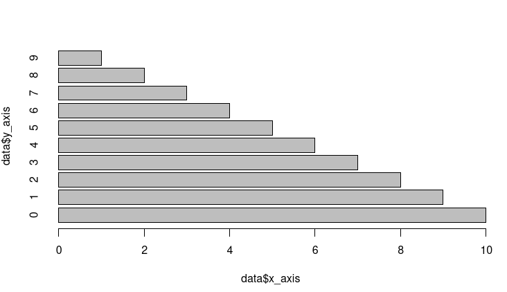
fig 1: Horizontal bar plot
Method 2: Using GGPLOT2
In this method, we draw the bar plot using the ggplot2 function. ggplot2 have a function named geom_bar() which is used to plot the horizontal bar, and we put our data into the geom_bar function with ggplot() to plot the bar. At last, we will flip the whole plot using the coord_flip() function. A flipped vertical plot will generate a horizontal plot.
Example:
R
library("ggplot2")
data <- data.frame(x_axis = (1:10),
y_axis = 9:0)
ggp <- ggplot(data, aes(x_axis, y_axis)) +
geom_bar(stat = "identity")
ggp + coord_flip()
|
Output:
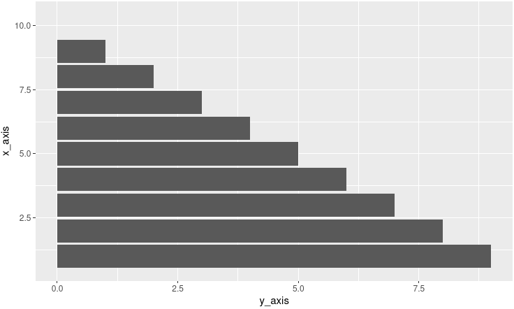
fig 2: Horizontal bar plot
Like Article
Suggest improvement
Share your thoughts in the comments
Please Login to comment...