How to draw stacked bars in ggplot2 that show percentages in R ?
Last Updated :
05 Nov, 2021
In this article, we are going to see how to draw stacked bars in ggplot2 that show percentages in R programming language.
The plyr package in R is used to split the data apart, perform operations with it, and then subsequently bring it back together again. It is used to perform data manipulation. This package can be downloaded and installed into the working space using the following command :
install.packages("plyr")
The ddply method in R is used to combine the results into a single data frame after the application of a function on each of the subsets of the data frame.
Syntax: ddply(.data, .variables, .fun = NULL)
Arguments :
- data: The data frame to be used
- variables: variables to split data frame by
- fun: the function to be applied on the data frame
The function to be applied here can be the transform function, which can be used to append or remove or mutate columns in the data frame. It can be used to add more columns in the dataframe. The percentage column can be added to the data frame by calculating the fraction of each component in the dataframe.
The percentage column can then be used to append labels using “%” sign. The column is constructed using the paste0() method which is used to concatenate strings by combining the percentage with the corresponding “%” sign.
paste0(str1, str2)
The ggplot2 package is used for data visualization and depicting the plots. This package can be downloaded and installed into the working space using the following command :
install.packages("ggplot2")
The ggplot method in this package is used to construct various kinds of plots, like scatter plots, boxplots, etc. The plots take as input the data frame to be used and also supply aesthetic mappings using the x and y coordinates. Other arguments can be added by using the color specified by the grouping column.
Syntax: ggplot (data, mapping = aes(x= , y= , fill = ))
Arguments :
- data: The data frame to be used
- mapping: aesthetic mapping supplied by aes() method
The geom_bar() method in this package is used to make the height of the bar proportional to the number of cases in each group. It has the following syntax :
Syntax: geom_bar(position , stat = “identity” )
Arguments :
- position: Position adjustment
The geom_text method can be used to add text to the stacked bars and stack them on top of one another. The label is assigned as the percentage label string computed. The label can be assigned using the label argument and its corresponding position. It can be further customized using the size parameter.
Syntax: geom_text(mapping = NULL, position , size)
Arguments :
- mapping: Aesthetic mappings
- position: The position adjustment to use for overlapping points on this layer
- size: the size of the text added
Example:
R
library(plyr)
library(ggplot2)
data_frame < - data.frame(stringsAsFactors=FALSE,
col1=c(rep(5: 7, each=4)),
col2=c(rep(1: 4, each=3)),
col3=c(1: 12))
print("original dataframe")
print(data_frame)
data_frame = ddply(data_frame, .(col2), transform,
percentage=col1/sum(col1) * 100)
data_frame$prcntlabel = paste0(sprintf("%.0f",
data_frame$percentage),
"%")
print("converted dataframe")
print(data_frame)
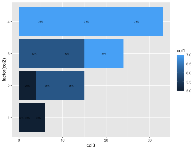
ggplot(data_frame, aes(x=factor(col2), y=col3, fill=col1)) +
geom_bar(position=position_stack(), stat="identity") +
geom_text(aes(label=prcntlabel), position=position_stack(vjust=0.5), size=2) +
coord_flip()
|
Output
[1] "original dataframe"
  col1 col2 col3
1     5    1    1
2     5    1    2
3     5    1    3
4     5    2    4
5     6    2    5
6     6    2    6
7     6    3    7
8     6    3    8
9     7    3    9
10    7    4   10
11    7    4   11
12    7    4   12
[1] "converted dataframe"
   col1 col2 col3 percentage  prcntlabel
1     5    1    1   33.33333        33%
2     5    1    2   33.33333        33%
3     5    1    3   33.33333        33%
4     5    2    4   29.41176        29%
5     6    2    5   35.29412        35%
6     6    2    6   35.29412        35%
7     6    3    7   31.57895        32%
8     6    3    8   31.57895        32%
9     7    3    9   36.84211        37%
10    7    4   10   33.33333        33%
11    7    4   11   33.33333        33%
12    7    4   12   33.33333        33%
Like Article
Suggest improvement
Share your thoughts in the comments
Please Login to comment...