How To Make Bubble plot with Altair in Python?
Last Updated :
26 Nov, 2020
Prerequisite: Introduction to Altair in Python
Altair is a simple and easy to use statistical visualization library for python. It contains many types of built-in plots and various options to modify the properties and generate other plots. Bubble Plot is a very useful visualization for bivariate analysis of data with respect to a third variable. It is not readily available in the Altair library but can be made by doing some simple modifications to the scatter plot.
What is a Bubble Plot?
Bubble Plot is basically a scatter plot between two variables/data columns where in place of the data points, there are bubbles/circles of varying sizes indicating the third variable. The third variable can be of a quantitative, ordinal, or nominal type, but the best type to be used in bubble plot is the ordinal type, i.e. data having a specific ordering. The legend shows which circle size corresponds to which data value.
A bubble plot can help us see the relationship between two variables with respect to a third variable. The bigger the bubble, the bigger value of data it corresponds to.
Creating a Bubble Plot
To make a bubble plot, the user simply has to map a suitable variable from the dataset to the size encoding in a simple scatter plot.
The datasets used in these articles are from the Vega_datasets library.
Python3
import altair as alt
from vega_datasets import data
cars = data.cars()
alt.Chart(cars).mark_point().encode(
x = 'Acceleration',
y = 'Displacement',
size = 'Cylinders:N'
)
|
Output:
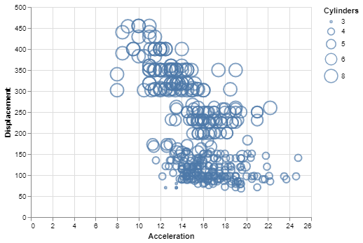
Simple Bubble Plot using Altair
Customizing the Bubble Plot
You can do the following customizations to the bubble plot:
- Color: You can change the default color of the bubbles by setting the color parameter of the mark_point() method.
- Opacity: You can change the default opacity of the bubbles by setting the opacity parameter of the mark_point() method. It ranges from 0 to 1.
- Filled: This is false by default, but you can change the filled parameter to true, thereby filling the bubble with the specified color.
Example:
Python3
import altair as alt
from vega_datasets import data
cars = data.cars()
alt.Chart(cars).mark_point(color='green',
filled=True,
opacity=0.4).encode(
x='Acceleration',
y='Displacement',
size='Cylinders:N'
)
|
Output:
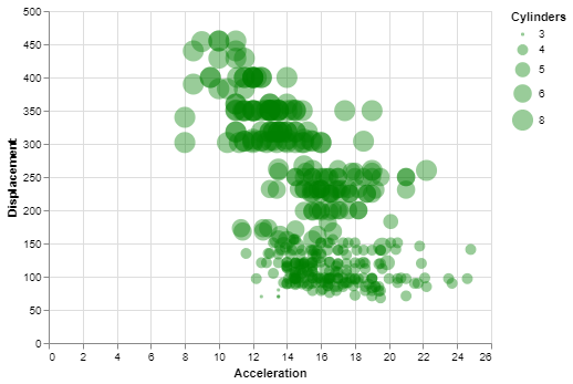
Customized Bubble Plot using Altair
Like Article
Suggest improvement
Share your thoughts in the comments
Please Login to comment...