How to Make ECDF Plot with Seaborn in Python?
Last Updated :
27 Jan, 2023
Prerequisites: Seaborn
In this article, we are going to make the ECDF plot with Seaborn Library.
ECDF Plot
- ECDF stands for Empirical Commutative Distribution. It is more likely to use instead of the histogram for visualizing the data because the ECDF plot visualizes each and every data point of the dataset directly, which makes it easy for the user to interact with the plot.
- This plot contains more information because it has no bin size setting, which means it doesn’t have any smoothing parameters.
- Since its curves are monotonically increasing, so it is well suited for comparing multiple distributions at the same time.
- In an ECDF plot, the x-axis corresponds to the range of values for the variable whereas the y-axis corresponds to the proportion of data points that are less than or equal to the corresponding value of the x-axis.
- We can make the ECDF plot directly by using ecdfplot() function, or we can also make the plot by using displot() function with the new Seaborn version.
Installation:
To install the Seaborn library, write the following command in your command prompt.
pip install seaborn
This ECDF plot and displot() function is available only in the new version of Seaborn that is version 0.11.0 or above. If already install Seaborn upgrade it by writing the following command.
pip install seaborn==0.11.0
For a better understanding of the ECDF plot. Let’s plot and do some examples using the datasets.
Step-by-Step Approach:
- Import the seaborn library.
- Create or load the dataset from the seaborn library.
- Select the column for which you are plotting the ECDF plot.
- For plotting the ECDF plot there are two ways are as follows:
- The first way is to use ecdfplot() function to directly plot the ECDF plot and in the function pass you data and column name on which you are plotting.
Syntax:
seaborn.ecdfplot(data=’dataframe’,x=’column_name’,y=’column_name’, hue=’color_column’)
- The second way is to use displot() function and pass your data and column on which you are making the plot and pass the parameter of displot kind=’ecdf’.
Syntax:
seaborn.displot(data=’dataframe’, x=’column_name’,y=’column_name’ kind=’type_of_plot’,hue=’color_column’, palette=’color’
The below table shows the list of parameters used in this article.
| Parameter |
Description |
| data |
Data frame or numpy.ndarray |
| x |
Key vectors in data or column name on which plot is made. |
| y |
Key vectors in data or column name on which plot is made. |
| hue |
To determine the color of the plot variable. |
| palette |
This parameter is used to choose color when mapping the hue.
It can be string, list, dict.
|
| kind |
It is the parameter of displot(), used to give the kind of plot we want. |
Method 1: Using ecdfplot() method
In this method, we are using ‘exercise’ data provided by seaborn.
Python
import seaborn as sns
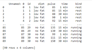
excr = sns.load_dataset('exercise')
print(excr)
|
Output:
Example 1: Making ECDF plot by using exercise dataset provided by seaborn.
Python
import seaborn as sns
import matplotlib.pyplot as plt
excr = sns.load_dataset('exercise')
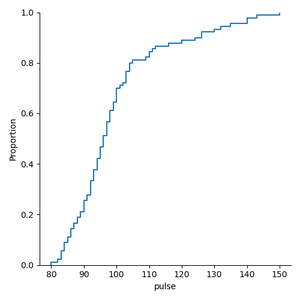
sns.ecdfplot(data=excr,x='pulse')
plt.show()
|
Output:
Example 2: Making ECDF plot by interchanging the plot axis.
Python
import seaborn as sns
import matplotlib.pyplot as plt
excr = sns.load_dataset('exercise')
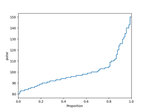
sns.ecdfplot(data=excr,y='pulse')
plt.show()
|
Output:
Example 3: Making ECDF plot when we have multiple distributions.
Python
import seaborn as sns
import matplotlib.pyplot as plt
excr = sns.load_dataset('exercise')
sns.ecdfplot(data=excr, x='pulse', hue='kind')
plt.show()
|
Output:
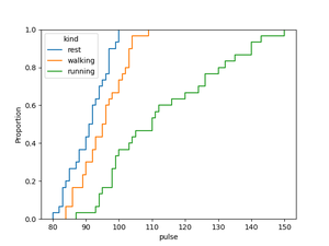
The above plot shows the distribution of pulse rate of the peoples with respect to the kind i.e, rest, walking, running.
Method 2: Using displot() method
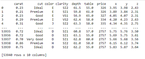
In this method, we are using ‘diamonds’ data provided by seaborn.
Python
import seaborn as sns
diam = sns.load_dataset('diamonds')
print(diam)
|
Output:
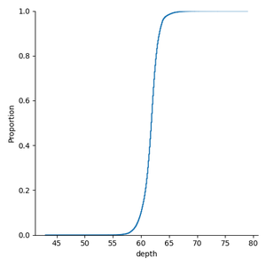
Example 1: Plotting ECDF plot using displot() on penguins dataset provided by seaborn.
Python
import seaborn as sns
import matplotlib.pyplot as plt
diam = sns.load_dataset('diamonds')
sns.displot(data=diam,x='depth',kind='ecdf')
plt.show()
|
Output:
Example 2: Plotting ECDF plot using displot() when we have multiple distributions with default setting.
Python
import seaborn as sns
import matplotlib.pyplot as plt
diam = sns.load_dataset('diamonds')
sns.displot(data=diam,x='depth',kind='ecdf',hue='cut')
plt.show()
|
Output:
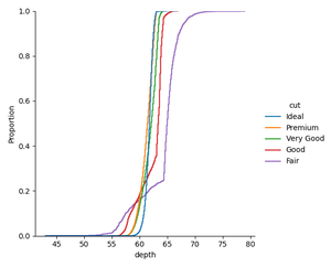
The above plot shows the depth of the diamonds on the basis of their cut.
Example 3: Making ECDF plot using displot() by setting up the color.
Python
import seaborn as sns
import matplotlib.pyplot as plt
diam = sns.load_dataset('diamonds')
sns.displot(data=diam,x='table',kind='ecdf',hue='cut',palette='icefire_r')
plt.show()
|
Output:
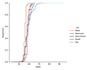
We can set the palette to Accent_r, magma_r, plasma, plasma_r, etc, according to our choice, it has many other options available.
Like Article
Suggest improvement
Share your thoughts in the comments
Please Login to comment...