How to make Wind Rose and Polar Bar Charts in Plotly – Python?
Last Updated :
01 Oct, 2020
A Plotly is a Python library that is used to design graphs, especially interactive graphs. It can plot various graphs and charts like histogram, barplot, boxplot, spreadplot, and many more. It is mainly used in data analysis as well as financial analysis. plotly is an interactive visualization library.
What is Wind Rose and Polar Bar Charts?
The wind rose chart are graphical charts that show the speed and direction of winds at a location over a period of time. This chart is represented in circular format and the circle indicates the amount of time that the wind blows from a particular direction. The wind rose chart is also known as the polar bar chart.
Creating Wind Rose Chart
In plotly, a wind rose chart can be made by using the go.Barpolar() method of graph_object class or by px.bar_polar() method of express class.
Syntax: plotly.graph_objects.Barpolar(arg=None,dr=None, dtheta=None,r=None,theta=None)
Syntax: plotly.express.bar_polar(data_frame=None, r=None, theta=None, color=None,)
Example 1:
Python3
import plotly.express as px
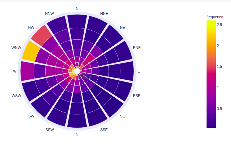
df = px.data.wind()
fig = px.bar_polar(df, r="strength", theta="direction",
color="frequency",)
fig.show()
|
Output:
Example 2:
Python3
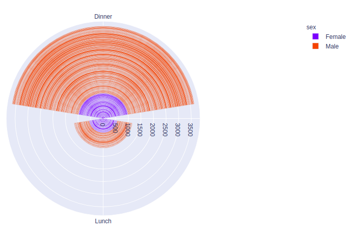
import plotly.express as px
df = px.data.tips()
fig = px.bar_polar(df, r="total_bill", theta="time",
color="sex",)
fig.show()
|
Output:
Example 3:
Python3
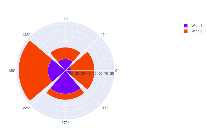
import plotly.graph_objects as go
fig = go.Figure()
fig.add_trace(go.Barpolar(
r=[10, 20, 30, 40],
name='Wind 1',
))
fig.add_trace(go.Barpolar(
r=[40, 20, 50, 10],
name='Wind 2',
))
fig.show()
|
Output:
Like Article
Suggest improvement
Share your thoughts in the comments
Please Login to comment...