How to plot a histogram with various variables in Matplotlib in Python?
Last Updated :
04 Jan, 2022
In this article, we are going to see how to plot a histogram with various variables in Matplotlib using Python.
A histogram is a visual representation of data presented in the form of groupings. It is a precise approach for displaying numerical data distribution graphically. It’s a type of bar plot in which the X-axis shows bin ranges and the Y-axis represents frequency. In python, we plot histogram using plt.hist() method.
Syntax: matplotlib.pyplot.hist(x, bins=None, range=None, density=False, weights=None, cumulative=False, bottom=None, histtype=’bar’, align=’mid’, orientation=’vertical’, rwidth=None, log=False, color=None, label=None, stacked=False, \*, data=None, \*\*kwargs)
Simple histogram
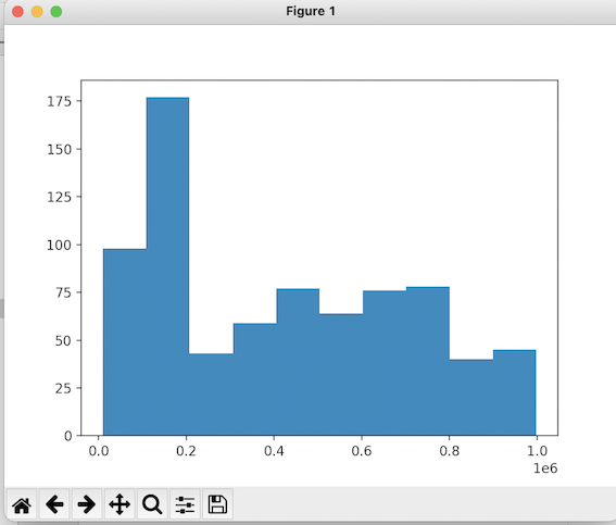
The below code is to plot a simple histogram with no extra modifications. packages are imported, CSV file is read and the histogram is plotted using plt.hist() method.
To download and read the CSV file click schoolimprovement2010grants
Python3
import pandas as pd
import seaborn as sns
import matplotlib.pyplot as plt
df = pd.read_csv('schoolimprovement2010grants.csv')
plt.hist(df['Award_Amount'])
plt.show()
|
Output:
Example 1: Histogram with various variables
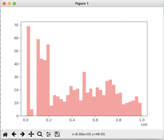
The below histogram is plotted with the use of extra parameters such as bins, alpha, and color. alpha determines the transparency, bins determine the number of bins and color represents the color of the histogram.
Python3
import pandas as pd
import seaborn as sns
import matplotlib.pyplot as plt
df = pd.read_csv('schoolimprovement2010grants.csv')
plt.hist(df['Award_Amount'],bins = 35,
alpha = 0.45, color = 'red')
plt.show()
|
Output:
Example 2: Overlapping histograms
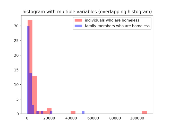
In the below code we plot two histograms on the same axis. we use plt.hist() method twice and use the parameters, bins, alpha, and colour just like in the previous example.
To download and view the CSV file used click here.
Python3
import pandas as pd
import seaborn as sns
import matplotlib.pyplot as plt
df = pd.read_csv('homelessness.csv')
plt.hist(df['individuals'], bins=25, alpha=0.45, color='red')
plt.hist(df['family_members'], bins=25, alpha=0.45, color='blue')
plt.title("histogram with multiple \
variables (overlapping histogram)")
plt.legend(['individuals who are homeless',
'family members who are homeless'])
plt.show()
|
Output:
Example 3: Plotting three histograms on the same axis
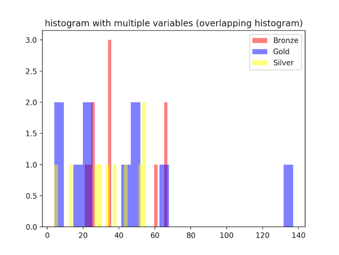
plt.hist() method is used multiple times to create a figure of three overlapping histograms. we adjust opacity, color, and number of bins as needed. Three different columns from the data frame are taken as data for the histograms.
To view or download the CSV file used click medals_by_country_2016
Python3
import pandas as pd
import seaborn as sns
import matplotlib.pyplot as plt
df = pd.read_csv('medals_by_country_2016.csv')
plt.hist(df['Bronze'],bins = 25, alpha = 0.5,
color = 'red')
plt.hist(df['Gold'],bins = 25, alpha = 0.5,
color = 'blue')
plt.hist(df['Silver'],bins = 25, alpha = 0.5,
color = 'yellow')
plt.title("histogram with multiple \
variables (overlapping histogram)")
plt.legend(['Bronze','Gold','Silver'])
plt.show()
|
Output:
Like Article
Suggest improvement
Share your thoughts in the comments
Please Login to comment...