How to style a checkbox using CSS ?
Last Updated :
01 Mar, 2024
Styling a checkbox using CSS involves modifying its appearance, such as changing its size, color, and shape. This can be achieved by targeting the checkbox element and applying CSS properties like background-color, border, and size adjustments.
Using Pseudo-elements
To style checkboxes using pseudo-elements, target the input[type=”checkbox”] element and apply styles to ::before or ::after pseudo-elements. This technique allows for custom designs using CSS properties like content, background, border, and size.
Using Pseudo-elements Example:
Here is the basic implementation to style checkbox Using Pseudo-elements
html
<!DOCTYPE html>
<html>
<head>
<style>
body {
font-family: Arial, sans-serif;
margin: 0;
display: flex;
justify-content: center;
}
h1 {
color: green;
}
.root{
padding: 20px;
}
.main {
display: block;
position: relative;
padding-left: 45px;
margin-bottom: 15px;
cursor: pointer;
font-size: 20px;
}
.main input[type=checkbox] {
visibility: hidden;
}
.checkbox-container {
position: absolute;
top: 0;
left: 0;
height: 25px;
width: 25px;
background-color: transparent;
border: 2px solid #000;
}
/* Hover effect */
.main:hover input~.checkbox-container {
background-color: yellow;
}
/* Active effect */
.main input:active~.checkbox-container {
background-color: red;
}
/* Checked effect */
.main input:checked~.checkbox-container {
background-color: green;
}
/* Checkmark */
.checkbox-container::after {
content: "";
position: absolute;
display: none;
left: 7px;
top: 3px;
width: 6px;
height: 12px;
border: solid white;
border-width: 0 2px 2px 0;
transform: rotate(45deg);
}
/* Display checkmark when checked */
.main input:checked~.checkbox-container::after {
display: block;
}
</style>
</head>
<body>
<div class="root">
<h1>Best Computer Science Platform</h1>
<label class="main">CodeX
<input type="checkbox">
<span class="checkbox-container"></span>
</label>
<label class="main">GeeksforGeeks
<input type="checkbox" checked="checked">
<span class="checkbox-container"></span>
</label>
<label class="main">CodeY
<input type="checkbox">
<span class="checkbox-container"></span>
</label>
</div>
</body>
</html>
|
Output:
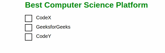
Using Pseudo-elements
Explanation:
- In the above exmaple we have Container div wraps content. Each checkbox within a label for accessibility and interaction.
- Hidden default checkboxes. Custom designs using pseudo-elements for hover, active, and checked states.
- Span wraps each checkbox for custom styling background.
- The ::after creates custom checkmark. Displayed when checkbox is checked. Diagonal effect using CSS transformation.
Using Custom Design with CSS
In this approach, custom checkbox designs are created using CSS. Default checkboxes are hidden, and pseudo-elements are used to create custom checkbox styles, including hover, active, and checked states, enhancing the visual appearance and user interaction.
Using Custom Design with CSS Example:
This example shows with another modified design of check-mark.
html
<!DOCTYPE html>
<html>
<head>
<title>
Style a checkbox using CSS
</title>
<style>
body {
font-family: Arial, sans-serif;
margin: 0;
}
h1 {
color: green;
}
.script {
display: block;
position: relative;
padding-left: 45px;
margin-bottom: 15px;
cursor: pointer;
font-size: 20px;
}
.script input[type=checkbox] {
visibility: hidden;
}
.geekmark {
position: absolute;
top: 0;
left: 0;
height: 25px;
width: 25px;
background-color: green;
}
.script:hover input~.geekmark {
background-color: yellow;
}
.script input:active~.geekmark {
background-color: red;
}
.script input:checked~.geekmark {
background-color: green;
}
.geekmark:after {
content: "";
position: absolute;
display: none;
}
.script input:checked~.geekmark:after {
display: block;
}
.script .geekmark:after {
left: 6px;
bottom: 5px;
width: 6px;
height: 6px;
border: solid white;
border-width: 4px 4px 4px 4px;
}
</style>
</head>
<body>
<h1>Is GeeksforGeeks Useful?</h1>
<label class="script">
Yes
<input type="checkbox">
<span class="geekmark"></span>
</label>
<label class="script">
Absolutely Yes
<input type="checkbox" checked="checked">
<span class="geekmark"></span>
</label>
</body>
</html>
|
Output:
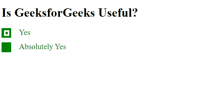
Explanation:
- In this example Checkboxes styled with custom design using CSS, replacing default browser appearance.
- Hovering or clicking checkboxes triggers color changes for better user interaction.
- Checked checkboxes display a green background, visually indicating selection.
- Checkmark styled using pseudo-elements, appearing inside the checkbox when selected.
Like Article
Suggest improvement
Share your thoughts in the comments
Please Login to comment...