Normal Probability Plot in R using ggplot2
Last Updated :
14 Jan, 2022
A normal probability plot is a graphical representation of the data. A normal probability plot is used to check if the given data set is normally distributed or not. It is used to compare a data set with the normal distribution. If a given data set is normally distributed then it will reside in a shape like a straight line.
In this article, we are going to use ggplot2 with qqplotr to plot and check if the dataset is normally distributed using qqplot only.
Approach
- Install the following necessary libraries by pasting them in r console
install.packages(“ggplot2”)
install.packages(“qqplotr”)
- Create a random data set with a different mean and standard deviation that you want to plot.
- Plotting data using stat_qq_point() method.
- Plotting data points with line using stat_qq_line() function.
Given below is a proper implementation using the above approach
Example 1: Plotting data using stat_qq_point() method.
R
library(ggplot2)
library(qqplotr)
random_values = rnorm(500, mean = 90, sd = 50)
ggplot(mapping = aes(sample = random_values)) + stat_qq_point(size = 2)
|
Output:
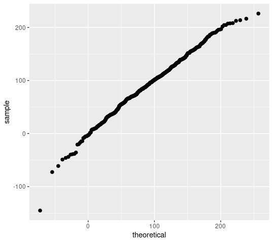
Fig. 1 Plotting Data points.
Example 2: Plotting data points with line using stat_qq_line() function.
R
library(ggplot2)
library(qqplotr)
random_values = rnorm(500, mean = 90, sd = 50)
ggplot(mapping = aes(sample = random_values))
+ stat_qq_point(size = 2,color = "red")
+ stat_qq_line(color="green")
+ xlab("x-axis") + ylab("y-axis")
|
Output:
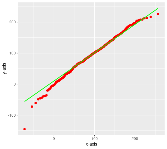
Fig. 2 Adding normal line
Like Article
Suggest improvement
Share your thoughts in the comments
Please Login to comment...