Plot OHLC Charts With Python
Last Updated :
27 Jan, 2022
OHLC charts are one of the most important financial charts that represent the Open, High, Low, and Close prices of a stock. In this article, let us discuss how to plot OHLC charts with python libraries.
Method 1: OHLC chart using Plotly library
Plotly library provides a chart called OHLC which can be used to plot candlestick patterns of the stock data. This function requires the time frame of the stock price which is taken as the x-axis of the plot. The open, high, low, and close prices of the stock are required to be supplied as positional arguments. The tip of the lines shows the low and high value of the stock price and the horizontal segments show the open and close price of the stock.
Syntax:
go.OHLC(x, open, high, low, close)
Parameters:
- x – The series object corresponding to the x-axis
- open – The opening price of the script
- high – The highest price of the script on that day.
- low – Lowest price of the script on that day.
- close – The closing price of the script.
Example:
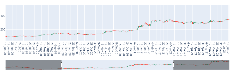
In this example, we import the graph objects from the plotly library and import the panda’s package to read the dataset, Initialize the graph objects Figure object Inside the Figure, the object passes the go.ohlc function. This function takes data in the x-axis and open, high, low, and close price of the script and uses fig. show() to view the ohlc plot in python.
Click here to download the dataset.
Python3
import plotly.graph_objects as go
import pandas as pd
data = pd.read_csv(r"C:\Users\Downloads\TATAMOTORS.csv")
fig = go.Figure(data=go.Ohlc(x=data['Date'],
open=data['Open Price'],
high=data['High Price'],
low=data['Low Price'],
close=data['Close Price']))
fig.show()
|
Output:
Method 2: OHLC chart using mpl_finance library
A similar OHLC chart can be plotted using the mpl_finance python library. The mpl_finance library requires the data to be in a specified format. The date column has to be in DateTime format. The names of the other column have to be named as Open, High, Close, and Low. In addition to the simple candlestick pattern, the mpl_finance library provides additional variants of OHLC charts which can be altered by changing the type parameter as Renko, pmf chart, etc. With such data preparation, an OHLC chart can be plotted using the mpl_finance library.
Syntax:
mpl.plot(data, type)
Parameters:
- data – a dataframe object, with Date as an index and DateTime format and columns Open, High, Low, and Close.
- type – specifies the type of ohlc chart. Candle, renko, pmf etc.
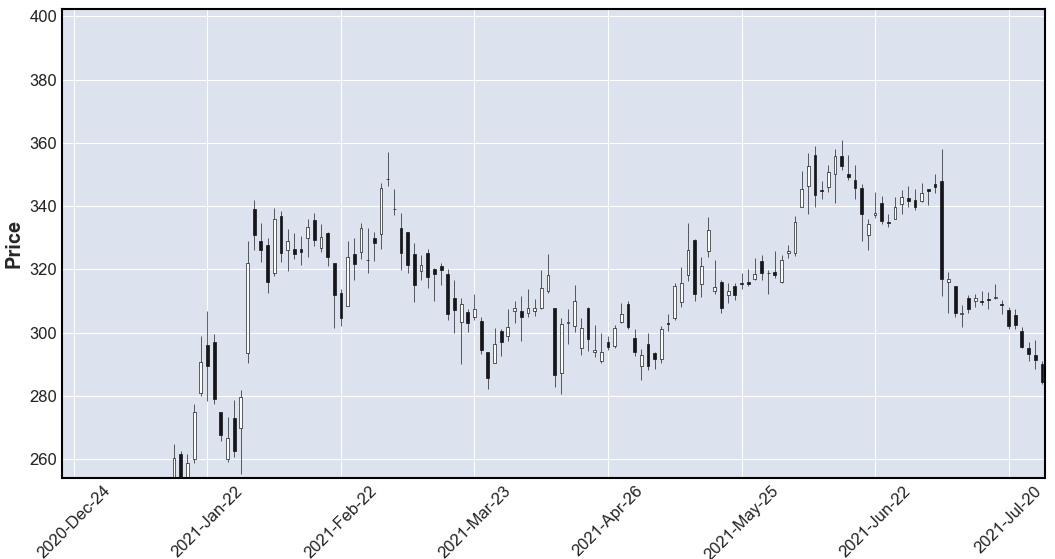
Example:
In this example, the used dataset is as same as in the previous example, If needed install the mplfinance package using pip install –upgrade mplfinance and import the mplfinance and pandas package as shown, then we set the parse_dates function to True and mention the column to be indexed. Now,we set the index column as ‘Date’, using the plot function of mplfinance, and mention the type as a candle to get the OHLC chart as shown in the output in python language.
Click hereto download the dataset.
Python3
import mplfinance as mpf
import pandas as pd
data = pd.read_csv(r"C:\Users\Downloads\TATAMOTORS.csv",
parse_dates=True, index_col=1)
data.index.name = 'Date'
mpf.plot(data, type='candle')
|
Output:
Like Article
Suggest improvement
Share your thoughts in the comments
Please Login to comment...