Plot the magnitude spectrum in Python using Matplotlib
Last Updated :
21 Apr, 2020
A Signal is an electromagnetic field or an electric current to transmit data. There are various components of a signal such as frequency, amplitude, wavelength, phase, angular frequency and period from which it is described.
A periodic signal can be represented using the below sine function:
y = A sin(w*t + Q)
In which A represents the amplitude(in meter), w represents frequency(in hertz), t represents time period(in seconds) and Q represents phase(in radian) of the periodic signal.
The two major components frequency and amplitude of a periodic signal define the Magnitude Spectrum of that signal. The frequency components of the periodic signal are plotted in the horizontal axis and amplitude component of the periodic signal is plotted in the vertical axis.
In Python, the magnitude_spectrum() method in the pyplot module of Python matplotlib library plots the magnitude spectrum of a periodic signal. Below are some programs which demonstrate the use of magnitude_spectrum() method to visualize the magnitude spectrum of different periodic signals.
Example 1:
import numpy
from matplotlib import pyplot
signalTime = numpy.arange(5, 10, 0.25);
signalAmplitude = numpy.sin(signalTime)
pyplot.plot(signalTime, signalAmplitude, color ='green')
pyplot.xlabel('Time')
pyplot.ylabel('Amplitude')
pyplot.title("Signal")
pyplot.magnitude_spectrum(signalAmplitude, color ='green')
pyplot.title("Magnitude Spectrum of the Signal")
pyplot.show()
|
Output:
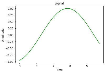
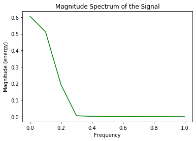
The first graph represents the signal in Amplitude vs Time components, the second graph represents the magnitude spectrum of the signal in Amplitude vs Frequency graph by using magnitude_spectrum() on the signal having time period from 5 to 10 seconds, 0.25 radian phase angle, frequency of the signal is calculated from the given time period and amplitude of the signal is calculated using the sin() function in numpy module.
Example 2:
import numpy
from matplotlib import pyplot
signalTime = numpy.arange(0, 1, 0.1);
signalAmplitude = numpy.sin(signalTime)
pyplot.plot(signalTime, signalAmplitude, color ='green')
pyplot.xlabel('Time')
pyplot.ylabel('Amplitude')
pyplot.title("Signal")
pyplot.magnitude_spectrum(signalAmplitude, color ='green')
pyplot.title("Magnitude Spectrum of the Signal")
pyplot.show()
|
Output:
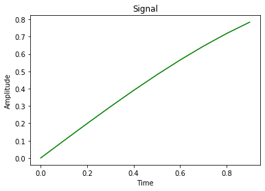
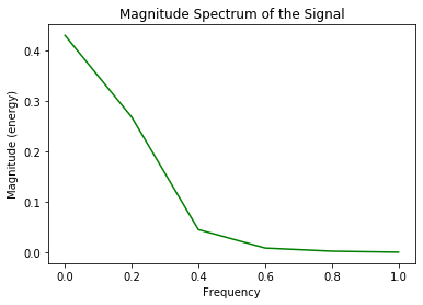
In the above program, as the amplitude of the signal is increasing with time so a sinusoidal wave is not formed in the first graph. The signal exists in the time period of 0 to 1 second and the phase angle is 0.1 radian, the magnitude spectrum of the signal is depicted using magnitude_spectrum() method.
Example 3:
import numpy
from matplotlib import pyplot
signalTime = numpy.arange(1, 100, 0.5);
signalAmplitude = numpy.sin(signalTime)
pyplot.plot(signalTime, signalAmplitude, color ='green')
pyplot.xlabel('Time')
pyplot.ylabel('Amplitude')
pyplot.title("Signal")
pyplot.magnitude_spectrum(signalAmplitude, color ='green')
pyplot.title("Magnitude Spectrum of the Signal")
pyplot.show()
|
Output:
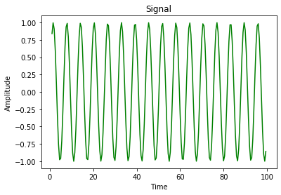
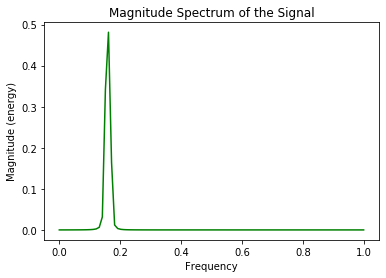
Here, the signal is represented in Amplitude vs Time graph which forms sinusoidal waves and the magnitude spectrum of the signal is represented using magnitude_spectrum() method in Amplitude vs Frequency graph. The time period of the signal starts from 1 second to 100th second and the phase angle is 0.5 radian.
Like Article
Suggest improvement
Share your thoughts in the comments
Please Login to comment...