Python – seaborn.pointplot() method
Last Updated :
01 Aug, 2020
Seaborn is an amazing visualization library for statistical graphics plotting in Python. It provides beautiful default styles and color palettes to make statistical plots more attractive. It is built on the top of matplotlib library and also closely integrated to the data structures from pandas.
seaborn.pointplot() :
- This method is used to show point estimates and confidence intervals using scatter plot glyphs. A point plot represents an estimate of central tendency for a numeric variable by the position of scatter plot points and provides some indication of the uncertainty around that estimate using error bars.
- This function always treats one of the variables as categorical and draws data at ordinal positions (0, 1, … n) on the relevant axis, even when the data has a numeric or date type.
Syntax: seaborn.pointplot(x=None, y=None, hue=None, data=None, order=None,hue_order=None, estimator=<function mean at 0x00000193E305E828>, ci=95, n_boot=1000, units=None, markers=’o’, linestyles=’-‘, dodge=False, join=True, scale=1, orient=None, color=None, palette=None, errwidth=None, capsize=None, ax=None, **kwargs)
Parameters: The description of some main parameters are given below:
- x, y: Inputs for plotting long-form data.
- hue: (optional) column name for color encoding.
- data: dataframe as a Dataset for plotting.
- markers: (optional) Markers to use for each of the ‘hue’ levels.
- linestyles: (optional) Line styles to use for each of the ‘hue’ levels.
- dodge: (optional) Amount to separate the points for each level of the ‘hue’ variable along the categorical axis.
- color: (optional) Color for all the elements, or seed for a gradient palette.
- capsize: (optional) Width of the ‘caps’ on error bars.
Return: The Axes object with the plot drawn onto it.
Below is the implementation of above method:
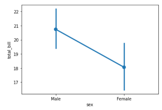
Example 1:
Python3
import seaborn as sns
import matplotlib.pyplot as plt
data = sns.load_dataset("tips")
sns.pointplot(x = "sex",
y = "total_bill",
data = data)
plt.show()
|
Output:
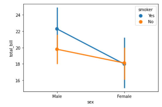
Example 2:
Python3
import seaborn as sns
import matplotlib.pyplot as plt
data = sns.load_dataset("tips")
sns.pointplot(x = "sex",
y = "total_bill",
hue = "smoker",
data = data)
plt.show()
|
Output :
Example 3:
Python3
import seaborn as sns
import matplotlib.pyplot as plt
data = sns.load_dataset("tips")
sns.pointplot(x = "size",
y = "total_bill",
linestyles = '-.',
markers = '^',
hue = "sex",
data = data)
plt.show()
|
Output:
Like Article
Suggest improvement
Share your thoughts in the comments
Please Login to comment...