React MUI Migration from @Material-ui/pickers
Last Updated :
01 Feb, 2023
Material-UI is a popular React UI library that provides a wide variety of reusable components. One of the components that Material-UI provides is the @material-ui/pickers library, which provides a set of picker components for various types of inputs, such as date and time.@material-ui/pickers v5 provides a set of picker components for various types of inputs such as date, time, and datetime.
These picker components are built on top of the latest APIs from Material-UI and the native datepicker in the browser, and it provides more flexibility, new functionalities, and better performance than previous versions. Some of the picker components :
- Date Picker: This component allows users to select a specific date from a calendar view. It can be configured to display different date formats, and also allows for date validation.
- Time Picker: This component allows users to select a specific time from a clock view. It can be configured to display different time formats and also allows for time validation and minimum/maximum time selectable.
The syntax for creating picker components in Material-UI v5 is similar to the syntax in previous versions, but there are some differences and new features. It also includes new props like inputVariant that allows changing the variant of the text field.
Syntax:
import { PickerType } from '@material-ui/pickers'
export default function MyComponent() {
    const [selectedValue, setSelectedValue] = useState(initialValue)
    return (
        <PickerType
            label={label}
            value={selectedValue}
            onChange={value => setSelectedValue(value)}
            {...otherProps}
        />
    )
}
Creating React Project:
Step 1: To create a react app, you need to install react modules through the npm command in your current repository.
npm create-react-app ./
Step 2: To use picker components run the following command:
npm install @mui/x-date-pickers
npm install date-fns --save
npm install dayjs
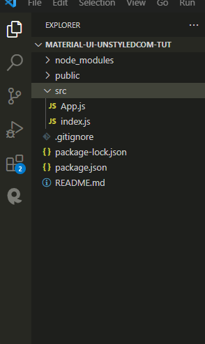
Step 3: you can delete the src folder which is installed and create a new src folder that contains the following files:
Project Structure:
project structure
Step to Run Application:
npm start
Example 1:
Javascript
import * as React from 'react';
import { Typography } from '@mui/material';
import TextField from '@mui/material/TextField';
import { AdapterDayjs } from '@mui/x-date-pickers/AdapterDayjs';
import { LocalizationProvider } from '@mui/x-date-pickers/LocalizationProvider';
import { DatePicker } from '@mui/x-date-pickers/DatePicker';
export default function App() {
const [value, setValue] = React.useState(null);
return (
<>
<Typography variant='h1' color="green">
GEEK FOR GEEKS </Typography>
<LocalizationProvider dateAdapter={AdapterDayjs}>
<DatePicker
label="Basic example"
value={value}
onChange={(newValue) => {
setValue(newValue);
}}
renderInput={(params) => <TextField {...params} />
}
/>
</LocalizationProvider>
</>
);
}
|
Javascript
import React from 'react';
import ReactDOM from 'react-dom';
import App from './App';
ReactDOM.render(<App />,document.getElementById('root'))
|
Output:
Example 2:
Javascript
import * as React from 'react';
import { Typography } from '@mui/material';
import TextField from '@mui/material/TextField';
import { AdapterDayjs } from '@mui/x-date-pickers/AdapterDayjs';
import { LocalizationProvider } from '@mui/x-date-pickers/LocalizationProvider';
import { TimePicker } from '@mui/x-date-pickers/TimePicker';
export default function BasicTimePicker() {
const [value, setValue] = React.useState(null);
return (
<><Typography variant='h1' color="green">
GEEK FOR GEEKS </Typography>
<LocalizationProvider dateAdapter={AdapterDayjs}>
<TimePicker
label="Basic example"
value={value}
onChange={(newValue) => {
setValue(newValue);
}}
renderInput={(params) => <TextField {...params} />}
/>
</LocalizationProvider></>
);
}
|
Javascript
import React from 'react';
import ReactDOM from 'react-dom';
import App from './App';
ReactDOM.render(<App />,document.getElementById('root'))
|
Output:
Reference: https://mui.com/material-ui/guides/pickers-migration/
Like Article
Suggest improvement
Share your thoughts in the comments
Please Login to comment...