React Suite DatePicker Usage ISO week
Last Updated :
28 Jun, 2022
React Suite is a front-end UI library that consists of a set of React components developed by keeping developers in mind. It is a well-thought-out and developer-friendly library. In this article, we will be seeing React Suite DatePicker Usage ISO week. The DatePicker Component is used to take the input of date and time from the users.
According to International Organisation for Standardization (ISO), each calendar week begins with Monday as starting day and ends with Sunday as the last day of the week. The calendar panel of the DatePicker component can be displayed according to ISO standards by using the isoWeek property.
React Suite DatePicker Usage ISO Week Components:
- DatePicker: The DatePicker component selects or inputs the date and/or time.
React Suite DatePicker Usage ISO Week Attributes/Props:
- isoWeek: It is a boolean attribute of the DatePicker component used to show the calendar panel according to the ISO standards.
- size: THis property of the DatePicker component is used to set the size of the component. It accept four values: “xs”, “sm”, “md”, and “lg”.
Syntax:
<DatePicker isoWeek />
Creating The React Application And Installing React Suite in the Project:
Step 1: Create the React application using the npx command:
npx create-react-app foldername
Step 2: After creating the project folder, move to it using the cd command:
cd foldername
Step 3: After creating the ReactJS application, Install the rsuite module so that we can use the DatePicker component using the following command:
npm install rsuite
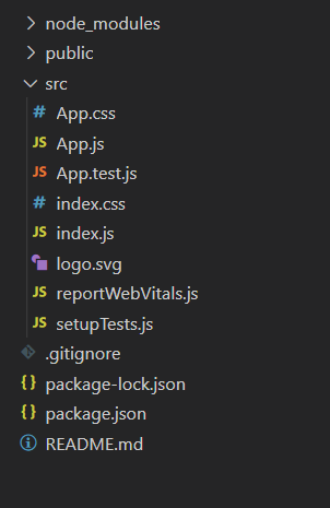
After following the above steps, the project structure will look like this:
Project Structure
Let’s see some examples to understand how to use the React Suite DatePicker isoWeek attribute/prop.
Example 1: Now replace the code in the App.js file with the code below. In this example, we used the isoWeek attribute on the DatePicker component to show its calendar panel in accordance with ISO standards.
App.js
import "rsuite/dist/rsuite.min.css";
import React from "react";
import { DatePicker } from "rsuite";
function App() {
const pickerStyle = {
marginTop: "10px",
marginBottom: "25px"
};
return (
<div className="App" style={{
display: "flex",
alignItems: "center",
flexDirection: "column"
}}>
<header style={{
textAlign: "center",
display: "block",
marginBottom: "30px"
}}>
<h3 style={{ color: "green" }}>
GeeksforGeeks
</h3>
<h5>
React Suite Dropdown ISO Week
</h5>
</header>
<p>Default DatePicker</p>
<DatePicker style={pickerStyle}/>
<p>DatePicker with ISO Standards</p>
<DatePicker isoWeek style={pickerStyle} />
</div>
);
}
export default App;
|
Run the Application: Run your app using the following command from the root directory of the project.
npm start
Output: Go to http://localhost:3000/ in your browser to see the output.
Example 2: In the example below, we used the size property of the DatePicker component along with isoWeek property to change the size of the Datepickers.
App.js
import "rsuite/dist/rsuite.min.css";
import React from "react";
import { DatePicker } from "rsuite";
function App() {
const pickerStyle = {
marginTop: "10px",
marginBottom: "25px"
};
return (
<div className="App" style={{
display: "flex",
alignItems: "center",
flexDirection: "column"
}}>
<header style={{
textAlign: "center",
display: "block",
marginBottom: "30px"
}}>
<h3 style={{ color: "green" }}>
GeeksforGeeks
</h3>
<h5>
React Suite Dropdown ISO Week
</h5>
</header>
<p>Extra Small ISO DatePicker</p>
<DatePicker style={pickerStyle}
isoWeek size="xs"/>
<p>Small ISO DatePicker</p>
<DatePicker style={pickerStyle}
isoWeek size="sm"/>
<p>Medium ISO DatePicker</p>
<DatePicker style={pickerStyle}
isoWeek size="md"/>
<p>Large ISO DatePicker</p>
<DatePicker style={pickerStyle}
isoWeek size="lg"/>
</div>
);
}
export default App;
|
Output:
Reference: https://rsuitejs.com/components/date-picker/#iso-week
Like Article
Suggest improvement
Share your thoughts in the comments
Please Login to comment...