Seaborn.barplot() method in Python
Last Updated :
16 Jun, 2021
Seaborn is a Python data visualization library based on Matplotlib. It provides a high-level interface for drawing attractive and informative statistical graphics. There is just something extraordinary about a well-designed visualization. The colors stand out, the layers blend nicely together, the contours flow throughout, and the overall package not only has a nice aesthetic quality, but it provides meaningful insights to us as well.
seaborn.barplot() method
A barplot is basically used to aggregate the categorical data according to some methods and by default it’s the mean. It can also be understood as a visualization of the group by action. To use this plot we choose a categorical column for the x-axis and a numerical column for the y-axis, and we see that it creates a plot taking a mean per categorical column.
Syntax : seaborn.barplot(x=None, y=None, hue=None, data=None, order=None, hue_order=None, estimator=<function mean at 0x000002BC3EB5C4C8>, ci=95, n_boot=1000, units=None, orient=None, color=None, palette=None, saturation=0.75, errcolor=’.26′, errwidth=None, capsize=None, dodge=True, ax=None, **kwargs,)
Parameters :
| Arguments |
Value |
Description |
| x, y, hue |
names of variables in “data“ or vector data, optional |
Inputs for plotting long-form data. See examples for interpretation. |
| data |
DataFrame, array, or list of arrays, optional |
Dataset for plotting. If “x“ and “y“ are absent, this is interpreted as wide-form. Otherwise it is expected to be long-form. |
| order, hue_order |
lists of strings, optional |
Order to plot the categorical levels in, otherwise the levels are inferred from the data objects. |
| estimator |
callable that maps vector -> scalar, optional |
Statistical function to estimate within each categorical bin. |
| ci |
float or “sd” or None, optional |
Size of confidence intervals to draw around estimated values. If “sd”, skip bootstrapping and draw the standard deviation of the observations. If “None“, no bootstrapping will be performed, and error bars will not be drawn. |
| n_boot |
int, optional |
Number of bootstrap iterations to use when computing confidence intervals. |
| units |
name of variable in “data“ or vector data, optional |
Identifier of sampling units, which will be used to perform a multilevel bootstrap and account for repeated measures design. |
| orient |
“v” | “h”, optional |
Orientation of the plot (vertical or horizontal). This is usually inferred from the dtype of the input variables, but can be used to specify when the “categorical” variable is a numeric or when plotting wide-form data. |
| color |
matplotlib color, optional |
Color for all of the elements, or seed for a gradient palette. |
| palette |
palette name, list, or dict, optional |
Colors to use for the different levels of the “hue“ variable. Should be something that can be interpreted by :func:`color_palette`, or a dictionary mapping hue levels to matplotlib colors. |
| saturation |
float, optional |
Proportion of the original saturation to draw colors at. Large patches often look better with slightly desaturated colors, but set this to “1“ if you want the plot colors to perfectly match the input color spec. |
| errcolor |
matplotlib color |
Color for the lines that represent the confidence interval. |
| errwidth |
float, optional |
Thickness of error bar lines (and caps). |
| capsize |
float, optional |
Width of the “caps” on error bars. |
| dodge |
bool, optional |
When hue nesting is used, whether elements should be shifted along the categorical axis. |
| ax |
matplotlib Axes, optional |
Axes object to draw the plot onto, otherwise uses the current Axes. |
| kwargs |
ey, value mappings |
Other keyword arguments are passed through to “plt.bar“ at draw time. |
Following steps are used :
- Import Seaborn
- Load Dataset from Seaborn as it contain good collection of datasets.
- Plot Bar graph using seaborn.barplot() method.
Below is the implementation :
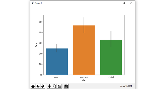
Example 1:
Python3
import seaborn as sns
import matplotlib.pyplot as plt
df = sns.load_dataset('titanic')
sns.barplot(x = 'who',
y = 'fare',
data = df)
plt.show()
|
Output:
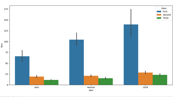
Example 2:
Python3
import seaborn as sns
import matplotlib.pyplot as plt
df = sns.load_dataset('titanic')
sns.barplot(x = 'who',
y = 'fare',
hue = 'class',
data = df)
plt.show()
|
Output:
Example 3:
Python3
import seaborn as sns
import matplotlib.pyplot as plt
df = sns.load_dataset('titanic')
sns.barplot(x = 'who',
y = 'fare',
hue = 'class',
data = df,
palette = "Blues")
plt.show()
|
Output:
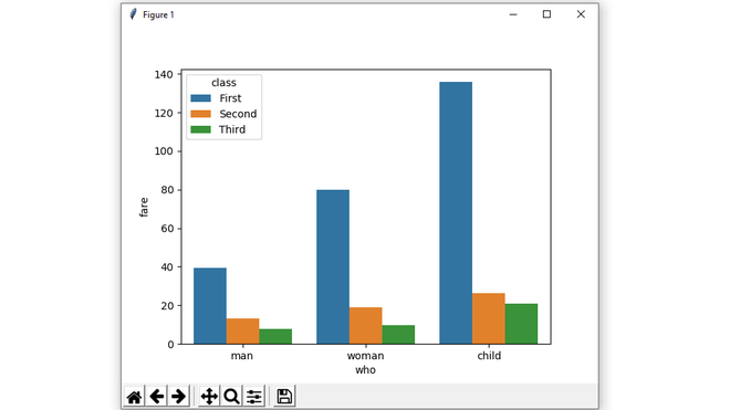
Example 4:
Python3
import seaborn as sns
import matplotlib.pyplot as plt
import numpy as np
df = sns.load_dataset('titanic')
sns.barplot(x = 'who',
y = 'fare',
hue = 'class',
data = df,
estimator = np.median,
ci = 0)
plt.show()
|
Output:
Like Article
Suggest improvement
Share your thoughts in the comments
Please Login to comment...