Sunburst Plot using graph_objects class in plotly
Last Updated :
10 Dec, 2021
Plotly is a Python library which is used to design graphs, especially interactive graphs. It can plot various graphs and charts like histogram, barplot, boxplot, spreadplot and many more. It is mainly used in data analysis as well as financial analysis. plotly is an interactive visualization library.
Sunburst Plot using graph_objects class
If Plotly Express does not render a good starting point, it is also accessible to custom from the more generic go.Sunburst class from plotly.graph_objects.The sunbrust is the prototype for exhibit hierarchical data.Each level of the hierarchy is represented by one ring or circle with the innermost circle as the top of the hierarchy.The sunbrust chart without any hierarchical data looks similar to doughnut chart.
Syntax: class plotly.graph_objects.Sunburst(arg=None, branchvalues=None, count=None, customdata=None, hoverinfo=None, **kwargs)
Parameters:
arg: dict of properties compatible with this constructor or an instance of plotly.graph_objects.Sunburst
branchvalues: Determines how the items in values are summed.
count: Determines default for values when it is not provided, by inferring a 1 for each of the “leaves” and/or “branches”, otherwise 0.
customdata: Assigns extra data each datum. This may be useful when listening to hover, click and selection events. Note that, “scatter” traces also appends customdata items in the markers DOM elements
hoverinfo: Determines which trace information appear on hover. If none or skip are set, no information is displayed upon hovering. But, if none is set, click and hover events are still fired.
Example:
Python3
import plotly.graph_objects as go
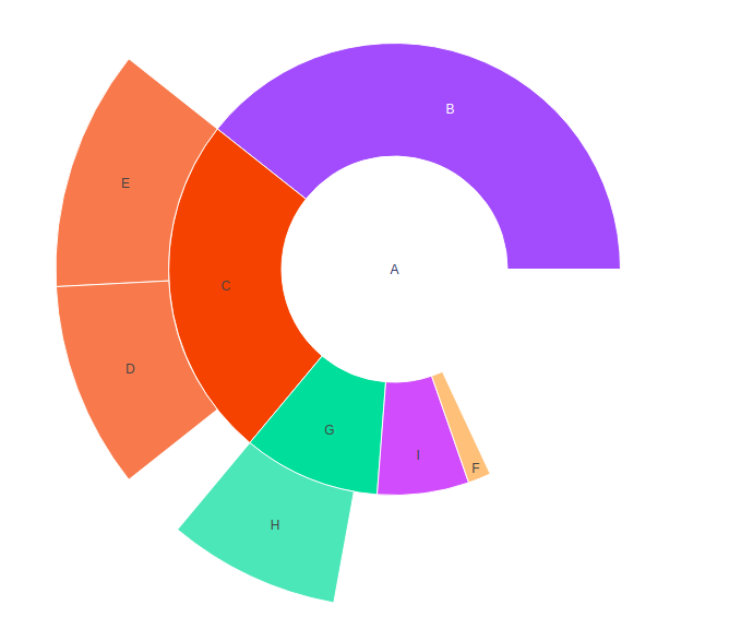
fig = go.Figure(go.Sunburst(
labels =["A", "B", "C", "D", "E", "F", "G", "H", "I"],
parents =["", "A", "A", "C", "C", "A", "A", "G", "A" ],
values =[11, 24, 2, 6, 7, 1, 1, 5, 4],
))
fig.update_layout(margin = dict(t = 0, l = 0, r = 0, b = 0))
fig.show()
|
Output:
Showing Branchvalues
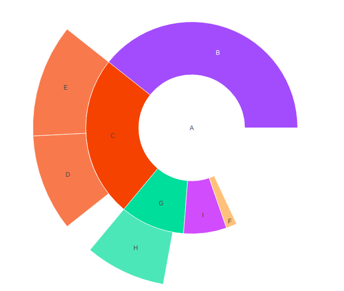
With branchvalues “total”, the value of parent to represent the width of the wedge. With branchvalues “remainder”, the parent width is demarcate by its own values plus the value of children.The sum of the children cannot exceed to the sum of the parent when the branch values are set to be “total”.Lets see an example to get know more about it, shown below:
Example:
Python3
import plotly.graph_objects as go
fig = go.Figure(go.Sunburst(
labels =["A", "B", "C", "D", "E", "F", "G", "H", "I"],
parents =["", "A", "A", "C", "C", "A", "A", "G", "A" ],
values =[11, 24, 2, 6, 7, 1, 1, 5, 4],
branchvalues ="remainder",
))
fig.update_layout(margin = dict(t = 0, l = 0, r = 0, b = 0))
fig.show()
|
Output:
Presenting Large Number of Slices
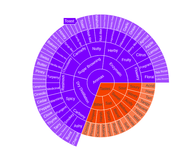
In plotly, the sunbrust chart have several slices in its pie which helps to present the data more understandable and in efficient way, as each column of the data is separated through different colors.Various data slices can be built in a single pie which lead to take less space in layout.Lets see an example which is given below
Example:
Python3
import plotly.graph_objects as go
import pandas as pd
fig = go.Figure()
fig.add_trace(go.Sunburst(
ids = df.ids,
labels = df.labels,
parents = df.parents,
domain = dict(column = 0)
))
fig.show()
|
Output:
Like Article
Suggest improvement
Share your thoughts in the comments
Please Login to comment...