Understanding Density Independence Pixel: sp, dp, dip in Android
Last Updated :
26 Apr, 2021
One of the most crucial factors to consider while developing an Android Application is the Responsiveness of the UI. It’s very important that your app looks good on all kinds of devices. Mobile devices can have different screen sizes as well as different pixel densities. Using constant values to define the sizes while designing the UI of an Android Application can sometimes lead to the app looking good on a few devices but looking jarring on some other devices. To avoid such issues, the Android team developed the concept of using Density Independent Pixels (dp, dip, sp) for defining sizes. To understand this concept, we’d first have to learn about a few basic terminologies:
- Pixel – The smallest addressable element in an image.
- Pixel density – The number of pixels that are present per unit area in a screen. The pixel density of a screen can be calculated using the following formula.
Screen density = Screen width (or height) in pixels / Screen width (or height) in inches
Understanding how pixels work
Here, we have created a component, defining its sizes using pixels (2px x 2px). On visualizing it, we can see that the exact same component looks different on devices with different screen densities.
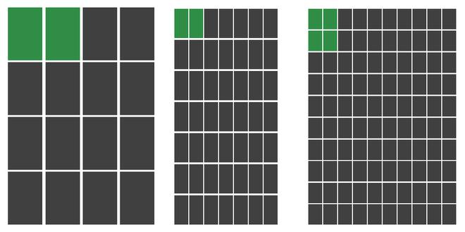
Viewing a component of size 2px x 2px on screens with different pixel densities
Based on the above pictures, the following observations can be made:
- On devices with higher pixel density, the component looks smaller as the screen has a greater number of pixels.
- On devices with lower pixel density, it looks larger as the screen has a fewer number of pixels.
Such difference can cause an uncomfortable user experience while building applications that would cater to numerous users.
Working with dp and sp
Density Independent Pixel is an abstract unit that is based on the density of a screen. These units are relative to the density of the screen and get adjusted according to it. Following up on the example given above, let’s now use dp for defining the size of the component instead.

Using dp concept to create a more responsive design that looks proportional across all screen sizes
Now, you can see that by using dp, the number of pixels occupied the component is held proportional to the screen density. i.e. The number of pixels occupied increases/decreases with an increase/decrease in pixel density. This allows the developer to size their widgets in proportion to the screen size and density, thus creating user interfaces that look great on all mobile devices. Both dp and sp follow this concept and can be used almost identically, albeit with a few differences.
|
dp
|
sp
|
| It stands for density-independent pixel. It is also sometimes denoted as dip. |
It stands for scale independent pixel. |
| It used for defining the sizes in all widgets, ranging from TextView to LinearLayout |
It is used for defining text size, as it scales according to the font size preference on a mobile device. |
Example
Here, we have created a responsive Button component using the concepts learned above, using dp for defining its height and weight, while using sp for defining the text size.
XML
<Button
android:layout_width="75dp"
android:layout_height="60dp"
android:textSize="18sp" />
|
Like Article
Suggest improvement
Share your thoughts in the comments
Please Login to comment...