Understanding the CSS BEM convention
Last Updated :
08 Feb, 2023
When working on a large-scale web development project, it’s essential to have a consistent and organized approach for styling. The BEM (Block-Element-Modifier) naming standard is one well-liked way to accomplish this. The term BEM stands for Block-Element-Modifier, which is a naming convention for CSS class names that helps to maintain a clear and consistent structure in a project’s styling. In this article, we’ll take a closer look at BEM.
The BEM Convention: BEM uses block, element, and modifier names to construct CSS class names, separated by double underscores (__) and hyphens (-). It is based on the idea of breaking down a web page into smaller, reusable blocks of code. Each block consists of elements and modifiers that can be used to create variations of that block. This approach makes it easy to understand the purpose of each class and how they relate to each other. It allows developers to quickly understand the structure of a project’s styling and make changes effectively.
Syntax:
block__element--modifier
Let us understand the components of BEM in detail:
Components of BEM:
- Blocks: A block represents the highest-level abstraction of the component. It is represented by a single word and represents a standalone entity that is meaningful on its own. For example, a button, a form, a header, etc.
The block follows the naming convention in CSS as:
.block {
    ...
}
- Elements: An element represents a part of the block. It is represented by the block name followed by two underscores (__) and the element name. For example, if the block name is ‘button’, the element name can be ‘label’ or ‘icon’.
Using the BEM convention, we can add a class to an element as:
.block__element {
    ...
}
- Modifiers: A modifier represents a variation of the block or element. It is represented by the block or element name followed by a single hyphen (-) and the modifier name. A modifier can be used to change the appearance or behavior of a block or element. For example, a button can have different variations like ‘primary’, ‘secondary’, ‘disabled’ etc.
The Modifiers follows the naming convention in CSS as:
.block__element--modifier {
    ...
}
<!-- OR -->
.block--modifier {
    ...
}
Why BEM is useful ?
- Clarity: BEM makes it clear which CSS styles apply to which parts of the HTML code, and makes it easy to understand and maintain.
- Reusability: BEM encourages the use of reusable blocks of code, which can be easily reused across different parts of a website or application.
- Scalability: BEM helps to maintain consistency across a large codebase, making it easier to scale and maintain large projects.
- Modularity: BEM allows you to separate the presentation and behavior of a component, making it easy to change the look and feel of a component without affecting its functionality.
- Namespacing: BEM provides a clear namespace for each element and modifier, preventing naming collisions and making it easy to keep track of your classes.
- Developer-Friendly: The naming of the class is intuitive and easy to follow and it makes it clear how the different parts of the form are related to each other. This makes it developer-friendly and easy to code.
- By using BEM, developers can write modular, reusable, and maintainable code which can help to increase productivity and reduce development time.
Steps to implement BEM:
- Start by defining the block: A block should be represented by a single CSS class and should be prefixed with the block name, such as “header”, “button”, or “form”.
- Identify the elements within the block: The elements are the parts of the block that make it up. Elements should be represented by a single CSS class and should be prefixed with the block name, followed by two underscores, and then the element name, such as “header_logo”.
- Define the modifiers: Modifiers should be represented by a single CSS class and should be prefixed with the block or element name, followed by two dashes, and then the modifier name, such as “button–primary”.
- Apply the BEM naming convention to your CSS classes: Once you’ve defined your blocks, elements, and modifiers, you should apply the BEM naming convention to your CSS classes.
- Use the BEM classes in your HTML: Once you’ve defined your BEM classes, you should use them in your HTML to apply the appropriate styles to your elements. You should use the block class on the top-level element, the element class on the child elements, and the modifier class on any elements that need to be modified.
- Keep the structure consistent: Be consistent with the structure and conventions you have chosen throughout your project, it will make it easier for other developers to understand and work with the codebase.
- Reuse the classes: Reuse the classes as much as possible to keep consistency in the design and to reduce the amount of code.
Let’s see a few examples of how BEM works in practice.
Example 1:
Approach: We will design a card component using HTML and CSS, adhering to the BEM naming conventions.
- In this example, we have a block called “card,” which contains a content element and a button element. The button element also has a “primary” variation, which acts as a modifier. The HTML code defines the structure of the card component, using a div with a class of “card” as the main container.
- The card represents a block. Inside the card container, there are various other elements, such as a content area and a button. Each of these elements has a class name that starts with “card__,” which indicates that they are children of the “card” block. The class “card__content” is applied to the content area. The class “card” is used to style the main container of the card component and all its children elements.
- The modifier is added as a class to the button element, following the BEM naming convention. The class name “card__button–primary” indicates that it is a variation of the “card__button” element. The CSS code uses this class to style the primary button differently from the default button.
HTML
<!DOCTYPE html>
<html lang="en">
<head>
<meta charset="UTF-8">
<meta http-equiv="X-UA-Compatible" content="IE=edge">
<meta name="viewport" content="width=device-width, initial-scale=1.0">
<style>
/* Using the BEM naming convention to design a Card */
/* The Block follows the naming convention as: .card */
.card {
background-color: rgb(45, 97, 66);
border-radius: 8px;
width: 50%;
display: flex;
flex-direction: column;
align-items: center;
justify-content: center;
margin: 100px auto;
box-shadow: 0px 2px 5px 2px #aaaaaa;
padding: 1rem;
}
/* The Elements follow the naming convention
mentioned as: .block__element */
.card__content {
padding: 16px;
}
.card__title {
font-size: 30px;
font-weight: bold;
margin-bottom: 8px;
}
.card__text {
font-size: 20px;
color: gray;
text-align: center;
}
.card__button {
background-color: white;
color: black;
border-radius: 4px;
padding: 10px;
text-transform: uppercase;
margin: 10px;
cursor: pointer;
box-shadow: 0px 2px 5px 2px #aaaaaa;
font-weight: bold;
}
/* The Modifiers follow the naming convention
mentioned as: .block__element--modifier */
.card__button--primary {
background-color: blue;
margin: 10px;
cursor: pointer;
}
</style>
</head>
<body>
<div class="card">
<div class="card__content">
<h3 class="card__title">Card Title</h3>
<p class="card__text">Card text</p>
</div>
<button class="card__button">Button</button>
<button class="card__button card__button--primary">
Primary Button
</button>
</div>
</body>
</html>
|
Output:
.png)
Designing a Card using the CSS BEM convention
Example 2:
Approach: We will design a form component using HTML and CSS, adhering to the BEM naming conventions.
- The form block is represented by the class “form“. This is the main container for the form and it is used to apply styles that affect the entire form.
- The labels and inputs are elements of the form block, they are represented by the classes “form__label” and “form__input” respectively. These elements are used to apply styles that affect only the labels and inputs of the form.
- The submit button is also an element of the form block and is represented by the class “form__submit“. It is used to apply styles that affect only the submit button of the form.
- The submit button also has a modifier called “disabled” which is represented by the class “form__submit–disabled“. This modifier is used to apply styles that change the appearance of the submit button when it is disabled.
HTML
<!DOCTYPE html>
<html lang="en">
<head>
<meta charset="UTF-8">
<meta http-equiv="X-UA-Compatible" content="IE=edge">
<meta name="viewport" content="width=device-width, initial-scale=1.0">
<style>
/* Block */
.form {
display: flex;
flex-wrap: wrap;
width: 400px;
}
/* Element */
.form__label {
width: 100%;
margin-bottom: 10px;
font-size: 18px;
}
/* Element */
.form__input {
width: 100%;
padding: 10px;
font-size: 16px;
margin-bottom: 20px;
}
/* Element */
.form__submit {
background-color: #007bff;
color: #fff;
padding: 10px 20px;
border: none;
font-size: 18px;
}
/* Modifier */
.form__submit--disabled {
background-color: #ccc;
cursor: not-allowed;
}
</style>
</head>
<body>
<form class="form">
<label class="form__label" for="name">
Name:
</label>
<input class="form__input" id="name"
type="text" placeholder="Enter your name">
<label class="form__label" for="email">
Email:
</label>
<input class="form__input" id="email"
type="email" placeholder="Enter your email">
<label class="form__label" for="password">
Password:
</label>
<input class="form__input" id="password"
type="password" placeholder="Enter your password">
<button class="form__submit form__submit--disabled"
type="submit" disabled>Sign Up</button>
</form>
</body>
</html>
|
Output:
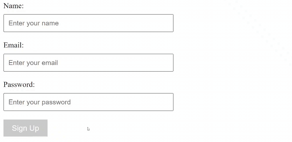
Output: Designing a form using the CSS BEM convention
Like Article
Suggest improvement
Share your thoughts in the comments
Please Login to comment...