Wine Quality Prediction – Machine Learning
Last Updated :
12 Sep, 2022
Here we will predict the quality of wine on the basis of given features. We use the wine quality dataset available on Internet for free. This dataset has the fundamental features which are responsible for affecting the quality of the wine. By the use of several Machine learning models, we will predict the quality of the wine.
Importing libraries and Dataset:
- Pandas is a useful library in data handling.
- Numpy library used for working with arrays.
- Seaborn/Matplotlib are used for data visualisation purpose.
- Sklearn – This module contains multiple libraries having pre-implemented functions to perform tasks from data preprocessing to model development and evaluation.
- XGBoost – This contains the eXtreme Gradient Boosting machine learning algorithm which is one of the algorithms which helps us to achieve high accuracy on predictions.
Python3
import numpy as np
import pandas as pd
import matplotlib.pyplot as plt
import seaborn as sb
from sklearn.model_selection import train_test_split
from sklearn.preprocessing import MinMaxScaler
from sklearn import metrics
from sklearn.svm import SVC
from xgboost import XGBClassifier
from sklearn.linear_model import LogisticRegression
import warnings
warnings.filterwarnings('ignore')
|
Now let’s look at the first five rows of the dataset.
Python3
df = pd.read_csv('winequality.csv')
print(df.head())
|
Output:
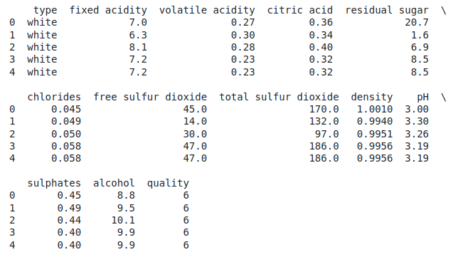
First Five rows of the dataset
Let’s explore the type of data present in each of the columns present in the dataset.
Output:
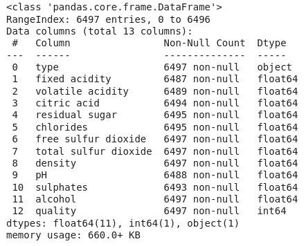
Information about columns of the data
Now we’ll explore the descriptive statistical measures of the dataset.
Output:
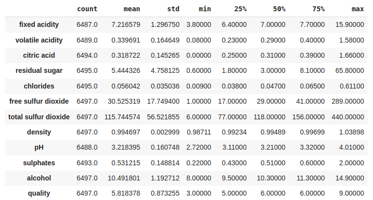
Some descriptive statistical measures of the dataset
Exploratory Data Analysis
EDA is an approach to analysing the data using visual techniques. It is used to discover trends, and patterns, or to check assumptions with the help of statistical summaries and graphical representations. Now let’s check the number of null values in the dataset columns wise.
Output:
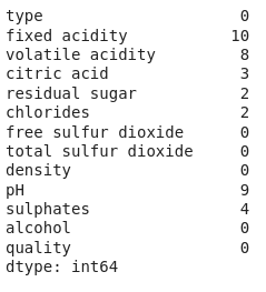
Sum of null values column wise
Let’s impute the missing values by means as the data present in the different columns are continuous values.
Python3
for col in df.columns:
if df[col].isnull().sum() > 0:
df[col] = df[col].fillna(df[col].mean())
df.isnull().sum().sum()
|
Output:
0
Let’s draw the histogram to visualise the distribution of the data with continuous values in the columns of the dataset.
Python3
df.hist(bins=20, figsize=(10, 10))
plt.show()
|
Output:
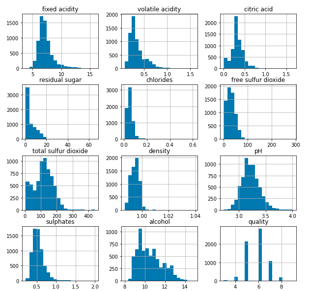
Histograms for the columns containing continuous data
Now let’s draw the count plot to visualise the number data for each quality of wine.
Python3
plt.bar(df['quality'], df['alcohol'])
plt.xlabel('quality')
plt.ylabel('alcohol')
plt.show()
|
Output:
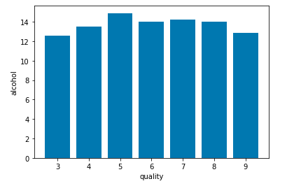
Count plot for each quality of wine
There are times the data provided to us contains redundant features they do not help with increasing the model’s performance that is why we remove them before using them to train our model.
Python3
plt.figure(figsize=(12, 12))
sb.heatmap(df.corr() > 0.7, annot=True, cbar=False)
plt.show()
|
Output:
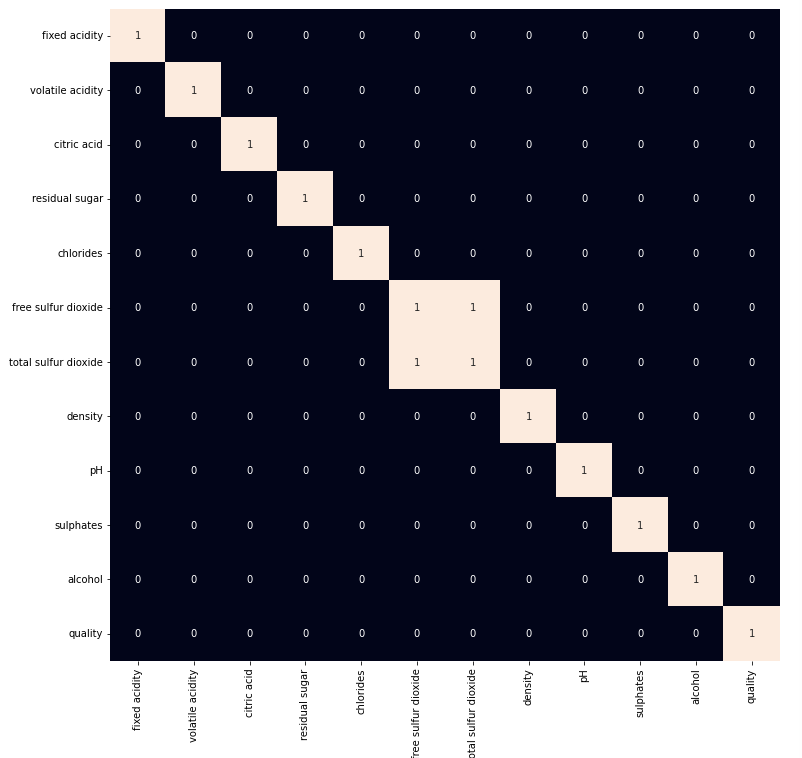
Heat map for highly correlated features
From the above heat map we can conclude that the ‘total sulphur dioxide’ and ‘free sulphur dioxide‘ are highly correlated features so, we will remove them.
Python3
df = df.drop('total sulfur dioxide', axis=1)
|
Model Development
Let’s prepare our data for training and splitting it into training and validation data so, that we can select which model’s performance is best as per the use case. We will train some of the state of the art machine learning classification models and then select best out of them using validation data.
Python3
df['best quality'] = [1 if x > 5 else 0 for x in df.quality]
|
We have a column with object data type as well let’s replace it with the 0 and 1 as there are only two categories.
Python3
df.replace({'white': 1, 'red': 0}, inplace=True)
|
After segregating features and the target variable from the dataset we will split it into 80:20 ratio for model selection.
Python3
features = df.drop(['quality', 'best quality'], axis=1)
target = df['best quality']
xtrain, xtest, ytrain, ytest = train_test_split(
features, target, test_size=0.2, random_state=40)
xtrain.shape, xtest.shape
|
Output:
((5197, 11), (1300, 11))
Normalising the data before training help us to achieve stable and fast training of the model.
Python3
norm = MinMaxScaler()
xtrain = norm.fit_transform(xtrain)
xtest = norm.transform(xtest)
|
As the data has been prepared completely let’s train some state of the art machine learning model on it.
Python3
models = [LogisticRegression(), XGBClassifier(), SVC(kernel='rbf')]
for i in range(3):
models[i].fit(xtrain, ytrain)
print(f'{models[i]} : ')
print('Training Accuracy : ', metrics.roc_auc_score(ytrain, models[i].predict(xtrain)))
print('Validation Accuracy : ', metrics.roc_auc_score(
ytest, models[i].predict(xtest)))
print()
|
Output:
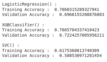
Accuracy of the model for training and validation data
Model Evaluation
From the above accuracies we can say that Logistic Regression and SVC() classifier performing better on the validation data with less difference between the validation and training data. Let’s plot the confusion matrix as well for the validation data using the Logistic Regression model.
Python3
metrics.plot_confusion_matrix(models[1], xtest, ytest)
plt.show()
|
Output:
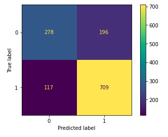
Confusion matrix drawn on the validation data
Let’s also print the classification report for the best performing model.
Python3
print(metrics.classification_report(ytest,
models[1].predict(xtest)))
|
Output:
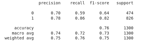
Classification report for the validation data
Like Article
Suggest improvement
Share your thoughts in the comments
Please Login to comment...