Bootstrap 4 | Cards
Last Updated :
29 Apr, 2022
A Bootstrap card is a flexible box containing some padding around the content. It includes the options for headers and footers, color, content, and powerful display options. It replaces the use of panels, wells, and thumbnails. It can be used in a single container called card.

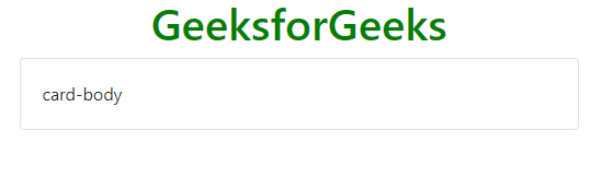
Basic Card: The .card and .card-body classes are used to create basic card. The .card-body class is used inside the .card class.
Example:
HTML
<!DOCTYPE html>
<html lang="en">
<head>
<title>Bootstrap Cards</title>
<meta charset="utf-8">
<meta name="viewport"
content="width=device-width, initial-scale=1">
<link rel="stylesheet" href=
<script src=
</script>
<script src=
</script>
<script src=
</script>
</head>
<body>
<h1 style="color:green;text-align:center;">
GeeksforGeeks
</h1>
<div class="container">
<div class="card">
<div class="card-body">
card-body
</div>
</div>
</div>
</body>
</html>
|
Output:
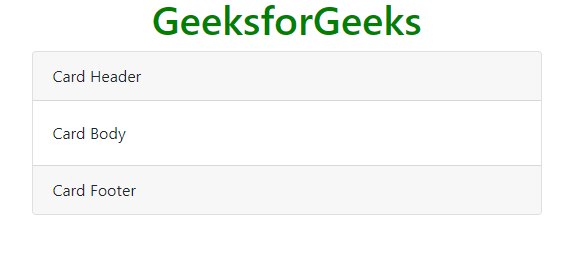
Header and Footer: The .card-header class provides header to the cards and .card-footer class provides footer to the cards.
Example:
HTML
<!DOCTYPE html>
<html lang="en">
<head>
<title>Bootstrap Cards</title>
<meta charset="utf-8">
<meta name="viewport"
content="width=device-width, initial-scale=1">
<link rel="stylesheet" href=
<script src=
</script>
<script src=
</script>
<script src=
</script>
</head>
<body>
<h1 style="color:green;text-align:center;">
GeeksforGeeks
</h1>
<div class="container">
<div class="card">
<div class="card-header">
Card Header
</div>
<div class="card-body">
Card Body
</div>
<div class="card-footer">
Card Footer
</div>
</div>
</div>
</body>
</html>
|
Output:
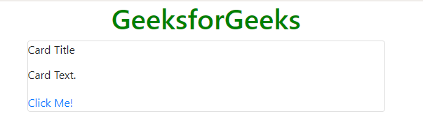
Card Title and Links: The .card-title class is used to set a title to the card and .card-link class is used to set a link to the card if required in it.
Example:
HTML
<!DOCTYPE html>
<html lang="en">
<head>
<title>Bootstrap Cards</title>
<meta charset="utf-8">
<meta name="viewport"
content="width=device-width, initial-scale=1">
<link rel="stylesheet" href=
<script src=
</script>
<script src=
</script>
<script src=
</script>
</head>
<body>
<h1 style="color:green;text-align:center;">
GeeksforGeeks
</h1>
<div class="container">
<div class="card">
<div class="card-title">
Card Title
</div>
<p class="card-text">
Card Text.
</p>
<a href="#" class="card-link">
Click Me!
</a>
</div>
</div>
</body>
</html>
|
Output:
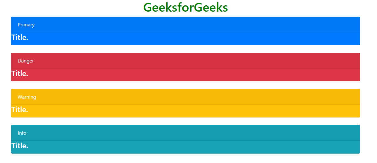
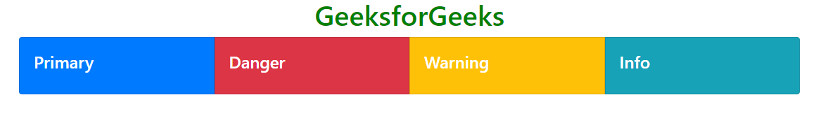
Card Styles: Card styles can be set by using a color of the card so that it may be easy for the user to understand what does the particular card stands for. It consists of the colors used in the alerts.
Example:
HTML
<!DOCTYPE html>
<html lang="en">
<head>
<title>Bootstrap Cards</title>
<meta charset="utf-8">
<meta name="viewport"
content="width=device-width, initial-scale=1">
<link rel="stylesheet" href=
<script src=
</script>
<script src=
</script>
<script src=
</script>
</head>
<body>
<h1 style="color:green;text-align:center;">
GeeksforGeeks
</h1>
<div class="container">
<div class="card text-white bg-primary">
<div class="card-header">
Primary
</div>
<h4 class="card-title">
Title.
</h4>
</div>
<br>
<div class="card text-white bg-danger">
<div class="card-header">
Danger
</div>
<h4 class="card-title">
Title.
</h4>
</div>
<br>
<div class="card text-white bg-warning">
<div class="card-header">
Warning
</div>
<h4 class="card-title">
Title.
</h4>
</div>
<br>
<div class="card text-white bg-info">
<div class="card-header">
Info
</div>
<h4 class="card-title">
Title.
</h4>
</div>
</div>
</body>
</html>
|
Output:
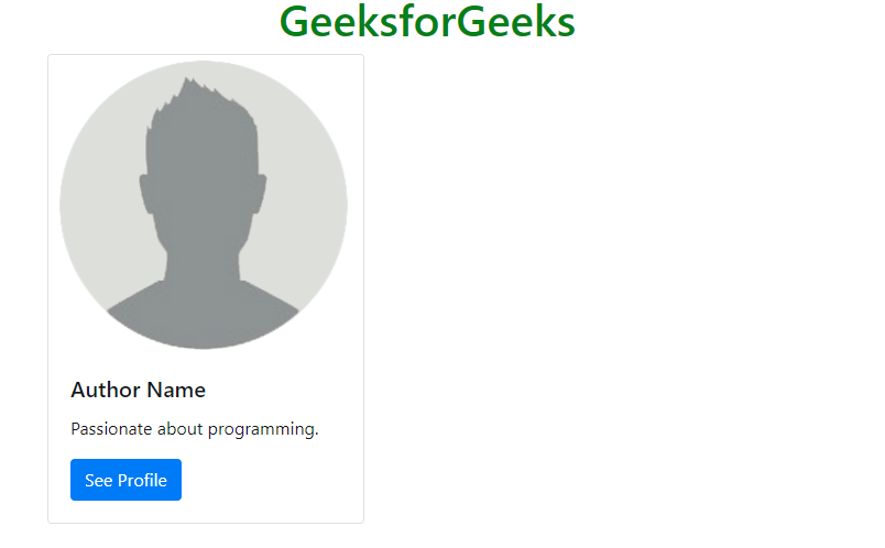
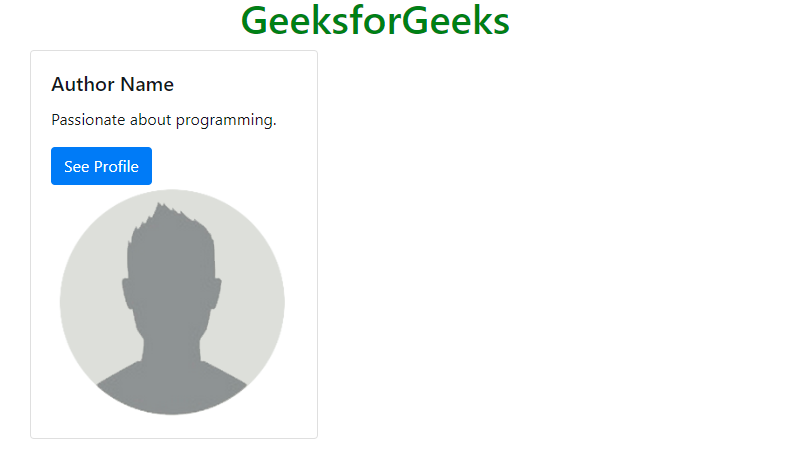
Card Images: The .card-img-top or .card-img-bottom class is used to place the image at top or bottom inside the card.
Example 1:
HTML
<!DOCTYPE html>
<html lang="en">
<head>
<title>Bootstrap Cards</title>
<meta charset="utf-8">
<meta name="viewport"
content="width=device-width, initial-scale=1">
<link rel="stylesheet" href=
<script src=
</script>
<script src=
</script>
<script src=
</script>
</head>
<body>
<h1 style="color:green;text-align:center;">
GeeksforGeeks
</h1>
<div class="container">
<div class="card" style="width: 18rem;">
<img class="card-img-top" src=
alt="Card image cap">
<div class="card-body">
<h5 class="card-title">
Author Name
</h5>
<p class="card-text">
Passionate about programming.
</p>
<a href="#" class="btn btn-primary">
See Profile
</a>
</div>
</div>
</div>
</body>
</html>
|
Output:
Example 2:
HTML
<!DOCTYPE html>
<html lang="en">
<head>
<title>Bootstrap Cards</title>
<meta charset="utf-8">
<meta name="viewport"
content="width=device-width, initial-scale=1">
<link rel="stylesheet" href=
<script src=
</script>
<script src=
</script>
<script src=
</script>
</head>
<body>
<h1 style="color:green;text-align:center;">
GeeksforGeeks
</h1>
<div class="container">
<div class="card" style="width: 18rem;">
<div class="card-body">
<h5 class="card-title">
Author Name
</h5>
<p class="card-text">
Passionate about programming.
</p>
<a href="#" class="btn btn-primary">
See Profile
</a>
<img class="card-img-top" src=
alt="Card image cap">
</div>
</div>
</div>
</body>
</html>
|
Output:
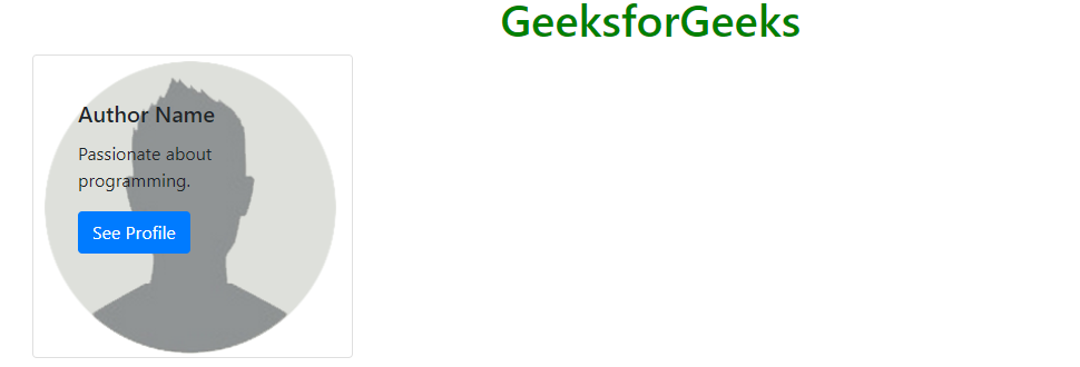
Card Image Overlays: The .card-img-overlay class is used to add text on the top of the image.
Example:
HTML
<!DOCTYPE html>
<html lang="en">
<head>
<title>Bootstrap Cards</title>
<meta charset="utf-8">
<meta name="viewport"
content="width=device-width, initial-scale=1">
<link rel="stylesheet" href=
<script src=
</script>
<script src=
</script>
<script src=
</script>
</head>
<body>
<h1 style="color:green;text-align:center;">
GeeksforGeeks
</h1>
<div class="container">
<div class="card" style="width: 18rem;">
<img class="card-img-bottom" src=
alt="Card image cap">
<div class="card-img-overlay">
<div class="card-body">
<h5 class="card-title">
Author Name
</h5>
<p class="card-text">
Passionate about programming.
</p>
<a href="#" class="btn btn-primary">
See Profile
</a>
</div>
</div>
</div>
</div>
</body>
</html>
|
Output:
Card Deck: The .card-deck class is used to create an equal height and width card grid.
Example:
HTML
<!DOCTYPE html>
<html lang="en">
<head>
<title>Bootstrap Cards</title>
<meta charset="utf-8">
<meta name="viewport"
content="width=device-width, initial-scale=1">
<link rel="stylesheet" href=
<script src=
</script>
<script src=
</script>
<script src=
</script>
</head>
<body>
<h1 style="color:green;text-align:center;">
GeeksforGeeks
</h1>
<div class="container">
<div class="card-deck">
<div class="card text-white bg-primary">
<div class="card-body">
<h4 class="card-title">
Primary
</h4>
</div>
</div>
<div class="card text-white bg-danger">
<div class="card-body">
<h4 class="card-title">
Danger
</h4>
</div>
</div>
<div class="card text-white bg-warning">
<div class="card-body">
<h4 class="card-title">
Warning
</h4>
</div>
</div>
<div class="card text-white bg-info">
<div class="card-body">
<h4 class="card-title">
Info
</h4>
</div>
</div>
</div>
</div>
</body>
</html>
|
Output:
Card Group: The .card-group class is used to create equal height and width card grid and removing the left and right margins between the cards.
Example:
HTML
<!DOCTYPE html>
<html lang="en">
<head>
<title>Bootstrap Cards</title>
<meta charset="utf-8">
<meta name="viewport"
content="width=device-width, initial-scale=1">
<link rel="stylesheet" href=
<script src=
</script>
<script src=
</script>
<script src=
</script>
</head>
<body>
<h1 style="color:green;text-align:center;">
GeeksforGeeks
</h1>
<div class="container">
<div class="card-group">
<div class="card text-white bg-primary">
<div class="card-body">
<h4 class="card-title">
Primary
</h4>
</div>
</div>
<div class="card text-white bg-danger">
<div class="card-body">
<h4 class="card-title">
Danger
</h4>
</div>
</div>
<div class="card text-white bg-warning">
<div class="card-body">
<h4 class="card-title">
Warning
</h4>
</div>
</div>
<div class="card text-white bg-info">
<div class="card-body">
<h4 class="card-title">
Info
</h4>
</div>
</div>
</div>
</div>
</body>
</html>
|
Output:
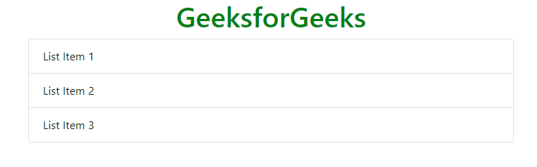
List groups: The .list-group and .list-group-flush classes are used to create a list of contents in a card.
Example:
HTML
<!DOCTYPE html>
<html lang="en">
<head>
<title>Bootstrap Cards</title>
<meta charset="utf-8">
<meta name="viewport"
content="width=device-width, initial-scale=1">
<link rel="stylesheet" href=
<script src=
</script>
<script src=
</script>
<script src=
</script>
</head>
<body>
<h1 style="color:green;text-align:center;">
GeeksforGeeks
</h1>
<div class="container">
<div class="card">
<ul class="list-group list-group-flush">
<li class="list-group-item">
List Item 1
</li>
<li class="list-group-item">
List Item 2
</li>
<li class="list-group-item">
List Item 3
</li>
</ul>
</div>
</div>
</body>
</html>
|
Output:
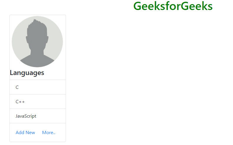
Kitchen sink: It is a name given to the type of card which consists of everything in it. It mixes and matches multiple contents to make the desired card.
Example:
HTML
<!DOCTYPE html>
<html lang="en">
<head>
<title>Bootstrap Cards</title>
<meta charset="utf-8">
<meta name="viewport"
content="width=device-width, initial-scale=1">
<link rel="stylesheet" href=
<script src=
</script>
<script src=
</script>
<script src=
</script>
</head>
<body>
<h1 style="color:green;text-align:center;">
GeeksforGeeks
</h1>
<div class="container">
<div class="card" style="width:12rem;">
<img class="card-img-top" src=
<div class="card-block">
<h4 class="card-title">
Languages
</h4>
</div>
<ul class="list-group list-group-flush">
<li class="list-group-item">
C
</li>
<li class="list-group-item">
C++
</li>
<li class="list-group-item">
JavaScript
</li>
</ul>
<div class="card-body">
<a href="#" class="card-link">
Add New
</a>
<a href="#" class="card-link">
More..
</a>
</div>
</div>
</div>
</body>
</html>
|
Output:
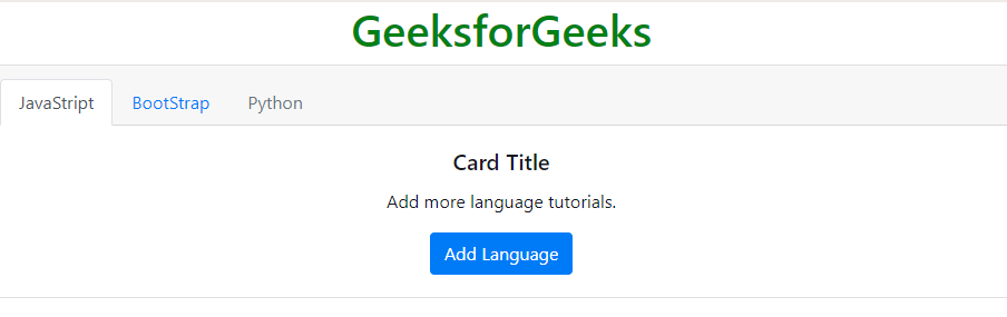
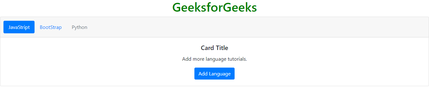
Navigation: It adds the navigation menu to the card header.
Example:
HTML
<!DOCTYPE html>
<html lang="en">
<head>
<title>Bootstrap Cards</title>
<meta charset="utf-8">
<meta name="viewport"
content="width=device-width, initial-scale=1">
<link rel="stylesheet" href=
<script src=
</script>
<script src=
</script>
<script src=
</script>
</head>
<body>
<h1 style="color:green;text-align:center;">
GeeksforGeeks
</h1>
<div class="card text-center">
<div class="card-header">
<ul class="nav nav-tabs card-header-tabs">
<li class="nav-item">
<a class="nav-link active" href="#">
JavaStript
</a>
</li>
<li class="nav-item">
<a class="nav-link" href="#">
BootStrap
</a>
</li>
<li class="nav-item">
<a class="nav-link disabled" href="#">
Python
</a>
</li>
</ul>
</div>
<div class="card-body">
<h5 class="card-title">
Card Title
</h5>
<p class="card-text">
Add more language tutorials.
</p>
<a href="#" class="btn btn-primary">
Add Language
</a>
</div>
</div>
</body>
</html>
|
Output:
Navigation menu in pills form: It adds the navigation menu in pills form to the card header.
Example:
HTML
<!DOCTYPE html>
<html lang="en">
<head>
<title>Bootstrap Cards</title>
<meta charset="utf-8">
<meta name="viewport"
content="width=device-width, initial-scale=1">
<link rel="stylesheet" href=
<script src=
</script>
<script src=
</script>
<script src=
</script>
</head>
<body>
<h1 style="color:green;text-align:center;">
GeeksforGeeks
</h1>
<div class="card text-center">
<div class="card-header">
<ul class="nav nav-pills card-header-pills">
<li class="nav-item">
<a class="nav-link active" href="#">
JavaStript
</a>
</li>
<li class="nav-item">
<a class="nav-link" href="#">
BootStrap
</a>
</li>
<li class="nav-item">
<a class="nav-link disabled" href="#">
Python
</a>
</li>
</ul>
</div>
<div class="card-body">
<h5 class="card-title">
Card Title
</h5>
<p class="card-text">
Add more language tutorials.
</p>
<a href="#" class="btn btn-primary">
Add Language
</a>
</div>
</div>
</body>
</html>
|
Output:
Supported Browsers:
- Google Chrome
- Internet Explorer
- Firefox
- Opera
- Safari
Share your thoughts in the comments
Please Login to comment...