How to Add Gradient to CardView in Android?
Last Updated :
14 Apr, 2023
UI stands for User Interface, which represents the graphical interface that allows the user to interact with software or any other devices. It comprises some visual elements like Buttons, icons, text, and Images that allow users to steer and interact with the software. UI basically concentrate on creating instinctive and User-Friendly interfaces that make user easily learn and adapt to the environment of the software or device.
What are CardViews In Android?
A CardView is a user interface widget that is used by developers to create a holder that ideally looks like a normal card having defined corners as well as elevated shadow. It was first introduced in Android Support Library but now you will find it in AndroidX Library.
What Actually Gradients Are?
In android, gradients represent transition or progression between two or more colors, shades, or tones. They are basically used for backgrounds like Buttons, Splash Screens, and CardView. So now let’s start the implementation of Gradient in CardView.
Step By Step Implementation
Step 1: Create a CardView in your Android Studio
XML
<?xml version="1.0" encoding="utf-8"?>
<LinearLayout
android:layout_width="match_parent"
android:layout_height="match_parent"
android:orientation="vertical"
android:background="#F3F0F8"
android:gravity="center_horizontal"
tools:context=".MainActivity">
<TextView
android:id="@+id/txtAdd"
android:layout_width="wrap_content"
android:layout_height="wrap_content"
android:layout_marginTop="50dp"
android:textSize="24sp"
android:text="Add Gradient To Your CardView"/>
<androidx.cardview.widget.CardView
android:id="@+id/grad"
android:layout_width="300dp"
android:layout_marginTop="90dp"
android:layout_height="400dp"
app:cardCornerRadius="15dp"/>
</LinearLayout>
|
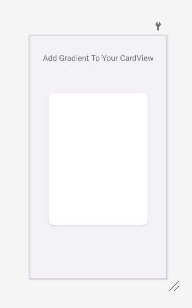
White base CardView
Step 2: Create an xml file for the gradient in your drawable section
XML
<?xml version="1.0" encoding="utf-8"?>
<item>
<shape
android:shape="rectangle">
<corners
android:radius="15dp">
</corners>
<gradient
android:startColor="#026A3D"
android:endColor="#22C686">
</gradient>
</shape>
</item>
</selector>
|
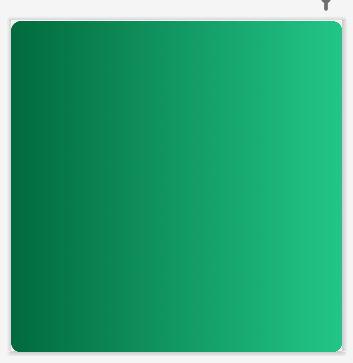
Gradient green
Step 3: See through your Themes folder in the res folder in your Android Studio and add the Style attribute to it
Note: Make sure that you attach the same drawable file in which you have created the gradient.
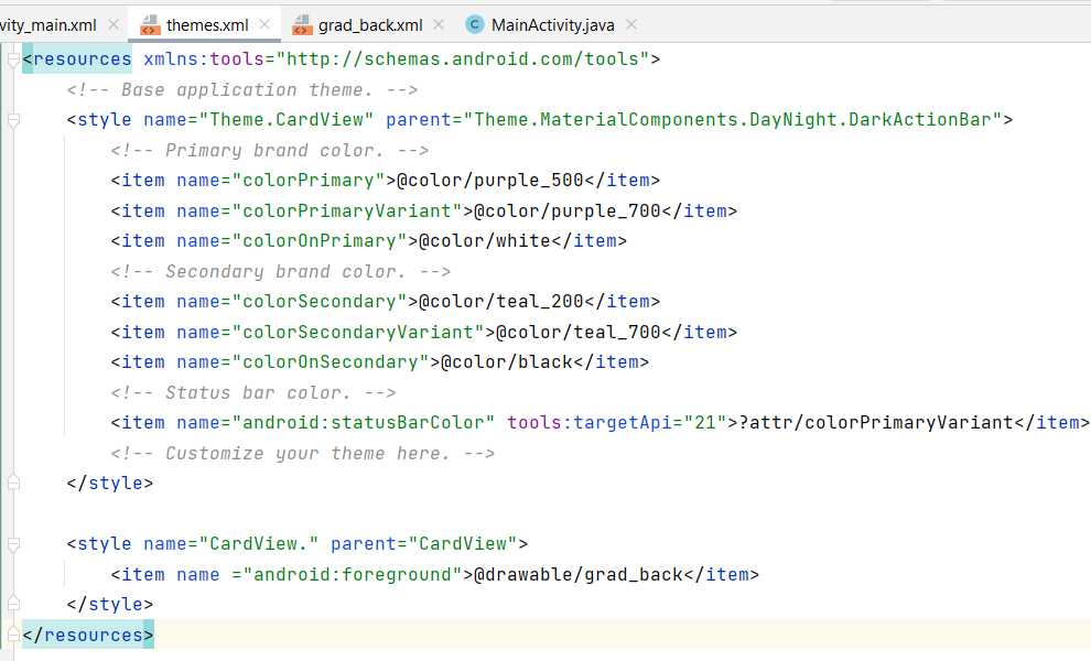
res>themes>themes.xml
Step 4: Now go to your CardView xml file and add this new style to it.
XML
<?xml version="1.0" encoding="utf-8"?>
<LinearLayout
android:layout_width="match_parent"
android:layout_height="match_parent"
android:orientation="vertical"
android:background="#F3F0F8"
android:gravity="center_horizontal"
tools:context=".MainActivity">
<TextView
android:id="@+id/txtAdd"
android:layout_width="wrap_content"
android:layout_height="wrap_content"
android:layout_marginTop="50dp"
android:textSize="24sp"
android:text="Add Gradient To Your CardView"/>
<androidx.cardview.widget.CardView
android:id="@+id/grad"
android:layout_width="300dp"
android:layout_marginTop="90dp"
android:layout_height="400dp"
app:cardCornerRadius="15dp"
style="@style/CardView."/>
</LinearLayout>
|
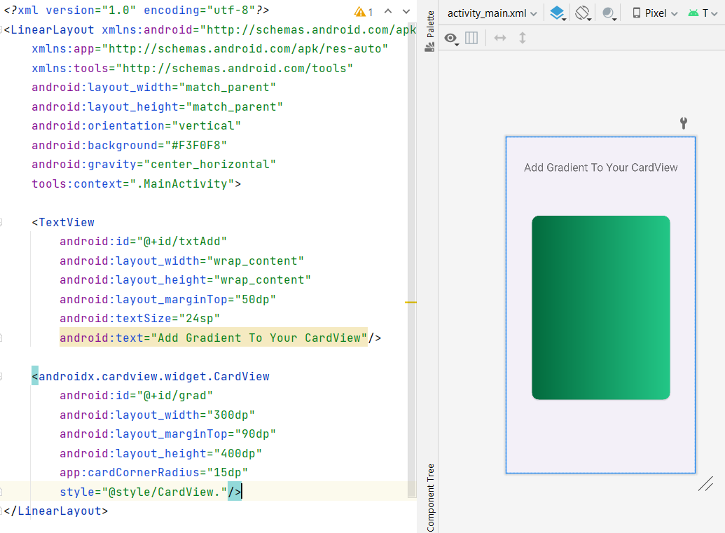
cardView.xml
Points To Remember
- Take the start color as Dark Color and the end Color as light color of that same color which you have chosen and vice versa for better visualization.
- Keep the cardView corner radius and grad corner radius the same so that it fits perfectly on it.
- If you want any other color then find its hexa color code and copy and paste it into your gradient file.
Share your thoughts in the comments
Please Login to comment...