How to Apply Transitions to the Display Property in CSS ?
Last Updated :
14 Feb, 2024
In CSS, transitions allow you to change property values smoothly over a specified duration. However, the display property is not animatable, which means you cannot directly apply transitions to it like you can with properties such as opacity or transform. This limitation is because the display property does not support values between its states (e.g., there’s no halfway point between display: none; and display: block;). Despite this, there are creative ways to simulate transitions for the display property, achieving a visually similar effect.
Approach 1: Using opacity and visibility
One common approach to simulate transitioning the display property is to use opacity for the fade effect and visibility to make the element not interactable when it’s supposed to be “hidden”.
HTML
<!DOCTYPE html>
<html lang="en">
<head>
<meta charset="UTF-8">
<meta name="viewport" content=
"width=device-width, initial-scale=1.0">
<title>Transition Display Effect</title>
<style>
.box {
transition: opacity 0.5s, visibility 0.5s;
opacity: 1;
visibility: visible;
}
.box.hidden {
opacity: 0;
visibility: hidden;
}
</style>
</head>
<body>
<div class="box">Welcome to GeeksforGeeks</div>
<button onclick="toggleBox()">Toggle Box</button>
<script>
function toggleBox() {
document.querySelector('.box').classList.toggle('hidden');
}
</script>
</body>
</html>
|
Output
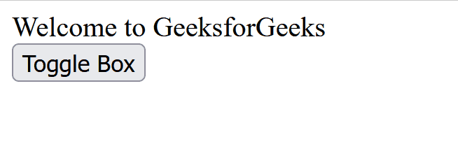
In this example, toggling the hidden class changes the opacity and visibility of the .box, simulating a “display” transition. The visibility property takes a bit longer to apply, ensuring that the element becomes non-interactable only after it has faded out.
Approach 2: Combining height, overflow, and opacity
Another way to simulate a display transition is by animating the height, overflow, and opacity properties together. This approach can effectively make an element appear to slide in/out of view while fading.
HTML
<!DOCTYPE html>
<html lang="en">
<head>
<meta charset="UTF-8">
<meta name="viewport" content=
"width=device-width, initial-scale=1.0">
<title>Slide and Fade Transition</title>
<style>
.container {
overflow: hidden;
height: 0;
opacity: 0;
transition: height 0.5s ease, opacity 0.5s ease;
}
.container.open {
height: 100px;
opacity: 1;
}
.content {
padding: 20px;
background-color: lightgreen;
}
</style>
</head>
<body>
<div class="container" id="container">
<div class="content">
Welcome to GeeksforGeeks
</div>
</div>
<button onclick="toggleContainer()">
Toggle Container
</button>
<script>
function toggleContainer() {
document.getElementById('container')
.classList.toggle('open');
}
</script>
</body>
</html>
|
Output
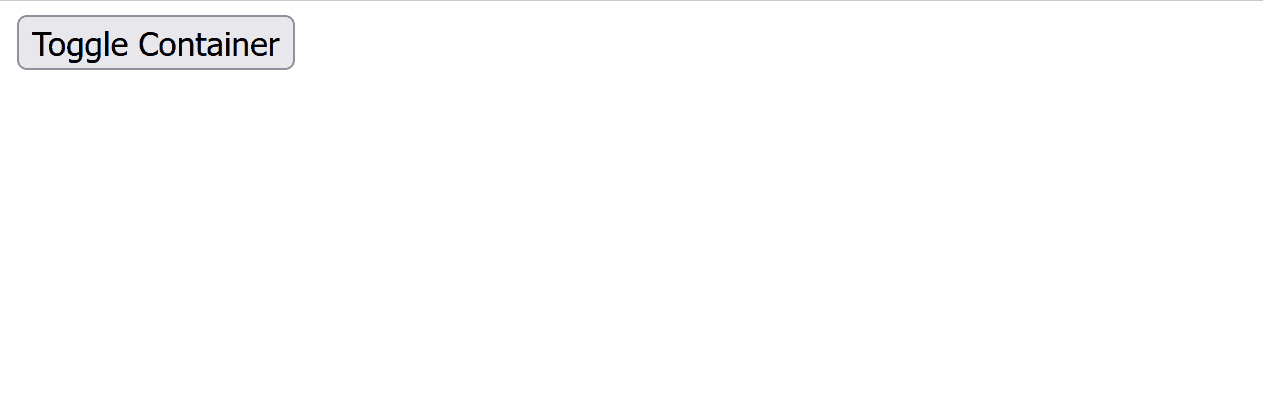
Here, the .container starts with height: 0 and opacity: 0. When the .open class is toggled, the height and opacity transition to their final values, creating a smooth slide and fade effect. Adjust the height value in the .open class based on the content size you need to reveal.
Approach 3: Using JavaScript with CSS Transitions
For more complex scenarios where CSS alone might not suffice, JavaScript can dynamically apply styles and use event listeners to create a seamless transition effect.
HTML
<!DOCTYPE html>
<html lang="en">
<head>
<meta charset="UTF-8">
<meta name="viewport" content=
"width=device-width, initial-scale=1.0">
<title>Dynamic JS Transitions</title>
<style>
.dynamic-box {
transition: opacity 0.5s ease;
opacity: 0;
}
</style>
</head>
<body>
<div class="dynamic-box" id="dynamicBox">
Welcome to GeeksforGeeks
</div>
<button onclick="toggleDynamicBox()">
Toggle Dynamic Box
</button>
<script>
const box = document.getElementById('dynamicBox');
function toggleDynamicBox() {
if (box.style.opacity === '0') {
box.style.opacity = '1';
box.style.display = 'block';
} else {
box.style.opacity = '0';
setTimeout(() => box.style.display = 'none', 500);
}
}
</script>
</body>
</html>
|
Output
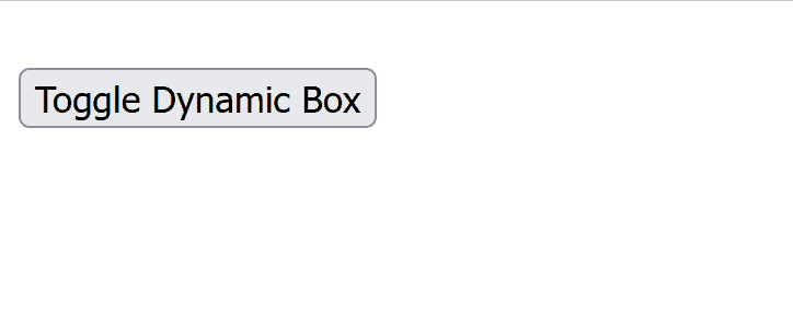
This method uses JavaScript to dynamically change the opacity and uses a setTimeout function to delay the application of display: none; until after the opacity transition completes, achieving a smooth effect.
Share your thoughts in the comments
Please Login to comment...