How to Assign Colors to Categorical Variable in ggplot2 Plot in R ?
Last Updated :
24 Jun, 2021
In this article, we will see how to assign colors to categorical Variables in the ggplot2 plot in R Programming language.
Note: Here we are using a scatter plot, the same can be applied to any other graph.
Dataset in use:
| |
Year |
Points |
Users |
| 1 |
2011 |
30 |
user1 |
| 2 |
2012 |
20 |
user2 |
| 3 |
2013 |
15 |
user3 |
| 4 |
2014 |
35 |
user4 |
| 5 |
2015 |
50 |
user5 |
To Create an R plot, we use ggplot() function and to make it scatter plot we add geom_point() function to ggplot() function. By Default, the plot has following colors.
Example:
R
library(ggplot2)
data <- data.frame(Year = c(2011, 2012, 2013, 2014, 2015),
Points = c(30, 20, 15, 35, 50),
Users = c("user1", "user2", "user3",
"user4", "user5"))
ggplot(data, aes(Year, Points, color = Users)) +
geom_point(size = 10)
|
Output:
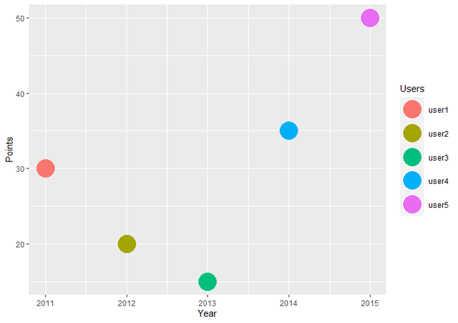
ScatterPlot using ggplot2 with default colors
In R Programming, we have many in built function for creating our own discrete scales such as scale_fill_manual, scale_size_manual, scale_shape_manual, scale_linetype_manual, etc. To assign desired colors to categorical data, we use one of them scale_color_manual() function, which is used to scale (map) the manual colors.
Syntax : scale_color_manual(values)
Parameter :
- values : A set of aesthetic values to map the data. Here we take desired set of colors.
Return : Scale the manual values of colors on data.
Example:
R
library(ggplot2)
data <- data.frame(Year = c(2011, 2012, 2013, 2014, 2015),
Points = c(30, 20, 15, 35, 50),
Users = c("user1", "user2", "user3",
"user4", "user5"))
ggplot(data, aes(Year, Points, color = Users)) +
geom_point(size = 10)+
scale_color_manual(values = c("green", "orange", "red",
"yellow", "blue"))
|
Output :
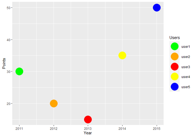
Plot with fixed colors
Share your thoughts in the comments
Please Login to comment...