How to create a Responsive Inline Form using CSS ?
Last Updated :
25 Jan, 2024
When the browser window is resized, the labels and inputs will stack on top of each other for smaller screens. To create a responsive inline form using CSS, use a container with flexible styling, such as Flexbox or Grid, to arrange form elements horizontally. Utilize media queries to adjust the layout for smaller screens, ensuring a user-friendly experience across various devices.
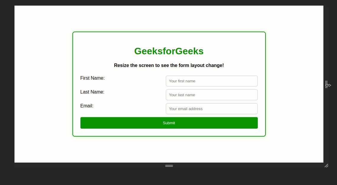
Preview

Approach
- Create an HTML with a container for the form elements. Use appropriate HTML tags for labels, input fields, and buttons.
- Apply CSS styles to the container, using Flexbox or Grid to enable a horizontal arrangement of form elements. Set up flexible widths to adjust to different screen sizes.
- Style form elements (labels, inputs, and buttons) with appropriate widths, padding, and borders. Ensure a clean and readable design that adapts well to different devices.
- Implement media queries to define specific styles for smaller screens. Adjust the layout, font sizes, or any other properties to enhance responsiveness and maintain usability on various devices.
- Test the form on different devices and screen sizes to ensure a seamless and responsive user experience.
Example: Implemenattion to design responsive inline form.
HTML
<!DOCTYPE html>
<html lang="en">
<head>
<meta charset="UTF-8">
<meta name="viewport" content=
"width=device-width, initial-scale=1.0">
<title>Responsive Inline Form</title>
<link rel="stylesheet" href="style.css">
</head>
<body>
<div class="responsive-form">
<h1>GeeksforGeeks</h1>
<h3>
Resize the screen to see
the form layout change!
</h3>
<form class="form-container">
<label for="firstName"
class="form-container-label">
First Name:
</label>
<input type="text"
id="firstName"
name="firstName"
placeholder="Your first name"
class="form-container-input" required>
<label for="lastName"
class="form-container-label">
Last Name:
</label>
<input type="text"
id="lastName"
name="lastName"
placeholder="Your last name"
class="form-container-input"
required>
<label for="email"
class="form-container-label">
Email:
</label>
<input type="email"
id="email"
name="email"
placeholder="Your email address"
class="form-container-input"
required>
<button type="submit"
class="form-container-button">
Submit
</button>
</form>
</div>
</body>
</html>
|
CSS
body {
margin: 0;
padding: 0;
display: flex;
align-items: center;
justify-content: center;
height: 100vh;
font-family: Arial, Helvetica, sans-serif;
}
.responsive-form {
max-width: 600px;
box-shadow: 0 0 10px rgba(97, 240, 68, 0.5);
width: 100%;
text-align: center;
border-radius: 8px;
border: 2px solid green;
background-color: #fff;
padding: 25px;
}
.responsive-form h1 {
color: green
}
.responsive-form h3 {
margin-bottom: 25px;
font-size: 16px;
}
.form-container {
display: flex;
flex-wrap: wrap;
justify-content: space-between;
}
.form-container-label {
text-align: left;
min-width: 48%;
margin-bottom: 10px;
flex: 1;
}
.form-container-input {
flex: 1;
margin-bottom: 10px;
box-sizing: border-box;
min-width: 45%;
border: 1px solid #ccc;
border-radius: 6px;
padding: 10px;
}
.form-container-button {
width: 100%;
border-radius: 4px;
color: #fff;
padding: 12px;
cursor: pointer;
border: none;
flex: 1;
background-color: green;
}
@media screen and (max-width: 600px) {
.form-container-label,
.form-container-input,
.form-container-button {
flex: 100%;
min-width: 100%;
}
}
|
Output:
Share your thoughts in the comments
Please Login to comment...