How to Create Glassmorphism Login Form in HTML and CSS ?
Last Updated :
04 Mar, 2024
Glassmorphism, characterized by its transparent and frosted glass-like appearance, provides a visually appealing user interface. The login form will feature translucent backgrounds, blurred elements, and subtle shadows to achieve the Glassmorphism effect. the step-by-step process of designing and coding a stunning Glassmorphism login form that can be seamlessly integrated into web applications, enhancing both aesthetics and user experience.
Output Preview: Let us have a look at how the final output will look like
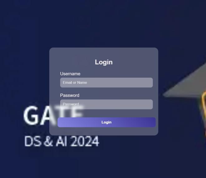
Preview
Approach to create Login Form with Glassmorphism effect
- Create a basic structure of the web page using HTML elements and Link external Stylesheet.
- Set up a background image or color to create the glass effect. Use `rgba()` to set the background color with transparency.
- Style the container div to center the login form vertically and horizontally on the page. Use CSS flexbox or grid to align form elements neatly.
- Apply a blur effect to the background to enhance the glassmorphism effect. Use CSS transitions for smooth hover effects.
- Create form elements such as input fields for username and password and a login button. Style the input fields with rounded corners, box shadows, and slight background color to give them a glassy appearance.
- Customize the login button with a gradient background, box-shadow, and rounded corners for a glassy effect. Add hover effects to the form elements for interactivity, such as changing the color or shadow on hover.
- Choose appropriate fonts for the login form, such as Google Fonts, to enhance the visual appeal.
Example: Illustration of Creating A Glassmorphism Login Form in HTML and CSS.
HTML
<!DOCTYPE html>
<html lang="en">
<head>
<meta charset="UTF-8">
<meta name="viewport"
content="width=device-width, initial-scale=1.0">
<title>Glassmorphism Login Form</title>
<link rel="stylesheet" href="style.css">
</head>
<body>
<div class="container">
<form class="glass-login-form">
<h2>Login</h2>
<div class="input-group">
<label for="username">Username</label>
<input type="text" placeholder="Email or Name"
name="username" required>
</div>
<div class="input-group">
<label for="password">Password</label>
<input type="password" placeholder="Password"
id="password" name="password" required>
</div>
<button type="submit">Login</button>
</form>
</div>
</body>
</html>
|
CSS
body {
margin: 0;
padding: 0;
font-family: Arial, sans-serif;
display: flex;
justify-content: center;
align-items: center;
min-height: 100vh;
background: linear-gradient(45deg, #ffffff, #e0e0e0);
background-image: url(
background-repeat: no-repeat;
background-size: cover;
}
.container {
width: 75%;
max-width: 400px;
}
.glass-login-form {
background: rgba(255, 255, 255, 0.25);
border-radius: 15px;
backdrop-filter: blur(5px);
padding: 20px;
}
.glass-login-form h2 {
text-align: center;
color: #f4eeee;
}
.input-group {
margin: 20px;
}
.input-group label {
display: block;
margin-bottom: 5px;
color: #f1eaea;
}
::placeholder {
color: #e5e5e5;
}
.input-group input {
display: block;
width: 100%;
padding: 10px;
border: none;
border-radius: 8px;
background: rgba(245, 240, 240, 0.15);
backdrop-filter: blur(11px);
color: #f7efef;
}
.input-group input:focus {
outline: none;
background: rgba(255, 255, 255, 0.3);
}
button {
margin: 10px;
width: 100%;
padding: 10px;
border: none;
border-radius: 8px;
background: linear-gradient(45deg, #8686e3, #3b3494);
color: #fff;
font-weight: bold;
cursor: pointer;
}
button:hover {
background: linear-gradient(45deg, #5d5e5d, #a4a4a7);
}
|
Output:

Output
Share your thoughts in the comments
Please Login to comment...