How to Set a Fixed Width Column with CSS Flexbox ?
Last Updated :
26 Apr, 2024
When working with CSS flexbox, setting a fixed width for a column can be achieved by using various approaches to override the default behavior of flex items, which typically grow and shrink to fill available space.
Using the flex property
The flex property is used in CSS to control the behavior of flexible items within a flex container.
Approach
- .container class is defined to use Flexbox layout via display: flex;.
- .column class represents the individual columns within the flex container.
- flex: 1; property ensures each column takes up an equal amount of space within the flex container.
- Additional styling includes padding, background color, border, and margin for each column.
Example: To demonstrate creating a layout where the columns are horizontally aligned and evenly spaced within the container using the flexbox properties.
HTML
<!DOCTYPE html>
<html>

<head>
    <meta charset="utf-8" />
    <title>Flexbox Example</title>
    <link rel="stylesheet" href="gfg.css" />
</head>

<body>
    <div class="container">
        <div class="column">
            <h2>Column 1</h2>
            <p>This is the content of column 1.</p>
        </div>
        <div class="column">
            <h2>Column 2</h2>
            <p>This is the content of column 2.</p>
        </div>
        <div class="column">
            <h2>Column 3</h2>
            <p>This is the content of column 3.</p>
        </div>
    </div>
</body>

</html>
.container {
    display: flex;
    /* Establishes flex container */
}

.column {
    flex: 1;
    /* Each column takes up equal space */
    padding: 20px;
    background-color: #f0f0f0;
    border: 1px solid #ccc;
    margin: 5px;
}
Output:
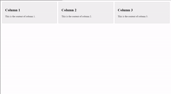
using the flex property
Using the min-width and max-width properties
Setting both min-width and max-width to the same value effectively fixes the width of the column.
Approach
- .container class uses Flexbox layout via display: flex;.
- .column class defines the styling for individual columns.
- flex: 0 0 auto; sets the column width to be fixed, not allowing it to grow or shrink.
- padding, background-color, border, and margin properties define the visual appearance of each column.
- min-width and max-width properties specify the minimum and maximum width constraints for each column.
Example: To demonstrate creating a columns with fixed widths that won’t change based on content, but are bounded by minimum and maximum width limits.
HTML
<!DOCTYPE html>
<html>

<head>
    <meta charset="utf-8" />
    <title>Flexbox Example</title>
    <link rel="stylesheet" href="gfg.css" />
</head>

<body>
    <div class="container">
        <div class="column">
            <h2>Column 4</h2>
            <p>This is the content of column 4.</p>
        </div>
        <div class="column">
            <h2>Column 5</h2>
            <p>This is the content of column 5.</p>
        </div>
        <div class="column">
            <h2>Column 6</h2>
            <p>This is the content of column 6.</p>
        </div>
    </div>
</body>

</html>
.container {
    display: flex;
}

.column {
    flex: 0 0 auto;
    /* Fixed width */
    padding: 20px;
    background-color: #f0f0f0;
    border: 1px solid #ccc;
    margin: 5px;
    min-width: 200px;
    /* Minimum width */
    max-width: 300px;
    /* Maximum width */
}
Output:
.gif)
using the min-width and max-width properties
Combining flex-basis with flex-grow and flex-shrink
By setting flex-basis to a specific width and flex-grow and flex-shrink to 0, you can create a fixed-width column.
Approach
- .container class employs Flexbox layout with display: flex;.
- .column class specifies styling for individual columns.
- flex-grow: 0; ensures that columns won’t grow beyond their initial size.
- flex-shrink: 0; prevents columns from shrinking if there’s insufficient space.
- flex-basis: 200px; sets the initial width of each column to 200 pixels.
- Additional styling includes padding, background color, border, and margin for each column.
Example: To demonstrate creating columns with fixed widths of 200 pixels that won’t change, regardless of available space, due to the flex-grow and flex-shrink properties being disabled.
HTML
<!DOCTYPE html>
<html>

<head>
    <meta charset="utf-8" />
    <title>Flexbox Example</title>
    <link rel="stylesheet" href="gfg.css" />
</head>

<body>
    <div class="container">
        <div class="column">
            <h2>Column 7</h2>
            <p>This is the content of column 7.</p>
        </div>
        <div class="column">
            <h2>Column 8</h2>
            <p>This is the content of column 8.</p>
        </div>
        <div class="column">
            <h2>Column 9</h2>
            <p>This is the content of column 9.</p>
        </div>
    </div>
</body>

</html>
.container {
    display: flex;
}

.column {
    flex-grow: 0;
    /* Prevents column from growing */
    flex-shrink: 0;
    /* Prevents column from shrinking */
    flex-basis: 200px;
    /* Fixed width of 200 pixels */
    padding: 20px;
    background-color: #f0f0f0;
    border: 1px solid #ccc;
    margin: 5px;
}
Output:
.gif)
combining flex-basis with flex-grow and flex-shrink
Share your thoughts in the comments
Please Login to comment...