How to set column in center using Bootstrap?
Last Updated :
03 May, 2024
Setting a column in the center using Bootstrap refers to the process of horizontally aligning a column within its parent element using Bootstrap’s predefined classes or utilities. This alignment ensures that the column is positioned centrally within its parent container on the webpage.
There are some approaches to Setting a column in the center using Bootstrap:
Approach 1: Using the offset class
To center a column using Bootstrap’s offset class, apply col-md-offset-4 to a column with col-md-4, creating a 4-unit column with a 4-unit offset, effectively centering it.
Example: This HTML uses Bootstrap’s grid system to center a column: a 6-unit column with a 3-unit offset, vertically aligned and horizontally centered within a container.
html
<!DOCTYPE html>
<html>

<head>
    <link rel="stylesheet"
          href=
"https://maxcdn.bootstrapcdn.com/bootstrap/4.0.0/css/bootstrap.min.css"
        integrity=
"sha384-Gn5384xqQ1aoWXA+058RXPxPg6fy4IWvTNh0E263XmFcJlSAwiGgFAW/dAiS6JXm"
        crossorigin="anonymous" />
</head>

<body>
    <div class="container">
        <div class="row">
            <div style="height: 200px;"
                 class="col-md-6 offset-md-3
                        text-center bg-success">.
                col-md-6 .offset-md-3
            </div>
        </div>
    </div>
</body>

</html>
Output

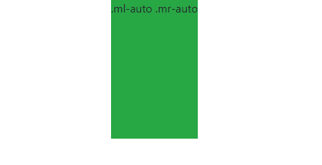
Approach 2: Margin auto
Setting left and right margins to auto will center the div with respect to its parent element. The left and right margin can be set with .ml-auto and .mr-auto class respectively. The below example implements this.
Example: In this example we centers a column using Bootstrap’s margin auto classes: mr-auto and ml-auto, achieving horizontal centering within a container.
html
<!DOCTYPE html>
<html>

<head>
    <link rel="stylesheet"
          href=
"https://maxcdn.bootstrapcdn.com/bootstrap/4.0.0/css/bootstrap.min.css"
          integrity=
"sha384-Gn5384xqQ1aoWXA+058RXPxPg6fy4IWvTNh0E263XmFcJlSAwiGgFAW/dAiS6JXm"
          crossorigin="anonymous" />
</head>

<body>
    <div class="container">
        <div class="row">
            <div style="height: 200px;"
                 class="mr-auto ml-auto
                        text-center bg-success">
                .ml-auto .mr-auto
            </div>
        </div>
    </div>
</body>

</html>
Output:
column centered in Bootstrap Example Output
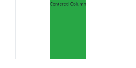
Approach 3: Using flexbox utilities:
To center a column using Bootstrap’s flexbox utilities, apply d-flex justify-content-center to the column’s parent, creating a flex container with content centered horizontally, thus centering the column within it.
Example: In this example we are using Bootstrap’s flexbox utilities: d-flex justify-content-center, centering a column horizontally within its container, visually marked by the border.
HTML
<!DOCTYPE html>
<html>

<head>
    <link rel="stylesheet"
          href=
"https://maxcdn.bootstrapcdn.com/bootstrap/4.0.0/css/bootstrap.min.css"
          integrity=
"sha384-Gn5384xqQ1aoWXA+058RXPxPg6fy4IWvTNh0E263XmFcJlSAwiGgFAW/dAiS6JXm"
          crossorigin="anonymous" />
</head>

<body>
    <div class="container">
        <div class="row">
            <div class="col-md-6
                        d-flex justify-content-center border">
                <div style="height: 200px; background-color: #28a745;">
                    Centered Column
                </div>
            </div>
        </div>
    </div>
</body>

</html>
Output:
column centered in Bootstrap Example Output
Share your thoughts in the comments
Please Login to comment...