React Bootstrap Close Button Component
Last Updated :
30 Jan, 2024
A React Bootstrap Close Button Component is a generic close button for dismissing content such as modals and alerts. You can use it to provide an option to close or hide a component with a simple click. You can customize its appearance and behavior with props such as variant, aria-label, onClick, and disabled.
Attributes:
- aria-label: A string that provides an accessible label indicating the relevant information about the Close Button. The default value is ‘Close’.
- onClick: A function that is fired after the Close Button is clicked. The function receives the event object as an argument.
- variant: A string that specifies the color variant for the button. The only valid value is ‘white’, which renders a white button instead of the default dark one. This attribute is useful when the button is placed on a dark background.
- disabled: Bootstrap adds relevant styling to a disabled close button to prevent user interactions.
Creating React Application And Installing Module:
Step 1: Create a React application using the following command.
npx create-react-app foldername
Step 2: After creating your project folder i.e. foldername, move to it using the following command.
cd foldername
Step 3: After creating the ReactJS application, Install the required modules using the following command.
npm install react-bootstrap bootstrap
Step 4: Add the below line in the index.jsx or App.jsx file.
import 'bootstrap/dist/css/bootstrap.min.css';
Approach:
- First, install the react-bootstrap using the command mentioned above.
- After installing, Import ‘CloseButton’ from ‘react-bootstrap/CloseButton’ in that file.
- Now in the file App.jsx write the code following the below instructions.
Example: Below is the practical implementation of the bootstrap close button component:
Javascript
import 'bootstrap/dist/css/bootstrap.min.css';
import "./App.css";
import CloseButton
from 'react-bootstrap/CloseButton';
function App() {
return (
<div>
<CloseButton aria-label="Hide"
onClick={
() => alert('Click Successful!')
} />
<CloseButton variant="white"
aria-label="Close" />
<CloseButton disabled />
</div>
);
}
export default App;
|
CSS
#root {
max-width: 1280px;
margin: 0 auto;
padding: 2rem;
text-align: center;
}
|
Step to Run Application:
npm start
Output: Go to http://localhost:3000/, and you will see the following output.
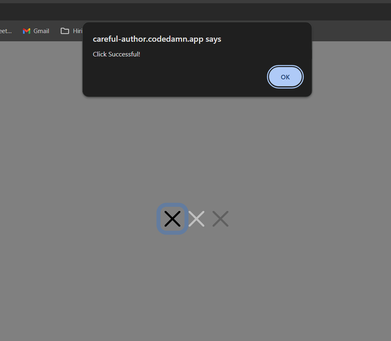
onClick Alert
Share your thoughts in the comments
Please Login to comment...