React Bootstrap Form Controls
Last Updated :
18 Jan, 2024
React-Bootstrap is a front-end framework mainly customized for React. Form controls are used in the creation and management of form elements within a React application. These components are the parts of the React Bootstrap Library “Form”.
Syntax:
import Form from 'react-bootstrap/Form';

<Form>
      <Form.Group>
        <Form.Label></Form.Label>
        <Form.Control/>
      </Form.Group>
</Form>
Form Control API properties
|
‘sm’| ‘lg’
|
Input size variants
|
|
number
|
It specifies the visible width in characters if as in input
|
|
bool
|
It renders the input as text. Generally used along side readOnly.
|
|
bool
|
It makes the control readonly
|
|
bool
|
It makes the control disabled
|
|
function
|
It is a callback function that fired when we change the input value
|
Form Control Props:
Here, we are describing some common props.
- type: This prop define the specific input element.
- readOnly: This prop make the component only readonly.
- size: This props defines the size of the element
- as: Specifies the HTML element or component to render instead of the default <input> element.
Creating React Application And Installing dependencies:
Step 1: Create a React application using the following command.
npx create-react-app foldername
cd foldername
Step 2: Install the required dependencies.
npm install react-bootstrap bootstrap
Step 3: Add the below line in index.js file.
import 'bootstrap/dist/css/bootstrap.css';
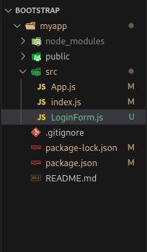
Project Structure
The updated dependencies in package.json file will look like:
"dependencies": {
    "@testing-library/jest-dom": "^5.17.0",
    "@testing-library/react": "^13.4.0",
    "@testing-library/user-event": "^13.5.0",
    "bootstrap": "^5.3.2",
    "react": "^18.2.0",
    "react-bootstrap": "^2.9.2",
    "react-dom": "^18.2.0",
    "react-scripts": "5.0.1",
    "web-vitals": "^2.1.4"
}
Example 1: The following program demonstrates the simple Login form using Form Control.
Javascript
import React from 'react';
import { Container } from 'react-bootstrap';
import LoginForm from './LoginForm';
const App = () => {
return (
<Container>
<LoginForm />
</Container>
)
}
export default App
|
Javascript
import React, { useState } from "react";
import { Form, Button } from "react-bootstrap";
const LoginForm = () => {
const [email, setEmail] = useState("");
const [password, setPassword] = useState("");
const handleEmailChange = (e) => {
setEmail(e.target.value);
};
const handlePasswordChange = (e) => {
setPassword(e.target.value);
};
const handleSubmit = (e) => {
e.preventDefault();
console.log("Login submitted:", { email, password });
};
return (
<div
style={{
display: "flex",
justifyContent: "center",
alignItems: "center",
height: "100vh",
}}
>
<Form
onSubmit={handleSubmit}
style={{
width: "400px",
padding: "20px",
border: "1px solid #ccc",
borderRadius: "8px",
boxShadow: "0 4px 8px rgba(0, 0, 0, 0.1)",
}}
>
<h2 style={{ textAlign: "center", marginBottom: "20px" }}>
Login
</h2>
<Form.Group controlId="formBasicEmail">
<Form.Label>Email address</Form.Label>
<Form.Control
type="email"
placeholder="Enter email"
value={email}
onChange={handleEmailChange}
required
size="m"
/>
</Form.Group>
<Form.Group controlId="formBasicPassword">
<Form.Label>Password</Form.Label>
<Form.Control
type="password"
placeholder="Password"
value={password}
onChange={handlePasswordChange}
required
size="m"
/>
</Form.Group>
<Button
className="mt-3"
variant="primary"
type="submit"
size="m"
style={{ width: "100%" }}
>
Login
</Button>
</Form>
</div>
);
};
export default LoginForm;
|
Output:

Example 2: The following program demonstrates the Form Control using the Text Area.
Javascript
import React from 'react'
import FormText from './FormText'
const App = () => {
return (
<div>
<FormText />
</div>
)
}
export default App
|
Javascript
import React, { useState } from "react";
import { Form, Button } from "react-bootstrap";
const FormText = () => {
const [message, setMessage] = useState("");
const handleMessageChange = (e) => {
setMessage(e.target.value);
};
const handleSubmit = (e) => {
e.preventDefault();
console.log("Message submitted:", message);
};
return (
<div
style={{
display: "flex",
justifyContent: "center",
alignItems: "center",
height: "100vh",
}}
>
<Form
onSubmit={handleSubmit}
style={{
width: "400px",
padding: "20px",
border: "1px solid #ccc",
borderRadius: "8px",
boxShadow: "0 4px 8px rgba(0, 0, 0, 0.1)",
}}
>
<h2 style={{ textAlign: "center", marginBottom: "20px" }}>
Text Area Form
</h2>
<Form.Group controlId="formTextarea">
<Form.Label>Message</Form.Label>
<Form.Control
as="textarea"
rows={5}
placeholder="Enter your message"
value={message}
onChange={handleMessageChange}
required
/>
</Form.Group>
<Button
className="mt-3"
variant="primary"
type="submit"
style={{ width: "100%" }}
>
Submit
</Button>
</Form>
</div>
);
};
export default FormText;
|
Output:
Share your thoughts in the comments
Please Login to comment...