React MUI Navigation Components
Last Updated :
14 Mar, 2023
React Material-UI (MUI) is a popular library that provides a set of reusable components for building user interfaces in React applications. These components are based on Material Design, a design system developed by Google that provides guidelines for creating visually appealing, user-friendly interfaces.
Navigation components refer to a type of component that is used to create navigation interfaces for an application.
MUI provides various types of Navigation Components:
|
Components
|
Descriptions
|
| Bottom Navigation |
This component allows you to create a bottom navigation bar, with options for text labels, icons, and multiple active states. |
| Breadcrumbs |
This component refers to a navigation component that displays a list of links to pages or sections, usually in a hierarchical structure, to indicate the current page’s position within the website or application. |
| Drawer |
This component provides a way to create a side navigation panel in your application, with options for content, navigation, and actions. |
| Link |
This component is used to create clickable links that can be used to navigate to different pages or sections within your application. |
| Menu |
This component is used to create a pop-up menu of options that can be used to perform actions within your application. |
| Pagination |
This component is used to display a set of pages and provide a way for the user to navigate between them. |
| Speed dial |
This component is used to create a floating action button that opens a set of related actions when it is clicked. |
| Stepper |
This component allows you to create a step-by-step process, with options for linear or non-linear progression, text labels, and icons. |
| Tabs |
This component allows you to create a tabbed navigation interface, with options for horizontal or vertical orientation, text labels, and icons. |
Setting up React.js application:
Step 1: Create a React.js application using the following command:
npx create-react-app foldername
Step 2: After creating your project folder i.e foldername, move into that directory using the following command:
cd foldername
Step 3: After creating the ReactJS application, Install the required module using the following command:
npm install @mui/material @emotion/react @emotion/styled
npm install @mui/icons-material
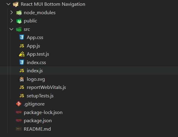
Project Structure: The project structure will look like this:
Example 1: In this example, we are using the BottomNavigation component. We have imported the icons from Material UI to represent the text and icon both as a Navigation option. The “onChange” function on the BottomNavigation prop is responsible to handle the change event, and for the navigation option or destination page, we have used the “BottomNavigationAction” with “label” and “icon” props.
App.js: Write down the below code in the App.js file, where App is our default component provided by React in which code is being written.
Javascript
import React, { useState, useEffect } from "react";
import BottomNavigation from
"@mui/material/BottomNavigation";
import BottomNavigationAction from
"@mui/material/BottomNavigationAction";
import AttachEmailOutlinedIcon from
'@mui/icons-material/AttachEmailOutlined';
import CloudDownloadOutlinedIcon from
'@mui/icons-material/CloudDownloadOutlined';
import BookmarksOutlinedIcon from
'@mui/icons-material/BookmarksOutlined';
import DeleteOutlineOutlinedIcon from '
@mui/icons-material/DeleteOutlineOutlined';
const App = () => {
const [value, setValue] = React.useState(0);
return (
<div style = {{
textAlign: "center",
marginTop: "50px"
}}>
<h1>Geeks for Geeks</h1>
<h3>Bottom Navigation Component</h3>
<BottomNavigation
showLabels
value={value}
onChange={(event, newValue) => {
setValue(newValue);
}}
>
<BottomNavigationAction label="Email"
icon={<AttachEmailOutlinedIcon />} />
<BottomNavigationAction label="Download"
icon={<CloudDownloadOutlinedIcon />} />
<BottomNavigationAction label="Bookmarked"
icon={<BookmarksOutlinedIcon />} />
<BottomNavigationAction label="Deleted"
icon={<DeleteOutlineOutlinedIcon />} />
</BottomNavigation>
</div>
);
};
export default App;
|
Step to run the program: To run the application execute the below command from the root directory of the project:
npm start
Output: Your web application will be live on “http://localhost:3000”.Now, you will see the following output:

Share your thoughts in the comments
Please Login to comment...