R is a powerful programming language and environment for statistical computation and data analysis. It is backed by data scientists, accountants, and educators because of its various features and capabilities. This project will use R to search and analyze stock market data for S&P 500 companies.
Tidyverse, ggplot2, and dplyr are just a few of the many libraries provided by R Programming Language that simplify data processing, visualization, and statistical modeling. These libraries allow us to perform many tasks such as data cleaning, filtering, aggregation, and visualization.
In this work, we will analyze the S&P 500 stock market dataset using these packages using R capabilities.
Hey! Hey! Hey! Welcome, adventurous data enthusiasts! Grab your virtual backpacks, put on your data detective hats, Ready to unravel this mysterious project journey with me.
- Dataset introduction – All files contain the following column.
- Date – In format: yy-mm-dd.
- Open – Price of the stock at the market open (this is NYSE data so everything is in USD).
- High – The highest value achieved for the day.
- Low Close – The lowest price achieved on the day.
- Volume – The number of transactions.
- Name – The stock’s ticker name.
Installing and Loading the Tidyverse Package
Our adventure begins with the mysterious meta-package called “tidyverse.” With a simple incantation, “library(tidyverse)” we unlock the powerful tools and unleash the magic of data manipulation and visualization.:
Listing files in the “../input” directory.
As we explore further, we stumble upon a mystical directory known as “../input/”. With a flick of our code wand, we unleash its secrets and reveal a list of hidden files.
R
list.files(path = "../input")
|
── Attaching core tidyverse packages ──────────────────────── tidyverse 2.0.0 ──
✔ dplyr     1.1.2     ✔ readr     2.1.4
✔ forcats   1.0.0     ✔ stringr   1.5.0
✔ ggplot2   3.4.2     ✔ tibble    3.2.1
✔ lubridate 1.9.2     ✔ tidyr     1.3.0
✔ purrr     1.0.1
── Conflicts ────────────────────────────────────────── tidyverse_conflicts() ──
✖ dplyr::filter() masks stats::filter()
✖ dplyr::lag()    masks stats::lag()
ℹ Use the conflicted package (<http://conflicted.r-lib.org/>) to force all conflicts to become errors
We stumbled upon a precious artifact—a CSV file named “all_stocks_5yr.csv“. With a wave of our wand and the invocation of “read.csv()“, we summon the data into our realm.
R
data <- read.csv("all_stocks_5yr.csv")
|
Data Exploration & Analysis
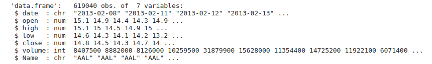
Our adventure begins with a simple task—discovering what lies within our dataset. We load the data and take a sneak peek. With the “head()” function, we unveil the first 10 rows. We revel in the joy of exploring the dimensions of our dataset using “dim()“.
Output:
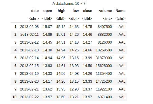
10 rows
Output:
619040 * 7
Missing values
We’ve stumbled upon missing values! But fret not, we shall fill these gaps and restore balance to our dataset.
Output:
date 0 open 11 high 8 low 8 close 0 volume 0 Name 0
You have summoned the names() function to reveal the secret names of the columns in your dataset. By capturing the output in the variable variable_names and invoking the print() spell, you have successfully unveiled the hidden names of the columns, allowing you to comprehend the structure of your dataset.
R
variable_names <- names(data)
print(variable_names)
|
Output:
"date" "open" "high" "low" "close" "volume" "Name"
Next, you cast the str() spell upon your dataset. This spell reveals the data types of each variable (column) granting you insight into their mystical nature. By deciphering the output of this spell, you can understand the types of variables present in your dataset
Output:
structure
Handling missing values
We fearlessly remove the voids using na.omit(), rescuing columns from emptiness. With a triumphant flourish, we check for any stragglers using colSums(is.na(data1)). Victory!
R
data1 <- na.omit(data)
colSums(is.na(data1))
|
Output:
date 0 open 0 high 0 low 0 close 0 volume 0 Name 0
Checking the dimension after removing missing values warriors.
Output:
619029 * 7
The summary reflects the essence of our data, focusing on minimum and maximum values, mean and median, and first and third quartile.
Output:
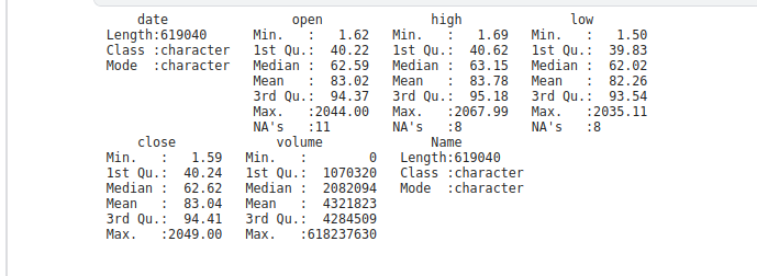
summary
Data Visualization
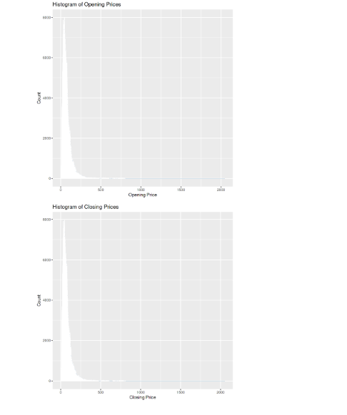
“Histogram of Opening Prices” displays the frequency distribution of opening prices. The x-axis represents the opening price values, and the y-axis represents the count. The second Histogram “Histogram of Closing Prices” visualizes the distribution of closing prices. I x-axis represents the closing price values and the y -axis represents the count.
R
ggplot(data1, aes(x = open)) +
geom_histogram(binwidth = 1,
fill = "steelblue", color = "white") +
labs(title = "Histogram of Opening Prices",
x = "Opening Price", y = "Count")
ggplot(data1, aes(x = close)) +
geom_histogram(binwidth = 1,
fill = "steelblue", color = "white") +
labs(title = "Histogram of Closing Prices",
x = "Closing Price", y = "Count")
|
Output:
histogram
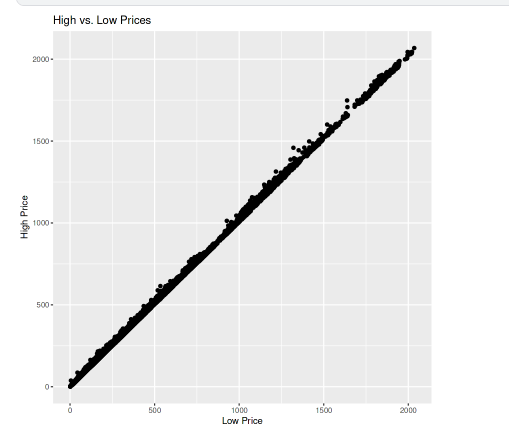
The scatter plot is named “High vs. Low Prices.” It compares the high and low prices for each data point. The x-axis represents the low prices, and the y-axis represents the high prices.
R
ggplot(data1, aes(x = low, y = high)) +
geom_point() +
labs(title = "High vs. Low Prices", x = "Low Price", y = "High Price")
|
Output:
plot
Data analysis
Telling the length or we can say the total number of unique companies in the dataset.
R
companies <- length(unique(data1$Name))
companies
|
Output:
505
Telling the lowest closing price in the dataset.
R
price <- min(data1$close)
price
|
Output:
1.59
Telling the highest closing price in the dataset.
R
price <- max(data1$close)
price
|
Output:
2049
Giving the result of the company name with the highest shared volume.
R
maximum_volume <- data1$Name[which.max(data1$volume)]
maximum_volume
|
Output:
'VZ'
Giving the result of the company name with the minimum shared volume.
R
minimum_volume <- data1$Name[which.min(data1$volume)]
minimum_volume
|
Output:
'BHF'
We calculate the average closing price by taking the mean of the close column in the dataset data1
R
mean_price <- mean(data1$close)
mean_price
|
Output:
83.0433.49787651
We determine the total trading volume by summing up the values in the volume column of the dataset data1.
R
total_volume <- sum(data1$volume)
total_volume
|
Output:
2675376439690
We find the company with the longest consecutive days of price increases by identifying the corresponding “Name” value where the condition for consecutive price increases is met.
R
price_increase <- data1$Name[rle(data1$close > lag(data1$close))$values &
rle(data1$close > lag(data1$close))$lengths > 1][1]
price_increase
|
Output:
'AAL'
We find the company with the longest consecutive days of price decreases by identifying the corresponding “Name” value where the condition for consecutive price decreases is met.
R
price_decrease <- data1$Name[rle(data1$close < lag(data1$close))$values &
rle(data1$close < lag(data1$close))$lengths > 1][1]
price_decrease
|
Output:
'AAL'
Feature Engineering
Feature Engineering helps to derive some valuable features from the existing ones. We convert the “date” column to a character format then split the date using “/” as the delimiter then create a new data frame with columns for date, day, month, and year.
R
data1$date <- as.character(data1$date)
splitted <- strsplit(data1$date, "/")
df <- data.frame(
date = data1$date,
day = as.integer(sapply(splitted, `[`, 1)),
month = as.integer(sapply(splitted, `[`, 2)),
year = as.integer(sapply(splitted, `[`, 3)),
stringsAsFactors = FALSE
)
head(df)
|
Output:
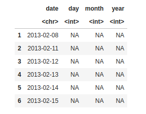
making column day, month, year
Now in this code, we are filling the column day, month, and year values from the date column.
R
see_the_change <- data.frame(
date = data1$date,
day = day(data1$date),
month = month(data1$date),
year = year(data1$date),
stringsAsFactors = FALSE
)
head(see_the_change)
|
Output:
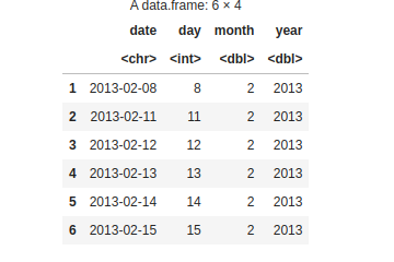
day, month, year changes
Now, we are including day, month, and year columns in the dataset data1.
R
data1$day <- day(data1$date)
data1$month <- month(data1$date)
data1$year <- year(data1$date)
head(data1)
|
Output:
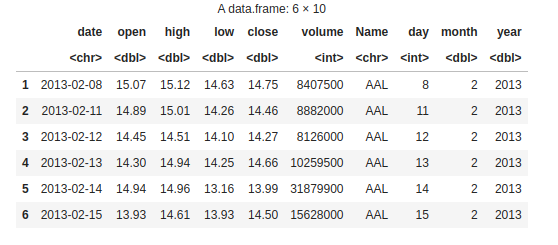
dataset data1
We create a new column “is_quarter_end” in data1 to see whether a particular date falls at the end of a quarter. Using the modulo operator (%%), we are checking if the month value is divisible by 3. If it is, we assign 1 to indicate it’s a quarter-end otherwise, we assign 0.
R
data1$is_quarter_end <- ifelse(data1$month %% 3 == 0, 1, 0)
head(data1 , 5)
|
Output:
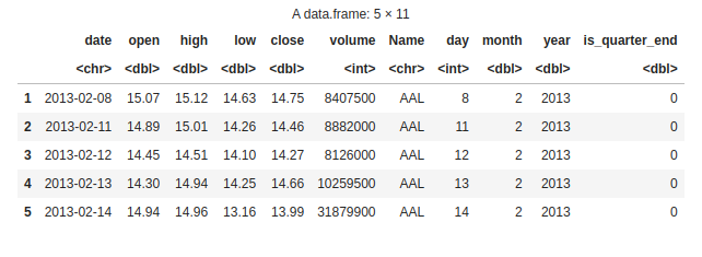
Quarterly data
First, we are taking the numeric columns (open, high, low, close) and the date column from “data1” to create a new data frame called “data_num”, then we calculate the year from the “date” column using the “lubridate::year” function and add it as a new column in “data_num” then group the data by year and calculate the mean for each numeric column. Create a bar plot for each numeric column, displaying the mean values for each year.
R
nume_column <- c("open", "high",
"low", "close")
data_num <- data1[, c("date", nume_column)]
data_num <- data_num[apply(data_num[, nume_column],
1, function(x) all(is.numeric(x))), ]
data_num$year <- lubridate::year(data_num$date)
data_grouped <- data_num %>%
group_by(year) %>%
summarise(across(all_of(nume_column), mean))
par(mfrow = c(2, 2), mar = c(4, 4, 2, 1))
for (i in 1:4) {
col <- nume_column[i]
barplot(data_grouped[[col]], main = col,
xlab = "Year", ylab = "Mean")
}
|
Output:
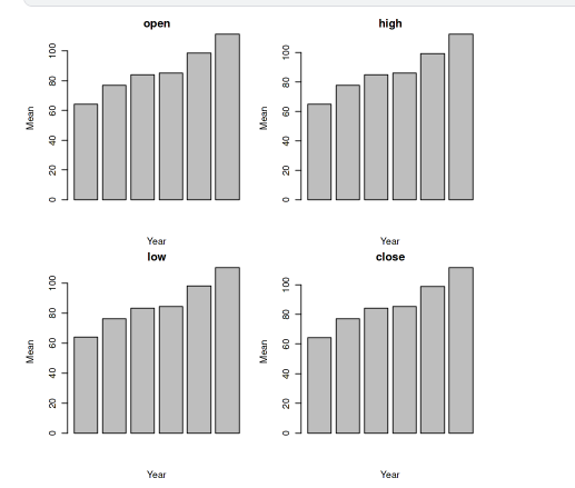
Bar plot
And that’s a wrap! But remember, this is just the beginning of our data adventure.
Share your thoughts in the comments
Please Login to comment...